Category: JavaFX Material Design

  • JavaFX Material Design Hamburgers and Transitions

    JavaFX Material Design Hamburgers and Transitions

    Hamburgers are a great replacement for menu icons. In material design, hamburgers can be used to trigger various navigation components. In this post, i will show how to add hamburgers to your JavaFX application. I have made a thorough tutorial for JFXHamburger transition.

    JFoenix library provides (Read about setting up material design library for JavaFX) JFXHamburger class for implementing Hamburger. It can be dragged and dropped  using Scene Builder, as demonstrated by the above video.

    JFXHamburger without transition support is merely 3 parallel lines. But when you associate it with some cool transition, it will become wonderful. So let’s have a look in to the transitions.

    HamburgerBackArrowBasicTransition
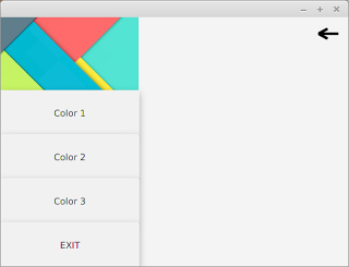
1. HamburgerBackArrowBasicTransition

    This transition creates a back arrow from the 3 parrallel lines (Hamburger). This can be created by passing the created Hamburger object as parameter to the HamburgerBackArrowBasicTransition class.

    HamburgerBackArrowBasicTransition transition = new HamburgerBackArrowBasicTransition(hamburger);
    
    The animation can be started using play() method. The state of the transition ( either arrow or hamburger) is set through setRate() method. The animation is controlled by changing the rate between -1 and 1.
    transition.setRate(-1);
    hamburger.addEventHandler(MouseEvent.MOUSE_PRESSED,(e)->{
            transition.setRate(transition.getRate()*-1);
            transition.play();
    });
    
    As you can see, at first, the transition rate should be set to -1 which is the hamburger. After the user clicks on the hamburger, it can be updated by multiplying with -1, i.e. to 1. Now the Hamburger will turn into a arrow. For further clicks on the hamburger, it will iterate  between -1 and 1.

    HamburgerBasicCloseTransition2. HamburgerBasicCloseTransition

    This transition converts the hamburger to a cross form. Usage of this one is very similar to the above except the class used.

    HamburgerBasicCloseTransition transition = new HamburgerBasicCloseTransition(hamburger);


    3. HamburgerSlideCloseTransitionHamburgerBasicCloseTransition

    This transition converts the hamburger to a close form like before, with a cool transition.

    HamburgerSlideCloseTransition transition = new HamburgerSlideCloseTransition(hamburger);


    HamburgerBasicCloseTransition

    4.HamburgerNextArrowBasicTransition

    This transition converts the hamburger to a forward arrow.

    HamburgerNextArrowBasicTransition transition = new HamburgerNextArrowBasicTransition(hamburger);


    Watch this tutorial in action from Genuine coder YouTube channel

  • How to make Navigation Drawer (Side Panel) in JavaFX – JavaFX Drawer

    How to make Navigation Drawer (Side Panel) in JavaFX – JavaFX Drawer

    Navigation drawer provides an intuitive way to keep main navigation controls of the UI clean. The drawer will only be made visible to the user on certain actions like button click so that we can make use of that space for much more important things yet keeping controls reachable with single click.

    Android introduced the material design Navigation bar or side pane or whatever you call, with its Material design goodness. JFoenix library provides JFXDrawer component.

    Today, I will be showing how to implement the Navigation drawer on your JavaFX application using JFoenix material design library. If you want some help on setting up the JFoenix material design library, see my post JavaFX Material Design : Setting Up and Making Login Application.

    I have made a video to make things more clear. You can watch it right here.


    If you are the kind of person who do not like to watch tutorial videos, read from here. I will explain it step by step.

    Step 1 : Design Content For Navigation Drawer 

    At first, you have to create an FXML layout for the Navigation bar itself. This layout can then be inflated to the navigation bar holder later. The above image shows a pretty simple VBox layout that consists of 4 Buttons and one image view. This content can the be loaded to a VBox variable in our code (from the main controller) using the following code

    VBox box = FXMLLoader.load(getClass().getResource("SidePanelContent.fxml");
    
    Step 2 : Design The Container (Main) Window
    Main window with Hamburger
    Main window with Hamburger

    Now we  have the navigation bar content. In this step, you have to design the main application window. The JFXDrawer can be added using scene builder by drag and drop. Once you position the drawer on the space you want, you can set the drawer direction to LEFT, RIGHT, TOP or BOTTOM from the Properties section of Scene Builder.

    I have added a JFXHamburger for material design look and feel. I have thouroughly explained how to use JFXHamburger in this video https://www.youtube.com/watch?v=rCnPY9Kj4J0 . If you don’t like to have a Hamburger, you can use a simple button. Add an action listener to your button and add this code.
    @FXML
    //Accessing FXML Element
    JFXDrawer drawer;
    //Add this in ActionListener
    if(drawer.isShown())
    drawer.close();
    else
    drawer.open();
    

    The navigation drawer can be made visible by using the open() method. It can be made invisible through the function call close().

    Step 3 : Setting the content of Drawer

    Now we have two separate components. The Drawer and Main window. We can attach the box loaded in step 1 to our drawer in main window using the following code.

    drawer.setSidePane(box);
    
    Step 4 : There is no 4th step. You are done !
    I used to get happier when things get completed sooner that expected. That’s why there is a step 4 🙂
    Run the code now. When you click on your button or Hamburger,you should see the navigation drawer like this. If you have some alignment issues for the drawer, increase the value of “Default Drawer Size” from the Scene Builder.

    Recently, as part of library management software tutorial, I have created more elaborate tutorial about creating Navigation Drawer. It contains more complex buttons with icons and CSS styling. Watch those tutorial videos from the following link.

    1. Designing The Drawer
    2. Attaching drawer to Dashboard
    3. Handling Button Click Events

    Get Project From GitHub


    You might also be interested in:-

    1. JavaFX Library Management System Development: https://genuinecoder.com/javafx-complete-project-tutorial-library-management-system-html/
    2. JavaFX Animation Tutorial: https://genuinecoder.com/javafx-animation-tutorial/
    3. JavaFX 3D Tutorial: https://genuinecoder.com/javafx-3d-tutorial-introduction/
  • JavaFX Material Design : Setting Up and Making Login Application

    JavaFX Material Design : Setting Up and Making Login Application

    One problem I have faced when developing java applications was the old look. Even after the introduction of Nimbus look and feel, the user interface components felt too static and dead. Then JavaFX came in to the scene and provided a much better interface and control elements.

    In this post, I would like to discuss on how to design our JavaFX applications using material design components. The developers at JFoenix had done an impressive job on developing material library for JavaFX. All that we have to do is to download the library and add it into Scene Builder and our application. I have made a video tutorial on setting-up the JFoenix library and making a material login interface.

    Adding JFoenix to Scene Builder

    First, download the library from https://github.com/jfoenixadmin/Jfoenix. Once you get the Jar file, you have to add it into Scene Builder. Once you add this library to Scene Builder, you can use components available in JFoenix library in your project with just drag and drop.

    Within SceneBuilder GUI, there is a setting button, as you can see in the following screenshot. Once you click on it, you will get a context menu. Select JAR/FXML manager which will open the library manager window.

    JavaFX Scene Builder add external jar
    JavaFX Scene Builder JAR/FXML manager

    Then, select Add Library/FXML from file system from the window. This will open a file selection window. Select the JFoenix Jar file. This will open another window listing all the components available in the library. Just select all. Once you successfully add this library, it can be seen under installed libraries/FXML files list.

    Scene Builder Library Manager
    External  library window

    After adding the components to Scene Builder, It’s pretty much drag drop. For JFXButton, you can set ripples, set it as RAISED…. oh my goodness! I have been developing desktop applications for a long time and this is the first time getting my hands on these much cool UI components. 

    Watch Video Tutorial about using JFoenix library to make a login Application

    I have posted a video tutorial in Genuine Coder YouTube channel about using JFoenix library. Watch it right from here.

    Download Sample Project Source Code : Google Drive
    Download Sample Project Application : Google Drive

    Complete JFoenix Components Tutorial

    Watch JFoenix tutorial from following playlist. Contains 19 videos about JFoenix components.

    JavaFX Material Design Library Management Software Development

    I have created a complete library management program using JavaFX and JFoenix based on Material Design. The Complete tutorial of the development is available in Genuine Coder YouTube Channel.  Read more about this project

    JavaFX Library Management Software
    JavaFX Library Management Software

    Material UI Components available in JFoenix

      • JFXBadge
      • JFXButton
      • JFXCheckBox
      • JFXColorPicker
      • JFXComboBox
      • JFXDatePicker
      • JFXDialog
      • JFXDialogLayout
      • JFXDrawer
      • JFXDrawerStack
      • JFXHamburger
      • JFXListCell
      • JFXListView
      • JFXNodesList
      • JFXPasswordField
      • JFXPopup
      • JFXProgressbar
      • JFXRadioButton
      • JFXRippler
      • JFXSlider
      • JFXSnackbar
      • JFXSpinner
      • JFXTabPane
      • JFXTextArea
      • JFXTextField
      • JFXToggleButton
      • JFXToggleNode
      • JFXTogglePane
      • JFXToolbar
      • JFXTreeTableCell
      • JFXTreeTableRow
      • JFXTreeTableView
      • NumberValidator
      • RequireFieldValidator