Category: JavaFX

  • JavaFX Image Button Tutorial

    JavaFX Image Button Tutorial

    In this tutorial, we will learn how to create image buttons in JavaFX. By default, there is no special component named ImageButton. However, we can easily extend the default JavaFX Button to create a button with image.

    JavaFX Image Button with Text

    To create a button with image, we can make use of the Button#setGraphic(Node) function. We can set the image we want to attach to the button through the setGraphic() method. Let’s see an example code to understand it better.

    import javafx.application.Application;
    import javafx.scene.Scene;
    import javafx.scene.control.Button;
    import javafx.scene.control.ContentDisplay;
    import javafx.scene.image.Image;
    import javafx.scene.image.ImageView;
    import javafx.scene.layout.Region;
    import javafx.scene.layout.StackPane;
    import javafx.stage.Stage;
    
    public class JavaFXImageButton extends Application {
    
      private static final double BUTTON_HEIGHT = 100;
    
      public void start(Stage stage) {
        //Create a Button
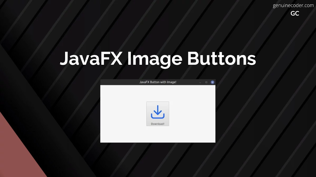
        Button button = new Button("Download!");
        button.setPrefSize(Region.USE_COMPUTED_SIZE, BUTTON_HEIGHT);
    
        //Create imageview with background image
        ImageView view = new ImageView(new Image("download.png"));
        view.setFitHeight(BUTTON_HEIGHT);
        view.setPreserveRatio(true);
    
        //Attach image to the button
        button.setGraphic(view);
        //Set the image to the top
        button.setContentDisplay(ContentDisplay.TOP);
    
        Scene scene = new Scene(new StackPane(button), 600, 300);
        stage.setTitle("JavaFX Button with Image!");
        stage.setScene(scene);
        stage.show();
      }
    
      public static void main(String[] args) {
        launch(args);
      }
    }
    
    JavaFX Image Button With Text
    JavaFX Image Button With Text

    You can see the result above. We have added the image icon on the top and text on the bottom. You can change the position of the text with respect to the image by changing the setContentDisplay() option.

    //Set button text to the right of the image
    button.setContentDisplay(ContentDisplay.RIGHT);
    //Set button text to the left of the image
    button.setContentDisplay(ContentDisplay.LEFT);
    

    JavaFX Image Only Button

    Now, if you would like to implement a button without any text that fits the button fully, let’s see how that can be achieved. When you want a clickable button with just an image and no text, you can still use the setGraphic(Node) function. Let’s understand it with an example code. We should make use of the no-arg constructor of javafx.scene.control.Button() to create button without any text.

    private static final double BUTTON_HEIGHT = 100;
    
    public void start(Stage stage) {
    
      //Creating a Button without any text
      Button button = new Button();
      button.setPrefSize(Region.USE_COMPUTED_SIZE, BUTTON_HEIGHT);
    
      //Create imageview with background image
      ImageView view = new ImageView(new Image("background.jpg"));
      view.setFitHeight(BUTTON_HEIGHT);
      view.setPreserveRatio(true);
    
      //Attach image to the button
      button.setGraphic(view);
    
      Scene scene = new Scene(new StackPane(button), 600, 300);
      stage.setTitle("JavaFX Button with Image!");
      stage.setScene(scene);
      stage.show();
    }
    

    This will create the following output.

    JavaFX Image Only Button
    JavaFX Image Only Button

    Q. How to remove the padding between the button graphic image and the button edge?
    If you want to get rid of the padding between the image and the button edge, you need to manually set the button padding to zero. This can be done using the setPadding(Inset) option.

    button.setPadding(Insets.EMPTY);
    

    JavaFX Image Button with CSS

    We can also create ImageButton with the help of JavaFX CSS. Set the image as the background for the Button using -fx-background-image CSS styling. Let’s see how we can create our ImageButton with CSS. The disadvantage of using a background image is that, the text will be on top of the image, and we will have to make sure that the text color is readable in the image background.

    import javafx.application.Application;
    import javafx.scene.Scene;
    import javafx.scene.control.Button;
    import javafx.scene.layout.StackPane;
    import javafx.stage.Stage;
    
    public class JavaFXImageButton extends Application {
    
      public void start(Stage stage) {
        //Creating a Button without any text
        Button button = new Button();
        button.setPrefSize(200, 100);
        button.setStyle("-fx-background-image: url(background.jpg);-fx-text-fill: white;-fx-font-size: 20px");
        button.setText("Download!");
    
        Scene scene = new Scene(new StackPane(button), 600, 300);
        stage.setTitle("JavaFX Image Button with CSS!");
        stage.setScene(scene);
        stage.show();
      }
    
      public static void main(String[] args) {
        launch(args);
      }
    }
    
    JavaFX Image Button using CSS
    JavaFX Image Button using CSS

    Conclusion

    In this tutorial, we have learned how to create JavaFX Buttons with Images. We have created button with image and text, button with only image and Image Button with CSS styling. If you liked this article, you might also want to checkout some of the other interesting articles I have written.

  • JavaFX ObservableList Tutorial

    JavaFX ObservableList Tutorial

    JavaFX ObservableList is JavaFX SDK’s special implementation of List interface. It is basically an observable list that provides option to attach listeners for list content change. ObservableList has an integral role in the JavaFX development because it is used for major components like TableView, ComboBox, etc.

    In this tutorial, we will explore the JavaFX ObservableList and see how we can utilize its special functionalities.

    Creating and using ObservableList

    You cannot instantiate an ObservableList class directly using a new call. Instead, FXCollections should be used to create an ObservableList. Let’s see how we can create an ObservableList of String type. The most common way to create it is using observableArrayList() function.

    ObservableList<String> listInstance = FXCollections.observableArrayList();
    //Add a single entry
    listInstance.add("Java");
    System.out.println(listInstance);
    
    //Add multiple entries
    listInstance.addAll("Cpp", "C#", "Python");
    System.out.println(listInstance);
    
    //Remove entry
    listInstance.remove("Cpp");
    System.out.println(listInstance);
    

    As you have already noted, the basic operations are similar to normal lists, except the addAll() function availability. You can add multiple entries to the ObservableList using comma separated values. The output of the above code is as follows.

    [Java]
    [Java, Cpp, C#, Python]
    [Java, C#, Python]
    

    Now, let’s see some special advanced features of the ObservableList.

    Listening for changes in the ObservableList

    ObservableList allows us to add listeners into the list so that we can execute some logic when the contents of the list is changed. In the previous code snippet, we have added system.out.println after each change we made into the list to print the list. Instead, we can actually attach a listener to the ObservableList and it will help us to print the list as soon as it is changed. To achieve this, we will make use of javafx.collections.ListChangeListener. The onChanged() function will be called as soon as any change is made to the contents of the list.

    ObservableList<String> listInstance = FXCollections.observableArrayList();
    
    //Add a ListChangeListener that will execute as soon as the contents of the list is changed.
    listInstance.addListener(new ListChangeListener<String>() {
      @Override
      public void onChanged(Change<? extends String> c) {
        System.out.println(listInstance);
      }
    });
    
    //Manipulate contents of the list
    listInstance.add("Java");
    listInstance.addAll("Cpp", "C#", "Python");
    listInstance.remove("Cpp");
    

    The output of the code snippet is given below. The “System.out.println(listInstance);” was executed three times, once after each list change.

    [Java]
    [Java, Cpp, C#, Python]
    [Java, C#, Python]
    

    ObservableList also provides a second type of listener called InvalidationListener. Unlike ListChangeListener that provides the actual change as a parameter to the onChanged function, it doesn’t provide the change. You can read more about it in the dedicated observable tutorial.

    Getting values from the ObserableList is similar to getting value from normal lists in Java. To get an item at specific index, you can call “observableList.get(index)”. You can also get iterator through observableList.iterator() function.

    Video Tutorial for JavaFX ObservableList

    If you are interested in learning more about the ObservableList, please have a look into this ObservableList video tutorial. The video shows how to make use of the ObservableList for JavaFX ListView with realworld example.

    ObservableList size change listener

    Thanks to JavaFX Binding class, we can add listeners to some observable properties of the list, like the size of the list. This way, similar to how we tracked the list-content-change using a listener, we can also easily track the list size. Let’s adjust the above list content listener code to list size listener code and learn how to create a binding value to an ObservableList’s size and add a listener to it.

    ObservableList<String> listInstance = FXCollections.observableArrayList();
    
    //Listen for changes in list size
    IntegerBinding listSizeProperty = Bindings.size(listInstance);
    listSizeProperty.addListener(new ChangeListener<Number>() {
      @Override
      public void changed(ObservableValue<? extends Number> observable, Number oldValue, Number newValue) {
        System.out.println("Updated list size: " + newValue);
      }
    });
    
    listInstance.add("something");
    listInstance.addAll("something1", "random_data", "something2");
    listInstance.remove("somethin3");
    

    Output of the above code snippet is given below. As you can see, the size of the list is tracked and printed for each 3 changes we have made.

    Updated list size: 1
    Updated list size: 4
    Updated list size: 3
    

    JavaFX Observable Program Output

    Conclusion

    In this tutorial, we have learned how to create and use ObservableList in JavaFX. It provides all the functionalities of normal Java lists along with cool observable support. You might also be interested in the other articles on JavaFX like JavaFX Scene Switch Animation and JavaFX Animation Tutorial.

  • JavaFX CheckComboBox

    JavaFX CheckComboBox

    JavaFX CheckComboBox is a special UI control provided by ControlsFX. It is used for giving option to users to select more than one item from a Combobox. It is an extremely useful component you can use to provide a rich user experience. In this tutorial, we will explore the component usage with an example and style it using CSS. The basic idea of this component is Checkbox + ComboBox so that ComboBox can have multiple parallel selections.

    Adding ControlsFX to Project

    Since the component is from ControlsFX library, you need to include the dependency on your project. If you are using the maven, add the dependency as follows.

    <dependency>
      <groupId>org.controlsfx</groupId>
      <artifactId>controlsfx</artifactId>
      <version>11.1.1</version>
    </dependency>
    

    If you are using Gradle, add the following line to your build.gradle file.

    implementation 'org.controlsfx:controlsfx:11.1.1'
    

    How to use CheckComboBox

    The usage of CheckComboBox is similar to the normal JavaFX ComboBox. You can create a list of item you want to add and then attach it to the CheckComboBox.
    In the following example, we will make use of CheckComboBox to keep things simlpe. Let’s see the usage on a sample code.

    JavaFX CheckComboBox<String> Example

    //Reduced import code
    import org.controlsfx.control.CheckComboBox;
    
    public class JavaFXCheckComboBoxTutorial extends Application {
    
      private CheckComboBox<String> createCheckComboBox() {
        // Create the list of items to be shown on the combobox
        ObservableList<String> programmingLanguages = FXCollections.observableArrayList(
            "Java",
            "Cpp",
            "Python",
            "C#",
            "Kotlin"
        );
        // Attach the list to the Combobox
        CheckComboBox<String> checkComboBox = new CheckComboBox<>(programmingLanguages);
        //As soon as an item is selected or selection is changed, display all the selected items
        checkComboBox.getCheckModel().getCheckedItems().addListener(new InvalidationListener() {
          @Override
          public void invalidated(Observable observable) {
            System.out.printf("\nSelected items: %s", getSelectedItems(checkComboBox));
          }
        });
        return checkComboBox;
      }
    
      /**
       * Get the currently selected items from the CheckComboBox
       */
      private List<String> getSelectedItems(CheckComboBox<String> checkComboBox) {
        return checkComboBox.getCheckModel().getCheckedItems();
      }
    
      @Override
      public void start(Stage stage) {
        VBox contentPane = new VBox(10);
        contentPane.setAlignment(Pos.CENTER);
        contentPane.getChildren().addAll(new Label("CheckComboBox Example"), createCheckComboBox());
    
        Scene scene = new Scene(contentPane, 400, 500);
        stage.setScene(scene);
        stage.show();
      }
    
      public static void main(String[] args) {
        launch();
      }
    }
    

    To get the list of selected items from the CheckComboBox, you can use

    checkComboBox.getCheckModel().getCheckedItems()

    It will return an ObservableList with all the selected items.

    Customize CheckComboBox with CSS

    Now, let’s see how to style the CheckComboBox with JavafX CSS styling. This component can be styled using combo-box-base CSS. By applying the following CSS, the CheckComboBox is customized with a lighter background.

    .combo-box-base {
      -fx-background-color: -fx-shadow-highlight-color, -fx-outer-border, -fx-inner-border, white;
      -fx-background-insets: 0 0 -1 0, 0, 1, 2;
      -fx-background-radius: 3px, 3px, 2px, 1px;
    }
    
    .combo-box .combo-box-popup .list-cell:hover {
      -fx-text-fill: yellow ;
      -fx-background-color: green ;
    }
    
    .combo-box .combo-box-popup .list-view, .combo-box .combo-box-popup .list-cell {
      -fx-background-color: black ;
      -fx-text-fill: white ;
    }
    

    JavaFX CheckComboBox Custom CSS

    Conclusion

    In this tutorial, we have discussed how to make use of the CheckComboBox in code and style it using CSS. ControlsFX has a lot of such useful extra components. You might also be interested to checkout the following articles.

  • JavaFX Custom Shaped Buttons

    JavaFX Custom Shaped Buttons

    JavaFX provides effective ways to customize the shape of most of the components. In this tutorial, we will learn how to set a custom shape for the JavaFX Button component.

    Creating custom shaped buttons

    We can make use of -fx-shape CSS property to set the button to any custom shape. Let’s see how we can make a heart shaped button using -fx-shape styling. We will create two buttons, one normal button without any special styling and one with heart-shape. The -fx-shape css property accepts SVG paths as shape. Thanks to the SVG support, we can actually make any shape by providing the corresponding svg parameters. You can learn more about SVG shapes from w3.org.

    import javafx.application.Application;
    import javafx.geometry.Pos;
    import javafx.scene.Scene;
    import javafx.scene.control.Button;
    import javafx.scene.layout.HBox;
    import javafx.stage.Stage;
    
    public class HeartShapedButtonTutorial extends Application {
    
      @Override
      public void start(Stage stage) {
        HBox contentContainer = new HBox(50d, createNormalButton(), createHeartShapedButton());
        contentContainer.setAlignment(Pos.CENTER);
        Scene scene = new Scene(contentContainer, 500, 500);
        stage.setTitle("JavaFX Button Tutorial");
        stage.setScene(scene);
        stage.show();
      }
    
      private Button createNormalButton() {
        Button button = new Button("Normal Button!");
        button.setPrefSize(200, 200);
        return button;
      }
    
      private Button createHeartShapedButton() {
        Button button = new Button("Custom Button!");
        button.setStyle(
            "-fx-shape: \"M23.6,0c-3.4,0-6.3,2.7-7.6,5.6C14.7,2.7,11.8,0,8.4,0C3.8,0,0,3.8,0,8.4c0,9.4,9.5,11.9,16,21.26.1-9.3,16-12.1,16-21.2C32,3.8,28.2,0,23.6,0z\";"
        );
        button.setPrefSize(200, 200);
        return button;
      }
    
      public static void main(String[] args) {
        launch();
      }
    }
    

    This will create the following output. The normal JavaFX button is added as the first child to the HBox. The custom shaped button is added as the second child.
    JavaFX Custom Shaped Button

    You can also make use of this styling on special buttons like JavaFX Material Design Button, JFXButton.

    Full tutorial on JavaFX Custom Shaped Button

    If you are interested in exploring this further, checkout my video tutorial on Genuine Coder YouTube channel.

    Circular Button

    We can make the button circular by applying the following CSS code.

    .circlular-javafx-button{
        -fx-background-radius: 150;
        -fx-pref-width: 300;
        -fx-pref-height: 300;
        -fx-background-color: green;        
    }
    
    JavaFX Circular Button
    JavaFX Circle Shaped Button

    Triangle Shaped Button

    We can make triangle buttons by applying the following CSS code.

    .balloon{
        -fx-shape: "M150 0 L75 200 L225 200 Z";
        -fx-background-color: #4DD0E1;
    }
    
    JavaFX Triangle Shaped Button
    Triangle Shaped Button

    Conclusion

    JavaFX allows setting custom shapes for its GUI components via -fx-shape option. We have explored the option and created variety of different buttons with heart-shape, circle-shape and triangle shape. You can make the button any shape you want by giving proper SVG path. If you have enjoyed this article, you might also be interested in the following.

  • JavaFx DatePicker Tutorial

    JavaFx DatePicker Tutorial

    In this tutorial, we will talk about JavaFX DatePicker basic usage, how to format the selected date using DateTimeFormatter to string value, and customize the component using JavaFX CSS.

    Using JavaFx DatePicker

    DatePicker is a standard component in the JavaFX SDK. It can be added from the SceneBuilder via FXML file as well. In the following code snippet, we will add the DatePicker to a simple scene without using FXML.

    import java.time.LocalDate;
    import javafx.application.Application;
    import javafx.beans.value.ChangeListener;
    import javafx.beans.value.ObservableValue;
    import javafx.scene.Scene;
    import javafx.scene.control.DatePicker;
    import javafx.scene.layout.StackPane;
    import javafx.stage.Stage;
    
    public class JavaFXDatePickerTutorial extends Application {
    
      @Override
      public void start(Stage stage) {
        Scene scene = new Scene(new StackPane(createDatePicker()), 400, 500);
        stage.setTitle("JavaFX DatePicker Tutorial");
        stage.setScene(scene);
        stage.show();
      }
    
      //Create a date picker and attach and event listener.
      private DatePicker createDatePicker() {
        DatePicker datePicker = new DatePicker();
        //Set Current date to today's date
        datePicker.setValue(LocalDate.now());
        //Add an event listener for date selection change
        datePicker.valueProperty().addListener(new ChangeListener<LocalDate>() {
          @Override
          public void changed(ObservableValue<? extends LocalDate> observable, LocalDate oldValue, LocalDate newValue) {
            //Print date change to console
            System.out.println("New date selected: " + newValue);
          }
        });
        return datePicker;
      }
    
      public static void main(String[] args) {
        launch();
      }
    }
    

    JavaFX DatePicker

    Get date as string from JavaFX DatePicker

    We can get the currently selected date anytime from the DatePicker calendar using the datePicker.getValue() function. It will return a LocalDate object representing the currently selected date.

    When we need to display these dates somewhere, we need to convert the object to a formatted string. It can be easily done through Java DateTimeFormatter.

    As an example, let’s convert the selected date to dd/MM/yyyy format.

    private String getFormattedDateFromDatePicker(DatePicker datePicker) {
      //Get the selected date
      LocalDate selectedDate = datePicker.getValue();
      //Create DateTimeFormatter
      DateTimeFormatter formatter = DateTimeFormatter.ofPattern("dd/MM/yyyy");
      //Convert LocalDate to formatted String
      return selectedDate.format(formatter);
    }
    

    If you want the date to be formatted in some other way, DateTimeFormatter can be customized. You can prepare your own pattern using the DateTimeFormatter.ofPattern() function. Following section shows some supported symbols you can use to prepare your own date format.

      Symbol  Meaning                     Presentation      Examples
      ------  -------                     ------------      -------
       G       era                         text              AD; Anno Domini; A
       u       year                        year              2004; 04
       y       year-of-era                 year              2004; 04
       D       day-of-year                 number            189
       M/L     month-of-year               number/text       7; 07; Jul; July; J
       d       day-of-month                number            10
    
       Q/q     quarter-of-year             number/text       3; 03; Q3; 3rd quarter
       Y       week-based-year             year              1996; 96
       w       week-of-week-based-year     number            27
       W       week-of-month               number            4
       E       day-of-week                 text              Tue; Tuesday; T
       e/c     localized day-of-week       number/text       2; 02; Tue; Tuesday; T
       F       week-of-month               number            3
    
       V       time-zone ID                zone-id           America/Los_Angeles; Z; -08:30
       z       time-zone name              zone-name         Pacific Standard Time; PST
       O       localized zone-offset       offset-O          GMT+8; GMT+08:00; UTC-08:00;
       X       zone-offset 'Z' for zero    offset-X          Z; -08; -0830; -08:30; -083015; -08:30:15;
       x       zone-offset                 offset-x          +0000; -08; -0830; -08:30; -083015; -08:30:15;
       Z       zone-offset                 offset-Z          +0000; -0800; -08:00;
    

    Customize DatePicker with CSS

    Now, let’s say you would like to customize the DatePicker. It is easily possible with JavaFX CSS styling. The following code snippet shows all the CSS customizations you can apply on the DatePicker for full customization. With the following CSS applied, the DatePicker will look as shown in this screenshot.

    JavaFX CSS Customized DatePicker

    * {
      -fx-primary-color: #c26000;
      -fx-secondary-color: #864500;
      -fx-light-grey-color: #d1d1d1;
      /*Set focus color*/
      -fx-focus-color: -fx-secondary-color;
      /*Increase font size*/
      -fx-font-size: 1.5em;
    }
    
    /*-----------------------------------------
    Customize the right button background color
    -------------------------------------------*/
    .date-picker .arrow-button {
      -fx-background-color: -fx-primary-color;
      -fx-background-radius: 0;
    }
    
    .date-picker .arrow-button:hover {
      -fx-background-color: -fx-secondary-color;
    }
    
    .date-picker .arrow-button .arrow {
      -fx-background-color: white;
    }
    
    /*-----------------------------------------
    Customize popup content
    -------------------------------------------*/
    .date-picker .cell {
      -fx-background-color: white;
    }
    
    .date-picker .cell:hover {
      -fx-background-color: -fx-primary-color;
    }
    
    .date-picker .cell:focused {
      -fx-background-color: -fx-primary-color;
    }
    
    /*-----------------------------------------
    Customize the selected cell
    -------------------------------------------*/
    .date-picker .selected {
      -fx-background-color: -fx-primary-color;
      -fx-text-fill: white;
    }
    
    .date-picker .selected:focused {
      -fx-background-color: -fx-primary-color;
      -fx-text-fill: white;
    }
    
    .date-picker-popup {
      -fx-border-color: transparent;
    }
    
    .date-picker-popup .month-year-pane {
      -fx-background-color: -fx-primary-color;
    }
    
    .date-picker-popup .month-year-pane .label {
      -fx-text-fill: white;
    }
    
    .date-picker-popup .week-number-cell {
      -fx-text-fill: -fx-secondary-color;
    }
    
    /*-----------------------------------------
    Customize left and right arrow
    -------------------------------------------*/
    .date-picker-popup .spinner .button .left-arrow,
    .date-picker-popup .spinner .button .right-arrow {
      -fx-background-color: #c2d70e;
    }
    

    Conclusion

    In this tutorial, we have learned how to use DatePicker, format the date, and customize it fully with CSS. You might also be interested in having a look into the following tutorials as well, or checkout our JavaFX tutorial page.

    1. JavaFX animation tutorial
    2. JavaFX scene switching animation
    3. JavaFX icon setup
  • JavaFX Application Icon Setup

    JavaFX Application Icon Setup

    All programs require a nice-looking icon or logo on the taskbar and the window to make it look professional. JavaFX provides easy ways to set up an application icon using any image of your choice, whether it be JPG or PNG or something else. In this tutorial, let’s see how to set up an icon for the application

    Set JavaFX Window/Stage icon from an image file

    The usual method of attaching an icon to the JavaFX application is that, you simply include the icon image inside the JAR file as a resource and then use it. Let’s see how you can do that.

    Step 1: Add the icon to the resource directory

    First, add the image into the resource directory. You can use any supported image formats, like PNG, JPEG etc.

    JavaFX Add Image Resource

    Step 2: Attach the icon to the application window

    Now, let’s attach the image from the resource directory to the window, aka stage. The following code snippets show how to do that in an example program.

    import javafx.application.Application;
    import javafx.scene.Scene;
    import javafx.scene.image.Image;
    import javafx.scene.layout.StackPane;
    import javafx.stage.Stage;
    
    public class JavaFXIconExample extends Application {
    
      @Override
      public void start(Stage stage) {
        Scene scene = new Scene(new StackPane(), 320, 320);    
    
        //Attach the icon to the stage/window
        stage.getIcons().add(new Image(JavaFXIconExample.class.getResourceAsStream("/logo.png")));
    
        stage.setTitle("Sample program!");
        stage.setScene(scene);
        stage.show();
      }
    
      public static void main(String[] args) {
        launch();
      }
    }
    

    So in the above example, we are attaching the icon to the primary stage (also known as root stage). If you want to add logo to the other stages you create, you can repeat the same process again to add icons to them as well, with just one line of code.

    stage.getIcons().add(new Image(JavaFXIconExample.class.getResourceAsStream("/logo.png")));
    

    JavaFX Application With Custom Icon

    Set icon from an image URL

    Now, let’s say you want to add the image dynamically from a URL instead of adding from an image file, that is also easily possible. This can be done with just one line of code, as shown below.

    stage.getIcons().add(new Image("https://genuinecoder.com/wp-content/uploads/2022/06/genuine_coder-3.png"));
    

    In this example, I have used genuine coder logo to dynamically load the application icon. The advantage of using the logo from a URL is that, you can change the logo in the server without touching your program once it is rolled out to your customers.

    Conclusion

    JavaFX provides a one-line option to attach images/logo to the windows. The logo image can be loaded from an image file or from a URL.

  • Bubble Sort Algorithm Visualization

    Bubble Sort Algorithm Visualization

    Bubble sort is a relatively simple sorting algorithm. It works by repeatedly fixing sort order between adjacent elements. Bubble sort is very popular yet not suitable for sorting large datasets since it has an average and worst case complexity of O(n2). Today I am sharing bubble sort algorithm visualization to get better understanding of it.

    View Project in GitHub

    In the following video, you could see the bubble sorting in action. The dataset (array to be sorted) is generated using random functions and it has a size of 500. The visualization is implemented using JavaFX.

    This visualization is implemented with the help of Chart component in JavaFX. I have used a javafx.scene.chart.BarChart. You can learn more about using JavaFX chart from this link.

  • JavaFX 3D Tutorial #12 – Depth Buffer

    JavaFX 3D Tutorial #12 – Depth Buffer

    So far, we have learned about the basics of 3D. We created 3D objects, prepared detailed textures, worked with animation etc. In this chapter, we will talk about the requirement of depth buffer.

    What is Depth Buffer?

    Depth buffering or Z-Buffering is a computer graphics technique used to determine surface depths at each pixel to decide which objects are visible. For example, when there are couple of objects in the scene graph, some edges of will be on top and some will be behind others. In order to identify and render these properly, it is important to fix the depth of each of the objects at each pixels.

    By default, in JavaFX Scenes, depth buffer is disabled. But, it can be easily enabled by using the following overridden constructor.

    Scene(Parent root, double width, double height, boolean depthBuffer)

    Just pass the final parameter as true and depth buffer will automatically enabled.

    SmartGroup group = new SmartGroup();
    group.getChildren().add(createBox());
    
    //Create new scene with depth buffer enabled
    Scene scene = new Scene(group, WIDTH, HEIGHT, true);


    Effects of not enabling depth buffer

    Following image shows the effect of using depth buffer. In the first image (image on the left), the wooden boxes were supposed to merged. But, since depth buffer is not used, the rendering is not proper and they appear to be two different boxes. When depth buffer is enabled, it is rendered correctly as it can be seen in the second image.

    JavaFX Depth Buffer Enabled / Disabled

    Visit JavaFX 3D Course Index Page

  • JavaFX 3D Tutorial #11 – Bump Maps for Wringles

    JavaFX 3D Tutorial #11 – Bump Maps for Wringles

    In the last chapter, we saw how to create glowing objects with self illumination. In this chapter, we will see about bump mapping in JavaFX.

    Bump Maps

    According to Wikipedia, Bump mapping is a computer graphics technique for simulating bumps and wrinkles on the surface of an object. Surfaces are not always super smooth. They mostly have some form of deformations. Bump mapping allows to add this extra detail to the surface.

    JavaFX PhongMaterial provides option to set bump maps using the method.

    public final void setBumpMap(Image value)

    Let’s have a look at example code snippet.

    PhongMaterial material = new PhongMaterial();
    material.setDiffuseMap(new Image(getClass().getResourceAsStream("wood.jpg")));
    
    //Set bump map
    material.setBumpMap(new Image(getClass().getResourceAsStream("bumpMap.jpg")));
    
    Box box = new Box(100, 20, 50);
    box.setMaterial(material);
    return box;


    Visit JavaFX 3D Course Index Page

  • JavaFX 3D Tutorial #10 – Self Illumination

    JavaFX 3D Tutorial #10 – Self Illumination

    In JavaFX 3D, you can make use of self illumination maps to provide glowing effects for objects. Self illumination allows to add extra details for the objects.

    Self Illumination Map

    Self illumination map allows to add an additional glow to the image. You can see the effect in the following image.

    JavaFX Self Illumination Example

    JavaFX PhongMaterial provides an option to set illumination map using the method

    public final void setSelfIlluminationMap(Image value)

    It takes an image as parameter. The glow color will be the color used in image. A dark pixel doesn’t contribute to the glow. For example, in the above earth illumination case, I have used following illumination map.

    Earth’s illumination map


    PhongMaterial material = new PhongMaterial();
    material.setDiffuseMap(new Image(getClass().getResourceAsStream("wood.jpg")));
    
    //Set self illumination map
    material.setSelfIlluminationMap(new Image(getClass().getResourceAsStream("illuminationMap.jpg")));
    
    Box box = new Box(100, 20, 50);
    box.setMaterial(material);
    return box;


    Visit JavaFX 3D Course Index Page

  • JavaFX 3D Tutorial #9 – Moving Light Animation

    JavaFX 3D Tutorial #9 – Moving Light Animation

    In the last chapter, we saw how to add lights to the 3D scene. In this chapter, we will see how a moving light works.

    You can add as many lights as you need. To animate the light sources, you can use predefined animations from javafx.animation package like TranslateTransition, RotateTransition etc or custom animations can be applied. In this example, I will write a custom rotation animation to get the following effect.

    JavaFX Light Animation

    Moving Light Animation

    We can create the rotation effect for the light source using rotateProperty. The important thing here is to specify the axis of rotation. We have the freedom to rotate the object in 360 degrees. In this example, I am rotating light source about X Axis.

    AnimationTimer will be called during each frame rendered. We can update the transform properties of objects to create smooth animation. In this example, I have increased rotation angle of light source by 1 degree during each frame.

    You can speedup the animation by increasing the value ‘1’ to a higher one. Animation speed can be reduced by reducing the value.

    private Node[] prepareLightSource() {
        //Create point light
    	pointLight.setColor(Color.RED);
    	pointLight.getTransforms().add(new Translate(0, -50, 100));
    	//Set axis of rotation
    	pointLight.setRotationAxis(Rotate.X_AXIS);
    
    	//Create a small sphere to locate the light source (Light source is invisible)
    	Sphere sphere = new Sphere(2);
    	//Attach sphere transforms to point light. So they move/rotate together
    	sphere.getTransforms().setAll(pointLight.getTransforms());
    	sphere.rotateProperty().bind(pointLight.rotateProperty());
    	sphere.rotationAxisProperty().bind(pointLight.rotationAxisProperty());
    
    	//Return lights
    	return new Node[]{pointLight, sphere};
    }
    
    @Override
    public void start(Stage primaryStage) {
    	Box box = prepareBox();
    
    	SmartGroup group = new SmartGroup();
    	group.getChildren().add(box);
    	//Add light and sphere
    	group.getChildren().addAll(prepareLightSource());
    
    	Camera camera = new PerspectiveCamera(true);
    	camera.setNearClip(1);
    	camera.setFarClip(1000);
    	camera.translateZProperty().set(-200);
    
    	Scene scene = new Scene(group, WIDTH, HEIGHT);
    	scene.setFill(Color.SILVER);
    	scene.setCamera(camera);
    
    	group.translateXProperty().set(0);
    	group.translateYProperty().set(0);
    	group.translateZProperty().set(0);
    
    	initMouseControl(group, scene, primaryStage);
    
    	primaryStage.setTitle("Genuine Coder");
    	primaryStage.setScene(scene);
    	primaryStage.show();
    
    	//Create animation timer
    	AnimationTimer timer = new AnimationTimer() {
    	  @Override
    	  public void handle(long now) {
    		//Increase rotation angle by 1 degree during each frame.
    		pointLight.setRotate(pointLight.getRotate() + 1);
    	  }
    	};
    	//Start animation automatically during startup
    	timer.start();
    }


    Visit JavaFX 3D Course Index Page

  • JavaFX 3D Tutorial #8 – Lighting with PointLight and AmbientLight

    JavaFX 3D Tutorial #8 – Lighting with PointLight and AmbientLight

    In this chapter, we will see how to add lighting to the JavaFX 3D. Lighting is one of the most important parts in 3D application development since it decides what should be visible at a point of time.

    JavaFX provides two options for lighting. One is AmbientLight and another one is PointLight.

    Ambient Light

    An ambient light radiates lights equally in all directions. When it is used, all the surfaces of the 3D object get equal amount of light. It can be considered as a natural default light.

    Let’s see how we can add Ambient Light. You can give the color of the light by using setColor() method.

    private LightBase prepareLightSource() {
            //Create light object
    	AmbientLight light = new AmbientLight();
    	//Set light color
    	light.setColor(Color.DEEPSKYBLUE);
    	return light;
    }
    

    Screenshot:-

    Point Light

    A point light can be considered as a light bulb that emits light in all directions. You can think of a point light as a sphere of light filling an area. Objects closer to the light will be brighter, and objects further away will be darker. JavaFX allows to add point light using javafx.scene.PointLight class.

    private LightBase prepareLightSource() {
    	//Create point light
    	PointLight pointLight = new PointLight();
    	//Set light color
    	pointLight.setColor(Color.RED);
    	//Set location of light source
    	pointLight.getTransforms().add(new Translate(0,-50,100));
    }
    

    Screenshot:-

    Visit JavaFX 3D Course Index Page

  • JavaFX 3D Tutorial #7 – Reflection with Specular Map

    JavaFX 3D Tutorial #7 – Reflection with Specular Map

    In the 6th chapter, we talked about giving wooden texture to the object. Today, let us see how to give reflection to surfaces in JavaFX 3D. JavaFX provides option to specify specular maps as either image or a color.

    Specular Map

    Specular maps allows to define a surface’s shininess and highlight colour. The higher the value of a pixel (from black to white), the shinier the surface will appear. Black provides zero reflection and white provides total reflection.

    If you want the surface to be having uniform reflection, then use a specular color with Material#setSpecularColor(Color color). Or use Material#setSpecularImage(Image image).

    Let’s have a look at the example code.

    private Box prepareBox() {
       PhongMaterial material = new PhongMaterial();
       //Set diffuse map
       material.setDiffuseMap(new Image(getClass().getResourceAsStream("/resources/wood.jpg")));
       //Set specular map
       material.setSpecularMap(new Image(getClass().getResourceAsStream("/resources/illuminati.jpg")));
    
       Box box = new Box(100, 20, 50);
       box.setMaterial(material);
       return box;
    }
    

    and the result will be

    JavaFX 3D Box with Reflection


    Specular Map used


    Visit JavaFX 3D Course Index Page

    Meta titles: JavaFX Reflection, JavaFX 3D Specular Map

  • JavaFX 3D Tutorial #6 – Textures with Diffuse Map

    JavaFX 3D Tutorial #6 – Textures with Diffuse Map

    In this chapter, we will talk about applying textures with diffuse map. In 3D programming, texture is one of the most important parts because it provides that actual look and feel of an object by adding details on its surface.

    JavaFX and PhongMaterial

    In the javafx.scene.paint package, you can see a class that extends Material abstract class, the PhongMaterial. PhongMaterial allows to create virtual materials that can be applied over your 3D object to create real-world like objects.

    Before diving directly in to the code, let’s have a look at what exactly is the Diffuse Map.

    What is a Diffuse Map ?

    According to the definition, Diffuse mapping (also know as texture mapping) refers to a computer graphics method that simply wrapped and mapped pixels from a texture to a 3D surface. It defines the color property of the surface. For example, if you want to color your object to red, you simply apply red diffuse map over it, it will become red.

    If you would like to read more about it, have a look at cryengine doc.

    Apply Color Over The Surface

    JavaFX PhongMaterial provides two option to apply a diffuse map. Either using a color or using an image. If you use a color, then the whole object will be painted with that color.

    Let’s see how setting a color works.

    //Create Material
    PhongMaterial material = new PhongMaterial();
    //Applying JavaFX Diffuse Map with Color Royal Blue[/caption] Royal blue color
    material.setDiffuseColor(Color.ROYALBLUE));
    Box box = new Box(100, 20, 50);
    //Apply material for the box
    box.setMaterial(material);


    JavaFX: Royal blue color applied as Diffuse Map

    So, using the PhongMaterial’s setDiffuseColor(Color.ROYALBLUE), we set the color of the surface. You can set any color you want.

    Apply Texture Over The Surface

    Colors are suitable in some cases. But, in most cases, we need something more complex than some simple colors. JavaFX provides option to set diffuse map using an Image. You can simply apply any image as texture for your object.

    Let’s see how a wooden texture works on our box.

    //Create Material
    PhongMaterial material = new PhongMaterial();
    //Applying wooden texture
    material.setDiffuseMap(new Image(getClass().getResourceAsStream("wood.jpg")));
    Box box = new Box(100, 20, 50);
    //Apply material for the box
    box.setMaterial(material);
    

    And it looks as follows. Pretty awesome, right?

    JavaFX Diffuse Map with Woode Image

    and that’s it. It is just 3 lines of code to apply a complex texture on your object. If you look at the set* methods of PhongMaterial, you will find a lot more methods. The thing is, diffuse map is just a start. You can make your objects with great amount of detail with these options. We will discover those methods in the upcoming chapters.

    Visit JavaFX 3D Course Index Page

  • JavaFX 3D Tutorial #5 – More fine mouse control – Zoom in and Zoom out

    JavaFX 3D Tutorial #5 – More fine mouse control – Zoom in and Zoom out

    In this chapter, we will implement the mouse zoom control. Currently we have complete rotation freedom on the mouse. With Zoom in/out effect, we can control the Z-axis.

    This zoom control will be based on mouse scrolling. JavaFX provides option to listen for mouse scroll event. We will make use of that.

    //Attach a scroll listener
    stage.addEventHandler(ScrollEvent.SCROLL, event -> {
            //Get how much scroll was done in Y axis.
    	double delta = event.getDeltaY();
            //Add it to the Z-axis location.
    	group.translateZProperty().set(group.getTranslateZ() + delta);
    });
    

    ScrollEvent.SCROLL allows to track the scrolling. JavaFX provides support for tracking horizontal scrolling (which can be obtained using event.getDeltaX()) as well as vertical scrolling (which can be obtained using event.getDeltaY()). Currently we are interested in vertical scrolling only.

    When we scroll upward, the value will be positive. Then the Z axis value will increase and object will go away. When the scroll is downward, Z value will be decreased and the object will come closer.

    Visit JavaFX 3D Course Index Page

  • JavaFX Communication Between Controllers

    JavaFX Communication Between Controllers

    When you begin with JavaFX, one problem you might come up with is the communication between different controllers to communicate between scenes. In this article, we will see how to properly communicate between two different controllers in JavaFX.

    JavaFX Controller Communication Method

    The solution here is to get the controller from FXMLLoader. We use JavaFX FXMLLoader for inflating fxml and loading new views. This loader has a method called getController(). getController method will return an instance of the controller corresponding to the view we are going to load.

    In this example, we take input to a text field from the user. When a button is clicked, new window will be opened and we pass the typed text to new window.

    First Scene Controller

    When the button actionBtn is clicked, a new window will be called which is the second scene window. We take the input from inputField textfield and pass it with transfer data.

    public class Scene1Controller implements Initializable {
    
        @FXML
        private TextField inputField;
        @FXML
        private Button actionBtn;
    
        @Override
        public void initialize(URL url, ResourceBundle rb) {
            //When button clicked, load window and pass data
            actionBtn.setOnAction(event -&amp;amp;amp;amp;amp;amp;amp;gt; {
                loadSceneAndSendMessage();
            });
        }
    
        private void loadSceneAndSendMessage() {
            try {
                //Load second scene
                FXMLLoader loader = new FXMLLoader(getClass().getResource("/javafxcontrollercommunication/scene2/scene2.fxml"));
                Parent root = loader.load();
    
                //Get controller of scene2
                Scene2Controller scene2Controller = loader.getController();
                //Pass whatever data you want. You can have multiple method calls here
                scene2Controller.transferMessage(inputField.getText());
    
                //Show scene 2 in new window
                Stage stage = new Stage();
                stage.setScene(new Scene(root));
                stage.setTitle("Second Window");
                stage.show();
            } catch (IOException ex) {
                System.err.println(ex);
            }
        }
    }
    

    Second Scene Controller

    This controller is elementary. You just have to write a method that accepts the string. Once the string is received, we set that in the display TextField.

    public class Scene2Controller {
        @FXML
        private TextField display;
    
        //Receive message from scene 1
        public void transferMessage(String message) {
            //Display the message
            display.setText(message);
        }
    }
    

    Watch another example on YouTube


    You may also find following interesting:-

    View in Github
    [JavaFX communicate between scenes, JavaFX window communication. JavaFX share data between scenes]

  • JavaFX Splash Screen

    JavaFX Splash Screen

    Splash screens are awesome. They allows to engage users when the application load in the background as a loading screen. In this article, we will talk about implementing JavaFX Splash Screen / Loading Screen with animation. For the splash screen, we will provide a fade-in and fade-out transition.

    Splash Screen with Fade Animation

    In this example, when the program starts, the splash screen will fade in. After some time, the flash screen will fade out.

    The algorithm is as follows

    • Load Preloader with a fade-in effect using FadeTransition
    • Remove Preloader with a fade-out effect using Fade transition.
    • On the end of fade-out load the actual content to the frame.

    Watch the implementation:-

    Let’s have a look at the code. The code is properly commented.

    private void loadSplashScreen() {
    	try {
    		//Load splash screen view FXML
    		StackPane pane = FXMLLoader.load(getClass().getResource(("myAwesomeSplashDesign.fxml")));
    		//Add it to root container (Can be StackPane, AnchorPane etc)
    		root.getChildren().setAll(pane);
    
    		//Load splash screen with fade in effect
    		FadeTransition fadeIn = new FadeTransition(Duration.seconds(3), pane);
    		fadeIn.setFromValue(0);
    		fadeIn.setToValue(1);
    		fadeIn.setCycleCount(1);
    
    		//Finish splash with fade out effect
    		FadeTransition fadeOut = new FadeTransition(Duration.seconds(3), pane);
    		fadeOut.setFromValue(1);
    		fadeOut.setToValue(0);
    		fadeOut.setCycleCount(1);
    
    		fadeIn.play();
    
    		//After fade in, start fade out
    		fadeIn.setOnFinished((e) -> {
    			fadeOut.play();
    		});
    
    		//After fade out, load actual content
    		fadeOut.setOnFinished((e) -> {
    			try {
    				AnchorPane parentContent = FXMLLoader.load(getClass().getResource(("/main.fxml")));
    				root.getChildren().setAll(parentContent);
    			} catch (IOException ex) {
    				Logger.getLogger(MainController.class.getName()).log(Level.SEVERE, null, ex);
    			}
    		});
    	} catch (IOException ex) {
    		Logger.getLogger(MainController.class.getName()).log(Level.SEVERE, null, ex);
    	}
    }
    

    How to show splash screen until loading gets completed

    Sometimes you may want to do some actual work like loading a database or importing something. In this case, we will have to do it in the background while splash screen is shown.

    You can do the heavy lifting tasks on the setOnFinished() method of fade-in transition.

    fadeIn.setOnFinished((e) -> {
        //Do the loading tasks
        DatabaseImporter.import();
        SomeComplexTask.start();
        //...
        //After the background tasks are done, load the fadeout
        fadeOut.play();
    });
    
    Problem with this approach

    The above code works fine when the background tasks are not that much (when the tasks complete within couple of seconds max). But if it is a long task, then the JavaFX UI Thread will hang. In this case, you might have to use a separate thread for processing the background tasks.

    The reliable solution

    You can make use of JavaFX Tasks or JavaFX Services. Then using a task complete listener, you can initiate fade out transition.

    fadeIn.setOnFinished((e) -> {
        //Start the Worker Task
        BackgroundWorkerTask task = new BackgroundWorkerTask();
        task.start();
        //After the completion of the task, start fadeOut animation
        task.setOnSucceeded(successEvent -> {
          fadeOut.play();
        });
    });
    

    So, that’s how you implement a JavaFX Splash Screen.

    See example on GitHub

    JavaFX Splash Screen without Borders

    In this video tutorial, you can see how to make a splash screen in a separate window without window borders. Here, splash screen uses a separate stage.

  • JavaFX 3D Tutorial #4 – 3D Object Transform (Rotation) with Mouse

    JavaFX 3D Tutorial #4 – 3D Object Transform (Rotation) with Mouse

    In the previous chapter, we saw how to do the transforms with keyboard input. In this chapter, we take it a step further. Today, we will talk about JavaFX 3D Mouse Control implementation. Giving control using mouse is more reliable than keyboard. With mouse control, user can directly interact with the 3D application.


    The basic idea is to track the mouse drag. Based on how much drag is made in x and y-axis, we apply rotation transformation.

    The following method will do the trick.

     //Tracks drag starting point for x and y
     private double anchorX, anchorY;
     //Keep track of current angle for x and y
     private double anchorAngleX = 0;
     private double anchorAngleY = 0;
     //We will update these after drag. Using JavaFX property to bind with object
     private final DoubleProperty angleX = new SimpleDoubleProperty(0);
     private final DoubleProperty angleY = new SimpleDoubleProperty(0);
    
     private void initMouseControl(SmartGroup group, Scene scene) {
        Rotate xRotate;
        Rotate yRotate;
        group.getTransforms().addAll(
            xRotate = new Rotate(0, Rotate.X_AXIS),
            yRotate = new Rotate(0, Rotate.Y_AXIS)
        );
        xRotate.angleProperty().bind(angleX);
        yRotate.angleProperty().bind(angleY);
    
        scene.setOnMousePressed(event -> {
          anchorX = event.getSceneX();
          anchorY = event.getSceneY();
          anchorAngleX = angleX.get();
          anchorAngleY = angleY.get();
        });
    
        scene.setOnMouseDragged(event -> {
          angleX.set(anchorAngleX - (anchorY - event.getSceneY()));
          angleY.set(anchorAngleY + anchorX - event.getSceneX());
        });
      }
    

    Let’s discuss the code parts.

    Step 1: Prepare and apply initial rotation transformation
    //Prepare X and Y axis rotation transformation obejcts
    Rotate xRotate;
    Rotate yRotate;
    //Add both transformation to the container
    group.getTransforms().addAll(
    	xRotate = new Rotate(0, Rotate.X_AXIS),
    	yRotate = new Rotate(0, Rotate.Y_AXIS)
    );
    /*Bind Double property angleX/angleY with corresponding transformation.
      When we update angleX / angleY, the transform will also be auto updated.*/
    xRotate.angleProperty().bind(angleX);
    yRotate.angleProperty().bind(angleY);
    
    Step 2: Track starting of mouse drag.

    It is necessary to track the drag start. Because, we will have to track how much the drag was happened in both axes.
    A drag always start with a mouse press.

    //Listen for mouse press -- Drag start with a click :-)
    scene.setOnMousePressed(event -> {
      //Save start points
      anchorX = event.getSceneX();
      anchorY = event.getSceneY();
      //Save current rotation angle
      anchorAngleX = angleX.get();
      anchorAngleY = angleY.get();
    });
    
    Step 3: Calculate angle of rotation based on current drag point

    When the user start dragging, after each pixel (or minor dragging), we will get a callback. We will check current (x,y) value and compare it with previous to calculate the rotation delta.

    //Listen for drag
    scene.setOnMouseDragged(event -> {
        /*event.getSceneY() gives current Y value. Find how much far away
          it is from saved anchorY point.
         */
        angleX.set(anchorAngleX - (anchorY - event.getSceneY()));
        angleY.set(anchorAngleY + anchorX - event.getSceneX());
    });
    

    It is important to note that, when the user drags in Y axis, we have to rotate based on X axis and vice versa (Try the opposite and see how much weird it is). The negative symbol in angleX is to set the direction of rotation. You can change the direction by changing the subtraction to addition.

    Visit JavaFX 3D Course Index Page

    Find Code in GitHub

  • JavaFX Animation Tutorial with Examples

    JavaFX Animation Tutorial with Examples

    In this article, we will have a deep look at JavaFX Animation. JavaFX provides easy to use animation API (javafx.animation package). There are some predefined animation that can be used out of the box or you can implement custom animations using KeyFrames.

    Following are the main predefined animations in JavaFX.

    TranslateTransition

    Translate transition allows to create movement animation from one point to another within a duration. Using TranslateTransition#setByX / TranslateTransition#setByY, you can set how much it should move in x and y axis respectively. It also possible to set precise destination by using TranslateTransition#setToX / TranslateTransition#setToY.

    import javafx.animation.TranslateTransition;
    import javafx.application.Application;
    import javafx.scene.Group;
    import javafx.scene.Scene;
    import javafx.scene.control.Button;
    import javafx.stage.Stage;
    import javafx.util.Duration;
    
    public class Animation extends Application {
        @Override
        public void start(Stage primaryStage) throws Exception {
            Button btn = new Button("ClickMe");
            Group group = new Group(btn);
            Scene scene = new Scene(group, 600, 600);
    
            //Duration = 2.5 seconds
            Duration duration = Duration.millis(2500);
            //Create new translate transition
            TranslateTransition transition = new TranslateTransition(duration, btn);
            //Move in X axis by +200
            transition.setByX(200);
            //Move in Y axis by +100
            transition.setByY(100);
            //Go back to previous position after 2.5 seconds
            transition.setAutoReverse(true);
            //Repeat animation twice
            transition.setCycleCount(2);
            transition.play();
    
            primaryStage.setScene(scene);
            primaryStage.show();
        }
        public static void main(String[] args) {
            Application.launch(args);
        }
    }
    

    ScaleTransition

    Scale transition is another JavaFX animation which can be used out of the box that allows to animate the scale / zoom of the given object. The object can be enlarged or minimized using this animation.

    import javafx.animation.ScaleTransition;
    import javafx.application.Application;
    import javafx.scene.Group;
    import javafx.scene.Scene;
    import javafx.scene.control.Button;
    import javafx.stage.Stage;
    import javafx.util.Duration;
    
    public class Animation extends Application {
    
      @Override
      public void start(Stage primaryStage) throws Exception {
        Button btn = new Button("Genuine Coder");
        Group group = new Group(btn);
        Scene scene = new Scene(group, 600, 600);
    
        //Duration = 2.5 seconds
        Duration duration = Duration.millis(2500);
        //Create new scale transition
        ScaleTransition scaleTransition = new ScaleTransition(duration, btn);
        //Set how much X should enlarge
        scaleTransition.setByX(1.5);
        //Set how much Y should
        scaleTransition.setByY(1.5);
        scaleTransition.play();
    
        primaryStage.setScene(scene);
        primaryStage.show();
      }
    
      public static void main(String[] args) {
        Application.launch(args);
      }
    }
    

    RotateTransition

    Rotate transition provides animation for rotating an object. We can provide upto what angle the node should rotate by toAngle. Using byAngle we can specify how much it should rotate from current angle of rotation.

    import javafx.animation.RotateTransition;
    import javafx.application.Application;
    import javafx.scene.Group;
    import javafx.scene.Scene;
    import javafx.scene.control.Button;
    import javafx.stage.Stage;
    import javafx.util.Duration;
    
    public class Animation extends Application {
    
      @Override
      public void start(Stage primaryStage) {
        Button btn = new Button("Genuine Coder");
        Group group = new Group(btn);
        Scene scene = new Scene(group, 600, 600);
    
        //Duration = 2.5 seconds
        Duration duration = Duration.millis(2500);
        //Create new rotate transition
        RotateTransition rotateTransition = new RotateTransition(duration, btn);
        //Rotate by 200 degree
        rotateTransition.setByAngle(200);
        rotateTransition.play();
    
        primaryStage.setScene(scene);
        primaryStage.show();
      }
    
      public static void main(String[] args) {
        Application.launch(args);
      }
    }
    

    FadeTransition

    Fade transition creates a fade in / fade out effect by controlling opacity of the object. We can make fade in transition or fade out transition in JavaFX by setting the to and from value.

    //Fade in transition
    FadeTransition fadeInTransition = new FadeTransition(Duration.millis(1500), btn);
    fadeInTransition.setFromValue(0.0);
    fadeInTransition.setToValue(1.0);
    
    //Fade out transition
    FadeTransition fadeOutTransition = new FadeTransition(Duration.millis(1500), btn);
    fadeOutTransition.setFromValue(1.0);
    fadeOutTransition.setToValue(0.0);
    

    PathTransition

    Path transition provides option to move object through a specified path. The path can be anything from simple straight line to complex quadratic curves. Following code rotates button through a circular path locate at (200,200) with radius 50

    import javafx.animation.PathTransition;
    import javafx.application.Application;
    import javafx.scene.Group;
    import javafx.scene.Scene;
    import javafx.scene.control.Button;
    import javafx.scene.shape.Circle;
    import javafx.stage.Stage;
    import javafx.util.Duration;
    
    public class Animation extends Application {
    
      @Override
      public void start(Stage primaryStage) {
        Button btn = new Button("Genuine Coder");
        Group group = new Group(btn);
        Scene scene = new Scene(group, 600, 600);
    
        //Create new path transition
        PathTransition pathTransition = new PathTransition();
        pathTransition.setDuration(Duration.millis(2500));
        //Set node to be animated
        pathTransition.setNode(btn);
        //Rotate button through a circular path locate at (200,200) with radius 50
        pathTransition.setPath(new Circle(200, 200, 50));
    
        pathTransition.play();
    
        primaryStage.setScene(scene);
        primaryStage.show();
      }
    
      public static void main(String[] args) {
        Application.launch(args);
      }
    }
    

    Combine Animation Sequentially with SequentialTransition

    Sequential transition allows to combine two or more transition we have discussed so far. After the completion of one transition, the next will be started. The following code will apply rotate transition and scale transition sequentially.

    //Create rotate transition
    RotateTransition rotateTransition = new RotateTransition(Duration.seconds(1));
    rotateTransition.setByAngle(180f);
    //Create scale transition
    ScaleTransition scaleTransition = new ScaleTransition(Duration.seconds(1));
    scaleTransition.setByX(1.5f);
    
    //First do rotateTransition, then do scaleTransition
    SequentialTransition sequentialTransition = new SequentialTransition(rotateTransition, scaleTransition);
    sequentialTransition.play();
    

    Combine Animation Parallely with ParallelTransition

    Parallel transition is very much similar to sequential transition. Except, it works on parallel. All the animations applied will be played in parallel. We can specify two or more transition to execute in parallel.

    //Create rotate transition
    RotateTransition rotateTransition = new RotateTransition(Duration.seconds(1));
    rotateTransition.setByAngle(180f);
    //Create scale transition
    ScaleTransition scaleTransition = new ScaleTransition(Duration.seconds(1));
    scaleTransition.setByX(1.5f);
    
    //Play both rotateTransition as well as scaleTransition in prallel
    ParallelTransition sequentialTransition = new ParallelTransition(rotateTransition, scaleTransition);
    sequentialTransition.play();
    

    KeyFrame Animation

    KeyFrame animation is one of the most key features of JavaFX Animation. The API javafx.animation.KeyFrame can be used to animate any JavaFX property. For example, let’s say you want to animate width of your application window. You can use widthProperty with KeyFrame to animate the width of your application window.

    Watch video on using KeyFrame animation to create slide-in effect in JavaFX.

    The following example loads a scene with slide in effect using JavaFX KeyFrame API

    Parent root = getNextSceneRoot();
    parentContainer.getChildren().add(root);
    
    //Create a timeline instance
    Timeline timeline = new Timeline();
    //Create a keyValue. We need to slide in -- We gradually decrement Y value to Zero
    KeyValue kv = new KeyValue(root.translateYProperty(), 0, Interpolator.EASE_IN);
    //Create keyframe of 1s with keyvalue kv
    KeyFrame kf = new KeyFrame(Duration.seconds(1), kv);
    //Add frame to timeline
    timeline.getKeyFrames().add(kf);
    
    //Start animation
    timeline.play();


    In this chapter we familiarized with JavaFX animation API. JavaFX provides a good set of predefined animation set and a powerful KeyFrame animation API.

    You Might also be interested in:-


  • JavaFX 3D Tutorial #3 – 3D Object Transform (Rotation) with Keyboard Input

    JavaFX 3D Tutorial #3 – 3D Object Transform (Rotation) with Keyboard Input

    In this chapter, we will talk about applying transformation on the 3D objects. JavaFX provides following transforms

    1. Affine
    2. Rotate
    3. Scale
    4. Shear
    5. Translate

    For now, we make use of Rotate transformation. All the transformations can be applied in a similar manner.

    Applying Transforms

    All JavaFX nodes have the method getTransforms() that will return an observable list of all the transforms applied on that. You can simple add a new transform by

     Transform whatever = new Transform();
     yourObject.getTransforms().add(whatever);
    

    When applying transform, it is important that you take care of existing transformation. Let’s say, your object is currently rotated 30 degrees, when you rotate it again by 10, you have to add with 30.

    This can be achieved using createConcatenation() method that combines two transformations.

    Transformable Container

    When we work on 3D programming, we will have to do the transformation regularly. The following class helps to do this in the easy way.

    class SmartGroup extends Group {
        Rotate r;
        Transform t = new Rotate();
    
        void rotateByX(int ang) {
          r = new Rotate(ang, Rotate.X_AXIS);
          t = t.createConcatenation(r);
          this.getTransforms().clear();
          this.getTransforms().addAll(t);
        }
    
        void rotateByY(int ang) {
          r = new Rotate(ang, Rotate.Y_AXIS);
          t = t.createConcatenation(r);
          this.getTransforms().clear();
          this.getTransforms().addAll(t);
        }
      }
    

    With this SmartGroup, you can separate the rotation logic. It also remembers previous rotation values.

    With this, you can rotate an object or a set of objects (the whole container) as follows.

        SmartGroup group = new SmartGroup();
        //Add all the components
        group.getChildren().addAll(box, sphere);
    
        //Rotate by X - 10 degrees
        group.rotateByX(10);
        //Make it 20
       group.rotateByX(10); 
    

    Listen for Keyboard Inputs

    You can register for keyboard press events using KeyEvent.KEY_PRESSED. We have to attach a keyboard listener to the stage itself so that all the key events can be tracked.

    primaryStage.addEventHandler(KeyEvent.KEY_PRESSED, event -> {
       //Process according to the key pressed.
       switch (event.getCode()) {
       }
    });
    

    Working Example

    import javafx.application.Application;
    import javafx.scene.Camera;
    import javafx.scene.Group;
    import javafx.scene.PerspectiveCamera;
    import javafx.scene.Scene;
    import javafx.scene.input.KeyEvent;
    import javafx.scene.paint.Color;
    import javafx.scene.shape.Box;
    import javafx.scene.transform.Rotate;
    import javafx.scene.transform.Transform;
    import javafx.stage.Stage;
    
    
    /**
     * @author afsal villan
     * @version 1.0
     *
     * https://genuinecoder.com
     */
    public class Rotation3D extends Application {
    
      private static final int WIDTH = 1400;
      private static final int HEIGHT = 800;
    
      @Override
      public void start(Stage primaryStage) {
        //Create box
        Box box = new Box(100, 20, 50);
    
        //Prepare transformable Group container
        SmartGroup group = new SmartGroup();
        group.getChildren().add(box);
    
        Camera camera = new PerspectiveCamera();
        Scene scene = new Scene(group, WIDTH, HEIGHT);
        scene.setFill(Color.SILVER);
        scene.setCamera(camera);
    
        //Move to center of the screen
        group.translateXProperty().set(WIDTH / 2);
        group.translateYProperty().set(HEIGHT / 2);
        group.translateZProperty().set(-1200);
    
        //Add keyboard control.
        primaryStage.addEventHandler(KeyEvent.KEY_PRESSED, event -> {
          switch (event.getCode()) {
            case W:
              group.translateZProperty().set(group.getTranslateZ() + 100);
              break;
            case S:
              group.translateZProperty().set(group.getTranslateZ() - 100);
              break;
            case Q:
              group.rotateByX(10);
              break;
            case E:
              group.rotateByX(-10);
              break;
            case NUMPAD6:
              group.rotateByY(10);
              break;
            case NUMPAD4:
              group.rotateByY(-10);
              break;
          }
        });
    
        primaryStage.setTitle("Genuine Coder");
        primaryStage.setScene(scene);
        primaryStage.show();
      }
    
    
      public static void main(String[] args) {
        launch(args);
      }
    
      class SmartGroup extends Group {
    
        Rotate r;
        Transform t = new Rotate();
    
        void rotateByX(int ang) {
          r = new Rotate(ang, Rotate.X_AXIS);
          t = t.createConcatenation(r);
          this.getTransforms().clear();
          this.getTransforms().addAll(t);
        }
    
        void rotateByY(int ang) {
          r = new Rotate(ang, Rotate.Y_AXIS);
          t = t.createConcatenation(r);
          this.getTransforms().clear();
          this.getTransforms().addAll(t);
        }
      }
    }


    Visit JavaFX 3D Course Index Page