In this tutorial, we will talk about JavaFX DatePicker basic usage, how to format the selected date using DateTimeFormatter to string value, and customize the component using JavaFX CSS.
Using JavaFx DatePicker
DatePicker is a standard component in the JavaFX SDK. It can be added from the SceneBuilder via FXML file as well. In the following code snippet, we will add the DatePicker to a simple scene without using FXML.
import java.time.LocalDate;
import javafx.application.Application;
import javafx.beans.value.ChangeListener;
import javafx.beans.value.ObservableValue;
import javafx.scene.Scene;
import javafx.scene.control.DatePicker;
import javafx.scene.layout.StackPane;
import javafx.stage.Stage;

public class JavaFXDatePickerTutorial extends Application {

  @Override
  public void start(Stage stage) {
    Scene scene = new Scene(new StackPane(createDatePicker()), 400, 500);
    stage.setTitle("JavaFX DatePicker Tutorial");
    stage.setScene(scene);
    stage.show();
  }

  //Create a date picker and attach and event listener.
  private DatePicker createDatePicker() {
    DatePicker datePicker = new DatePicker();
    //Set Current date to today's date
    datePicker.setValue(LocalDate.now());
    //Add an event listener for date selection change
    datePicker.valueProperty().addListener(new ChangeListener<LocalDate>() {
      @Override
      public void changed(ObservableValue<? extends LocalDate> observable, LocalDate oldValue, LocalDate newValue) {
        //Print date change to console
        System.out.println("New date selected: " + newValue);
      }
    });
    return datePicker;
  }

  public static void main(String[] args) {
    launch();
  }
}

Get date as string from JavaFX DatePicker
We can get the currently selected date anytime from the DatePicker calendar using the datePicker.getValue() function. It will return a LocalDate object representing the currently selected date.
When we need to display these dates somewhere, we need to convert the object to a formatted string. It can be easily done through Java DateTimeFormatter.
As an example, let’s convert the selected date to dd/MM/yyyy format.
private String getFormattedDateFromDatePicker(DatePicker datePicker) {
  //Get the selected date
  LocalDate selectedDate = datePicker.getValue();
  //Create DateTimeFormatter
  DateTimeFormatter formatter = DateTimeFormatter.ofPattern("dd/MM/yyyy");
  //Convert LocalDate to formatted String
  return selectedDate.format(formatter);
}
If you want the date to be formatted in some other way, DateTimeFormatter can be customized. You can prepare your own pattern using the DateTimeFormatter.ofPattern() function. Following section shows some supported symbols you can use to prepare your own date format.
  Symbol  Meaning                     Presentation      Examples
  ------  -------                     ------------      -------
   G       era                         text              AD; Anno Domini; A
   u       year                        year              2004; 04
   y       year-of-era                 year              2004; 04
   D       day-of-year                 number            189
   M/L     month-of-year               number/text       7; 07; Jul; July; J
   d       day-of-month                number            10

   Q/q     quarter-of-year             number/text       3; 03; Q3; 3rd quarter
   Y       week-based-year             year              1996; 96
   w       week-of-week-based-year     number            27
   W       week-of-month               number            4
   E       day-of-week                 text              Tue; Tuesday; T
   e/c     localized day-of-week       number/text       2; 02; Tue; Tuesday; T
   F       week-of-month               number            3

   V       time-zone ID                zone-id           America/Los_Angeles; Z; -08:30
   z       time-zone name              zone-name         Pacific Standard Time; PST
   O       localized zone-offset       offset-O          GMT+8; GMT+08:00; UTC-08:00;
   X       zone-offset 'Z' for zero    offset-X          Z; -08; -0830; -08:30; -083015; -08:30:15;
   x       zone-offset                 offset-x          +0000; -08; -0830; -08:30; -083015; -08:30:15;
   Z       zone-offset                 offset-Z          +0000; -0800; -08:00;
Customize DatePicker with CSS
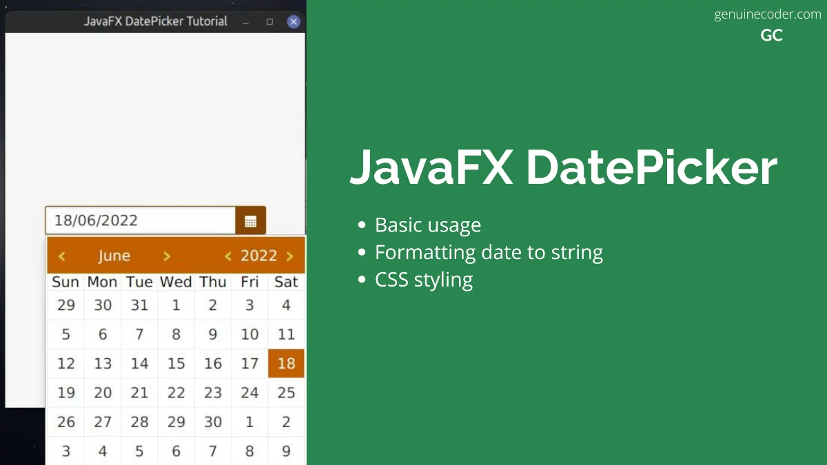
Now, let’s say you would like to customize the DatePicker. It is easily possible with JavaFX CSS styling. The following code snippet shows all the CSS customizations you can apply on the DatePicker for full customization. With the following CSS applied, the DatePicker will look as shown in this screenshot.

* {
  -fx-primary-color: #c26000;
  -fx-secondary-color: #864500;
  -fx-light-grey-color: #d1d1d1;
  /*Set focus color*/
  -fx-focus-color: -fx-secondary-color;
  /*Increase font size*/
  -fx-font-size: 1.5em;
}

/*-----------------------------------------
Customize the right button background color
-------------------------------------------*/
.date-picker .arrow-button {
  -fx-background-color: -fx-primary-color;
  -fx-background-radius: 0;
}

.date-picker .arrow-button:hover {
  -fx-background-color: -fx-secondary-color;
}

.date-picker .arrow-button .arrow {
  -fx-background-color: white;
}

/*-----------------------------------------
Customize popup content
-------------------------------------------*/
.date-picker .cell {
  -fx-background-color: white;
}

.date-picker .cell:hover {
  -fx-background-color: -fx-primary-color;
}

.date-picker .cell:focused {
  -fx-background-color: -fx-primary-color;
}

/*-----------------------------------------
Customize the selected cell
-------------------------------------------*/
.date-picker .selected {
  -fx-background-color: -fx-primary-color;
  -fx-text-fill: white;
}

.date-picker .selected:focused {
  -fx-background-color: -fx-primary-color;
  -fx-text-fill: white;
}

.date-picker-popup {
  -fx-border-color: transparent;
}

.date-picker-popup .month-year-pane {
  -fx-background-color: -fx-primary-color;
}

.date-picker-popup .month-year-pane .label {
  -fx-text-fill: white;
}

.date-picker-popup .week-number-cell {
  -fx-text-fill: -fx-secondary-color;
}

/*-----------------------------------------
Customize left and right arrow
-------------------------------------------*/
.date-picker-popup .spinner .button .left-arrow,
.date-picker-popup .spinner .button .right-arrow {
  -fx-background-color: #c2d70e;
}
Conclusion
In this tutorial, we have learned how to use DatePicker, format the date, and customize it fully with CSS. You might also be interested in having a look into the following tutorials as well, or checkout our JavaFX tutorial page.


51 thoughts on “JavaFx DatePicker Tutorial”