An OutlinedButton is a button with text child and a border outline. It is also a form of TextButton with an outline. They are used in the places where the button needs medium importance. Unlike the other two button types (TextButton and ElevatedButton), these buttons have the outline style set by default.
OutlinedButton Usage
There are two constructors available for the OutlinedButton, one with option to specify icon and one without icon. First, let’s try the simple outlined button that does not have any icon.
There are two mandatory fields in the constructor, onPressed and child.
const OutlinedButton({
    Key? key,
    required VoidCallback? onPressed,
    VoidCallback? onLongPress,
    ValueChanged<bool>? onHover,
    ValueChanged<bool>? onFocusChange,
    ButtonStyle? style,
    FocusNode? focusNode,
    bool autofocus = false,
    Clip clipBehavior = Clip.none,
    required Widget child,
});
Now, let’s see how we can make use of the OutlinedButton in a sample application. In the following example, when the button is pressed, a snackbar message will be shown.
import 'package:flutter/material.dart';

void main() {
  runApp(const OutlinedButtonExample());
}

class OutlinedButtonExample extends StatelessWidget {
  const OutlinedButtonExample({Key? key}) : super(key: key);

  @override
  Widget build(BuildContext context) {
    return MaterialApp(
      home: Scaffold(
          appBar: AppBar(title: const Text('OutlinedButton Example')),
          body: const OutlinedButtonWidget()),
    );
  }
}

class OutlinedButtonWidget extends StatelessWidget {
  const OutlinedButtonWidget({Key? key}) : super(key: key);

  //Button click handler: Show snackbar
  handleButtonClick(BuildContext context) {
    const snackBar = SnackBar(
      content: Text("Outlined Button Clicked!"),
    );
    ScaffoldMessenger.of(context).showSnackBar(snackBar);
  }

  @override
  Widget build(BuildContext context) {
    return Center(
      //Create Text Button
      child: OutlinedButton(
          //Handle button press event
          onPressed: () {
            handleButtonClick(context);
          },
          //Contents of the button
          child: const Text("Click Outlined Button!")),
    );
  }
}
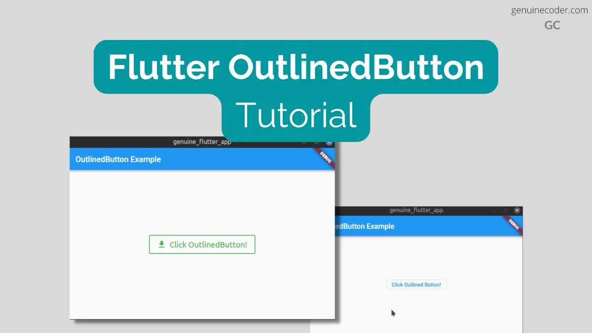
This code generates the following output.

Customize style and add an Icon
Now, let’s see how we can customize the OutlinedButton with the styling options available and add an icon into the button.
There’s a factory constructor available for making the button with an Icon. As you can see from the constructor signature below, 3 fields are mandatory. onPressed, icon and the label.
factory OutlinedButton.icon({
  Key? key,
  required VoidCallback? onPressed,
  VoidCallback? onLongPress,
  ButtonStyle? style,
  FocusNode? focusNode,
  bool? autofocus,
  Clip? clipBehavior,
  required Widget icon,
  required Widget label,
})
Note: In the default constructor, we have used ‘child’ parameter for specifying the button label. For the factory constructor with an icon, child is not available, and we have to use label to specify the button text.
For the button style customization, we will do the following.
- Set font size to 20dp
- Set font size to 20dp
- Add 20px padding on all sides
- Set the border color GREEN
- Set the border width to 2px
- Set the text color GREEN
Now, let’s see we can do it with an example code.
class OutlinedButtonWidget extends StatelessWidget {
  const OutlinedButtonWidget({Key? key}) : super(key: key);

  handleButtonClick(BuildContext context) {
    ScaffoldMessenger.of(context).showSnackBar(const SnackBar(content: Text("Outlined Button Clicked!")));
  }

  @override
  Widget build(BuildContext context) {
    return Center(
      //Create Elevated Button
      child: OutlinedButton.icon(
          //Handle button press event
          onPressed: () {
            handleButtonClick(context);
          },
          //Contents of the button
          style: ElevatedButton.styleFrom(
            //Style the text
            textStyle: const TextStyle(
              fontSize: 20, //Set font size
            ),
            //Style the border
            side: const BorderSide(
              color: Colors.green, //Set border color
              width: 2, //Set border width
            ),
            onPrimary: Colors.green, //Set the foreground (text + icon) color
            padding: const EdgeInsets.all(20.0), //Set the padding on all sides to 20px
          ),
          icon: const Icon(Icons.download), //Button icon
          label: const Text("Click OutlinedButton!")), //Button label
    );
  }
}
Customizing flutter buttons further
You can customize even more to the minute details of the buttons, thanks to the flutter SDK. We have discussed this in detail in the ElevatedButton article. If you are interested, please refer the article.
Conclusion
In this tutorial, we have learned how to make use of the Flutter OutlinedButton widget in flutter. This button is useful for non-primary actions in the GUI because it doesn’t attract too much attention for the user. We have seen how to customize it with icons and custom style. If you liked this article, you might be interested in the other Flutter tutorials I have written.


71 thoughts on “Flutter OutlinedButton Tutorial (2022)”