In this tutorial, we will explore the Button widgets available in the Flutter. Compared to the previous version Flutter2, Flutter3 has updated the button widget. We will see how to use the TextButton widget and customize it. If you want to learn how to create your first flutter project, head over to this tutorial on making your first flutter project.
TextButtons, as the name suggests, are widgets with simple text that can be interacted with a click. It uses the theme “TextButtonTheme”. These buttons are useful for action in dialogs, snackbars and cards. The material design 3 specifications for the TextButton can be found in here.
TextButton without Icon
Constructor of the TextButton given below. The onPressed and child properties are mandatory.
TextButton({
    Key? key,
    required VoidCallback? onPressed, //onPressed is mandatory
    VoidCallback? onLongPress,
    ValueChanged<bool>? onHover,
    ValueChanged<bool>? onFocusChange,
    ButtonStyle? style,
    FocusNode? focusNode,
    bool autofocus = false,
    Clip clipBehavior = Clip.none,
    required Widget child,            //child is mandatory
})
Let’s see how we can use the button on a sample application.

import 'package:flutter/material.dart';

void main() {
  runApp(const TextButtonExample());
}

class TextButtonExample extends StatelessWidget {
  const TextButtonExample({Key? key}) : super(key: key);

  @override
  Widget build(BuildContext context) {
    return MaterialApp(
      home: Scaffold(
          appBar: AppBar(title: const Text('TextButton Example')),
          body: const TextButtonWidget()),
    );
  }
}

class TextButtonWidget extends StatelessWidget {
  const TextButtonWidget({Key? key}) : super(key: key);

  //Button click handler: Show snackbar
  handleButtonClick(BuildContext context) {
    const snackBar = SnackBar(
      content: Text("Text Button Clicked!"),
    );
    ScaffoldMessenger.of(context).showSnackBar(snackBar);
  }

  @override
  Widget build(BuildContext context) {
    return Center(
      //Create Text Button
      child: TextButton(
        //Handle button press event
        onPressed: () {
          handleButtonClick(context);
        },
        //Contents of the button
        child: const Text("Click Text Button!")
      ),
    );
  }
}
Customize the TextButton
TextButton uses the theme TextButtonTheme. Let’s see how we apply the following style updates for the Button.
- Change the font size to 20: Use textStyle
- Make the button font bold: Use textStyle
- Change the text color to RED: Use primary
- Add padding of 20px on all sides: Use padding
@override
Widget build(BuildContext context) {
  return Center(
    //Create Text Button
    child: TextButton(
      //Handle button press event
        onPressed: () {
          handleButtonClick(context);
        },
        style: TextButton.styleFrom(
            //Change font size and weight
            textStyle: const TextStyle(
              fontSize: 20,
              fontWeight: FontWeight.bold,
            ),
            //Set the foreground color
            primary: Colors.red,
            //Set the padding on all sides to 20px
            padding: const EdgeInsets.all(20.0),
        ),
        //Contents of the button
        child: const Text("Click Text Button!")),
  );
}

TextButton with Icon
Now, let’s see how we can create the TextButton with an icon. There is a special factory constructor available for creating TextButton with an Icon. Let’s have a look into the factory constructor.
factory TextButton.icon({
    Key? key,
    required VoidCallback? onPressed,  //onPressed is mandatory
    VoidCallback? onLongPress,
    ValueChanged<bool>? onHover,
    ValueChanged<bool>? onFocusChange,
    ButtonStyle? style,
    FocusNode? focusNode,
    bool? autofocus,
    Clip? clipBehavior,
    required Widget icon,             //Icon is mandatory
    required Widget label,            //Label is mandatory
})
As it can be seen from the above constructor, we need to provide an icon, label and onPressed values.
Note: In the TextButton without icon constructor, we have used ‘child’ parameter for specifying the button label. In this factory constructor, child is not available, and we have to use label parameter.
Let’s see how we can do this with an example code.
@override
Widget build(BuildContext context) {
  return Center(
    //Create Text Button
    child: TextButton.icon(
        onPressed: () {
          handleButtonClick(context);
        },
        style: TextButton.styleFrom(
          //Change font size and weight
          textStyle: const TextStyle(
            fontSize: 20,
            fontWeight: FontWeight.bold,
          ),
          //Set the foreground color
          primary: Colors.deepOrange,
          //Set the padding on all sides to 20px
          padding: const EdgeInsets.all(20.0),
        ),
        //Set the icon
        icon: const Icon(Icons.send_rounded),
        //Set the label
        label: const Text("Click Text Button!")),
  );
}
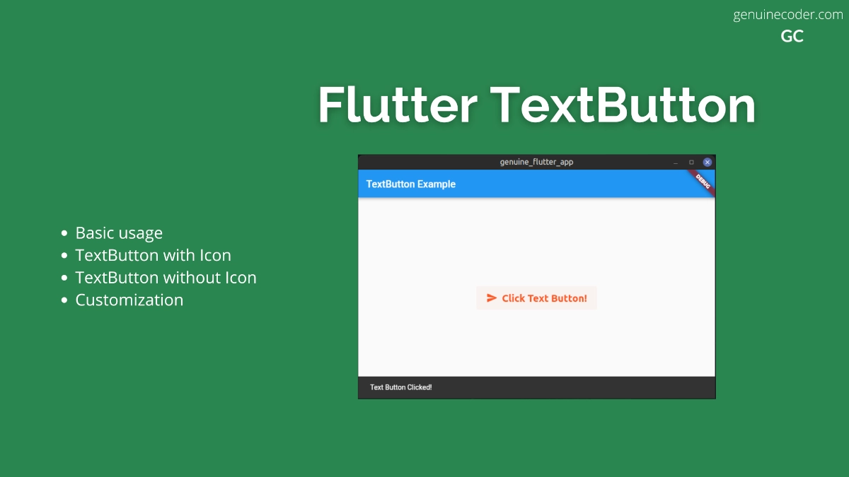
It generates the following output. As you can see, the icon is added to the button, the label is set and the customized styling is applying.
Conclusion
In this tutorial, we have learned how to use the TextButtons in flutter. We have seen how to use it, customize it, and add icons to it. If you liked this article, you might want to check out my other Flutter tutorials.
Leave a Reply
You must be logged in to post a comment.