TextField widgets are used for reading text inputs, like username, password, phone number, email address, etc. from the keyboard. They are one of the most commonly used widgets in Flutter, just like Buttons. Flutter TextField follows the Google’s material design principles and is fully compliant with the material design text-field specifications.
Create a simple TextField
By default, the TextButton component has only a simple line/divider at the bottom. No other decorations are given. Let’s see how the TextField looks in its bare form.

The following code generated the above output. In the example code, a no-arg constructor is used to prepare the TextField.
import 'package:flutter/material.dart';

void main() {
  runApp(const TextFieldTutorial());
}

class TextFieldTutorial extends StatelessWidget {
  const TextFieldTutorial({Key? key}) : super(key: key);

  @override
  Widget build(BuildContext context) {
    return MaterialApp(
      theme: ThemeData(primarySwatch: Colors.teal),
      home: Scaffold(
          appBar: AppBar(title: const Text('TextField Example')),
          body: const TextFieldWidget()),
    );
  }
}

class TextFieldWidget extends StatelessWidget {
  const TextFieldWidget({Key? key}) : super(key: key);

  @override
  Widget build(BuildContext context) {
    return const Center(
        //Create a text field
        child: TextField()
    );
  }
}
The TextField constructor has many parameters for customization. This widget being one of the most used widgets in all the framework widgets, it indeed has to have as many customizations as the SDK can provide. Click the following code snippet header to view the constructor and all its options;
const TextField({
 Key? key,
 TextEditingController? controller,
 FocusNode? focusNode,
 InputDecoration? decoration = const InputDecoration(),
 TextInputType? keyboardType,
 TextInputAction? textInputAction,
 TextCapitalization textCapitalization = TextCapitalization.none,
 TextStyle? style,
 StrutStyle? strutStyle,
 TextAlign textAlign = TextAlign.start,
 TextAlignVertical? textAlignVertical,
 TextDirection? textDirection,
 bool readOnly = false,
 ToolbarOptions? toolbarOptions,
 bool? showCursor,
 bool autofocus = false,
 String obscuringCharacter = '•',
 bool obscureText = false,
 bool autocorrect = true,
 SmartDashesType? smartDashesType,
 SmartQuotesType? smartQuotesType,
 bool enableSuggestions = true,
 int? maxLines = 1,
 int? minLines,
 bool expands = false,
 int? maxLength,
 MaxLengthEnforcement? maxLengthEnforcement,
 ValueChanged<String>?onChanged,
 VoidCallback? onEditingComplete,
 ValueChanged<String>?onSubmitted,
 AppPrivateCommandCallback? onAppPrivateCommand,
 List<TextInputFormatter>?inputFormatters,
 bool? enabled,
 double cursorWidth = 2.0,
 double? cursorHeight,
 Radius? cursorRadius,
 Color? cursorColor,
 BoxHeightStyle selectionHeightStyle = ui.BoxHeightStyle.tight,
 BoxWidthStyle selectionWidthStyle = ui.BoxWidthStyle.tight,
 Brightness? keyboardAppearance,
 EdgeInsets scrollPadding = const EdgeInsets.all(20.0),
 DragStartBehavior dragStartBehavior = DragStartBehavior.start,
 bool? enableInteractiveSelection,
 TextSelectionControls? selectionControls,
 GestureTapCallback? onTap,
 MouseCursor? mouseCursor,
 InputCounterWidgetBuilder? buildCounter,
 ScrollController? scrollController,
 ScrollPhysics? scrollPhysics,
 Iterable<String>?autofillHints = const<String>[],
 Clip clipBehavior = Clip.hardEdge,
 String? restorationId,
 bool scribbleEnabled = true,
 bool enableIMEPersonalizedLearning = true
})
Customize the TextField
Let’s learn how to customize the TextField widget with an email input example. We need to make the widget look like the material design TextField with nice rounded borders with label. Let’s also add an email icon.
We will do the following customizations:
- Set a rounded border with border label
- Set a hint text
- Set an email icon at the start position of the TextField
- Set font size to 18dp
- Set input type to email so that the virtual keyboard will adjust accordingly (will show @ button)
class TextFieldWidget extends StatelessWidget {
  const TextFieldWidget({Key? key}) : super(key: key);

  @override
  Widget build(BuildContext context) {
    return const Center(
      child: TextField(
        //Set text style
        style: TextStyle(
          fontSize: 18
        ),
        keyboardType: TextInputType.emailAddress, //Set keyboard type for email address. This will show @ button on the primary section of the keyboard.
        //Set decoration
        decoration: InputDecoration(
            border: OutlineInputBorder(), //Create rounded outlined border
            labelText: "Email", //Set the label text that will be shown over the border
            prefixIcon: Icon(Icons.email), // Set email icon at the start of the TextField
            hintText: "Enter your email ID"), // Set the hint text that will be shown when TextField is empty
      ),
    );
  }
}
Retrieve typed text input from TextField
Flutter has multiples ways to get and process text from the TextField widget. The best approach is to use a TextController class to handle all the events coming out of the TextField properly. The simplest approach is to use an onChange() callback.
Also, it is possible to track every change happening on the text field (For example, while entering hello, get callback after each letter h, e, l, l, and o separately). On the other hand, if you are interested only when the text field input is finished and user wants to submit the data, there is a callback method for that as well.
Let’s see all these options in detail.
Tracking every text change in the TextField
First, let’s see how we can track every change happening on the TextField. There are two ways to do this.
- Using onChange() callback
- TextEditingController
Using onChange() callback – The easy way
onChange() callback can be added by providing it to the TextField constructor. We can provide a function to the onChanged property to register an onChange callback. This will print “Entered value: …..” as soon as we start typing contents to the TextField.
class TextFieldWidget extends StatelessWidget {
  const TextFieldWidget({Key? key}) : super(key: key);

  @override
  Widget build(BuildContext context) {
    return Center(
      child: TextField(
        onChanged: (value) {
          print('Entered value: $value');
        },
        style: const TextStyle(fontSize: 18),
        keyboardType: TextInputType.emailAddress,
        decoration: const InputDecoration(border: OutlineInputBorder(), labelText: "Email", prefixIcon: Icon(Icons.email), hintText: "Enter your email ID"),
      ),
    );
  }
}

Using TextEditingController – The best way
Using TextEditingController is recommended since it is easier to use as the text-value from the text field needs to be used on other widgets. For using TextEditingController, we have to do the following steps.
- Create a TextEditingController
- Create a function that executes whenever the text is changed
- Link the function to the TextEditingController inside initState() function. This is for creating the link between controller and function
- Dispose the TextEditingController inside dispose() for resource cleanup
- Link the controller to the TextField via the controller attribute
import 'package:flutter/material.dart';

void main() {
  runApp(const TextFieldTutorial());
}

class TextFieldTutorial extends StatefulWidget {
  const TextFieldTutorial({Key? key}) : super(key: key);

  @override
  State<StatefulWidget> createState() {
    return TextFieldWidget();
  }
}

class TextFieldWidget extends State<TextFieldTutorial> {

  //Create new TextEditingController
  final emailTextFieldController = TextEditingController();

  @override
  void initState() {
    super.initState();
    //Link controller to the function to be executed on change
    emailTextFieldController.addListener(printTextFieldValue);
  }

  @override
  void dispose() {
    //Dispose the controller when the widget is disposed
    emailTextFieldController.dispose();
    super.dispose();
  }

  //Function that executes when the text is changed
  void printTextFieldValue() {
    print('Second text field: ${emailTextFieldController.text}');
  }

  @override
  Widget build(BuildContext context) {
    return MaterialApp(
      debugShowCheckedModeBanner: false,
      theme: ThemeData(primarySwatch: Colors.blue),
      home: Scaffold(
        appBar: AppBar(title: const Text('TextField Example')),
        body: Padding(
          padding: const EdgeInsets.all(50),
          child: TextField(
            controller: emailTextFieldController, //Link controller to TextField
            style: const TextStyle(fontSize: 18),
            keyboardType: TextInputType.emailAddress,
            decoration: const InputDecoration(border: OutlineInputBorder(), labelText: "Email", prefixIcon: Icon(Icons.email), hintText: "Enter your email ID"),
          ),
        ),
      ),
    );
  }
}
Tracking text submission event with onSubmitted callback
So far, we have seen how to track every text change inside the TextField. Most of the time, we might not be interested in the individual text changes, but on the final text the user submits. Flutter provides a callback for the submission event as well. This callback can be registered through the onSubmitted parameter.
The onSubmitted callback will be fired only when you press the Submit button on the keyboard. In Android and iOS, it is the ‘check’ or ‘tick’ button on the keyboard. On the desktop platform, it is the ENTER key. In the following gif image, you can see that the onSubmitted function is fired only after the check button was pressed.
class TextFieldWidget extends StatelessWidget {
  const TextFieldWidget({Key? key}) : super(key: key);

  @override
  Widget build(BuildContext context) {
    return Center(
      child: TextField(
        onSubmitted: (submittedValue) {
          print('Submitted value: $submittedValue');
        },
        style: const TextStyle(fontSize: 18),
        keyboardType: TextInputType.emailAddress,
        decoration: const InputDecoration(border: OutlineInputBorder(), labelText: "Email", prefixIcon: Icon(Icons.email), hintText: "Enter your email ID"),
      ),
    );
  }
}

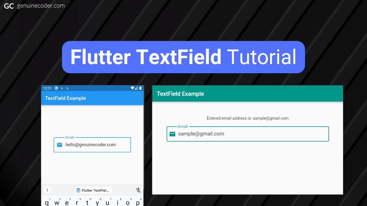
Example program: Change label value automatically when TextField text is changed
Let’s apply what we have learned so far in this chapter into a full example application. The requirement is as follows.
Requirement – There are two widgets in the screen, one “Text” and one “TextField” widget. Automatically update label/text component value when the input on the TextField is changed.
The solution for the problem is given below.
import 'package:flutter/material.dart';

void main() {
  runApp(const TextFieldTutorial());
}

class TextFieldTutorial extends StatefulWidget {
  const TextFieldTutorial({Key? key}) : super(key: key);

  @override
  State<StatefulWidget> createState() {
    return TextFieldWidget();
  }
}

class TextFieldWidget extends State<TextFieldTutorial> {
  String state = "";

  @override
  Widget build(BuildContext context) {
    return MaterialApp(
      debugShowCheckedModeBanner: false,
      theme: ThemeData(primarySwatch: Colors.blue),
      home: Scaffold(
        appBar: AppBar(title: const Text('TextField Example')),
        body: Padding(
          padding: const EdgeInsets.all(50),
          child: Column(children: [
            Text('Entered email address is: $state'), //Set the label text using the state variable
            const SizedBox(height: 20),
            TextField(
              onChanged: (value) {
                setState(() => state = value); //Update state as soon as the TextField text is changed
              },
              style: const TextStyle(fontSize: 18),
              keyboardType: TextInputType.emailAddress,
              decoration: const InputDecoration(border: OutlineInputBorder(), labelText: "Email", prefixIcon: Icon(Icons.email), hintText: "Enter your email ID"),
            ),
          ]),
        ),
      ),
    );
  }
}
The output of the above code snippet is as follows.

Conclusion
In this tutorial, we have learned how to use flutter TextField. We have gone through the customization, callbacks like onChange, onSubmit and text field controller options. If this tutorial was useful, you might be interested in the other Flutter tutorials I have written.
Leave a Reply
You must be logged in to post a comment.