In this tutorial, we will explore the ElevatedButton widget in Flutter. ElevatedButtons are, as the name suggests, buttons with a depth or elevation. They will stand on top of the container with a shadow. So they have a different appearance compared to the flat button TextButton.
ElevatedButton without Icon
There are two constructors available for the ElevatedButton, one with icon and one without icon. Let’s first see how to use the one without icon.
There are two mandatory fields in the constructor, onPressed and child.
const ElevatedButton({
    Key? key,
    required VoidCallback? onPressed,
    VoidCallback? onLongPress,
    ValueChanged<bool>? onHover,
    ValueChanged<bool>? onFocusChange,
    ButtonStyle? style,
    FocusNode? focusNode,
    bool autofocus = false,
    Clip clipBehavior = Clip.none,
    required Widget? child
})
Let’s see how we can create this button with an example code.
import 'package:flutter/material.dart';

void main() {
  runApp(const ElevatedButtonExample());
}

class ElevatedButtonExample extends StatelessWidget {
  const ElevatedButtonExample({Key? key}) : super(key: key);

  @override
  Widget build(BuildContext context) {
    return MaterialApp(
      home: Scaffold(
          appBar: AppBar(title: const Text('ElevatedButton Example')),
          body: const ElevatedButtonWidget()),
    );
  }
}

class ElevatedButtonWidget extends StatelessWidget {
  const ElevatedButtonWidget({Key? key}) : super(key: key);

  //Button click handler: Show snackbar
  handleButtonClick(BuildContext context) {
    const snackBar = SnackBar(
      content: Text("ElevatedButton Clicked!"),
    );
    ScaffoldMessenger.of(context).showSnackBar(snackBar);
  }

  @override
  Widget build(BuildContext context) {
    return Center(
      //Create Elevated Button
      child: ElevatedButton(
          //Handle button press event
          onPressed: () {
            handleButtonClick(context);
          },
          //Contents of the button
          child: const Text("Click ElevatedButton!")),
    );
  }
}
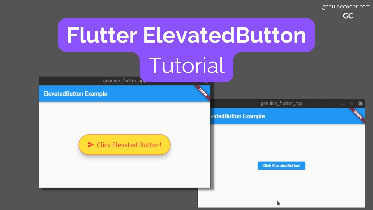
The above code generates the following output. Note that the color of the button is taken from the default theme. We will see how to customize the colors and fonts in the next section.

Customize button style and add an icon
Now, let’s see how to customize the button and add an icon to it. The ElevatedButton class has a separate constructor for creating the button with an icon. We will make use of that.
For styling the button, ElevatedButton.styleFrom() to update the values from the default theme.
factory ElevatedButton.icon({
    Key? key,
    required VoidCallback? onPressed,
    VoidCallback? onLongPress,
    ValueChanged<bool>? onHover,
    ValueChanged<bool>? onFocusChange,
    ButtonStyle? style,
    FocusNode? focusNode,
    bool? autofocus,
    Clip? clipBehavior,
    required Widget icon,
    required Widget label,
})
Note: In the ElevatedButton’s default constructor, we have used ‘child’ parameter for specifying the button label. For the factory constructor with icon, child is not available, and we have to use label parameter.
For the button style customization, we will do the following.
- Add a download icon
- Change the font size to 22dp
- Add 20px padding on all sides
- Set the foreground color to RED
- Set the background color to YELLOW
Now, let’s see we can do it with an example code.
@override
Widget build(BuildContext context) {
    return Center(
        //Create Elevated Button
        child: ElevatedButton.icon(
            //Handle button press event
            onPressed: () {
              handleButtonClick(context);
            },
            //Contents of the button
            style: ElevatedButton.styleFrom(
              //Change font size
              textStyle: const TextStyle(
                  fontSize: 22,
              ),
              //Set the background color
              primary: Colors.yellow,
              //Set the foreground (text + icon) color
              onPrimary: Colors.red,
              //Set the padding on all sides to 30px
              padding: const EdgeInsets.all(30.0),
            ),
            icon: const Icon(Icons.send_rounded), //Button icon
            label: const Text("Click Text Button!")), //Button label
    );
}
This will generate the following output. As you can see below, the
More button style customization
Let’s go through all the style customization flutter provides for the ElevatedButton. All the following mentioned customizations can be used within ElevatedButton.styleFrom(), Just like we did in the above example for padding, color etc.
Set the disabled state color (applies for button label and icon)
onSurface: Colors.colorOfYourChoice
Set the shadow/elevation color
shadowColor: Colors.colorOfYourChoice
Higher the elevation, more the shadow spread.
elevation: 6.0
Specify minimum size of the button
//First parameter is width, second is height.
minimumSize: Size(20, 40)
Set the button border
//Setting solid 1px red color border
side: BorderSide(color: Colors.red, width: 1.0, style: BorderStyle.solid),
//Setting sold 1px red color border
Set button shape
//Setting button shape to circle with radius of 35.
shape: RoundedRectangleBorder(borderRadius: BorderRadius.circular(35.0)),
Mouse cursor when button is enabled
//Set mouse cursor to click (hand cursor)
enabledMouseCursor: SystemMouseCursors.click,
//Set mouse cursor to text (I cursor)

Mouse cursor when button is disabled
//Hide mouse cursor when hovered over disabled ElevatedButton
disabledMouseCursor: SystemMouseCursors.none,
Set visual density
visualDensity: VisualDensity(horizontal: 0.0, vertical: 0.0)
Set tap target size
tapTargetSize: MaterialTapTargetSize.padded
Set button’s default animation duration for shape change and elevation change
//Setting the animation duration to 100ms
animationDuration: Duration(milliseconds: 100)
Enable/disable button click feedback
Enable or disable vibration (haptic) and sound (acoustic) feedbacks.
enableFeedback: true
Alighnment of button’s text
alignment: Alignment.bottomCenter
Background color of the button
primary: Colors.yourPrefferedBackground
Foreground color of the button icon + text
onPrimary: Colors.yourFavouriteForegroundColor
Change font properties
//Set font size and font weight
textStyle: const TextStyle(
       fontSize: 20,
       fontWeight: FontWeight.bold,
),
Set button padding
//Set the padding on all sides to 20px
padding: const EdgeInsets.all(20.0),
Conclusion
In this chapter, we have learned how to make use of the ElevatedButton widget in Flutter. We have seen how to create one with icon, without icon and went through all the style customizations we can do for the button. If you liked this article, you might be interested in the other Flutter tutorials I have written.


70 thoughts on “Flutter ElevatedButton Tutorial (2022)”