Month: July 2022

  • Dart/Flutter code highlighting for WordPress

    Dart/Flutter code highlighting for WordPress

    The WordPress’s SyntaxHighligter Evolved is a great plugin for syntax highlighting. It supports a ton of syntaxes and has a lot of customization. However, when I started making flutter tutorials, the plugin did not have support for dart language. For a while, I have tried using swift and javascript syntaxes for the same. But it didn’t work well. So, I decided to work on adding support for the dart language to the plugin. In this tutorial, we will see how we can add support for dart/flutter code syntax highlighting to the SyntaxHighligter Evolved plugin.

    You can follow the procedure described in this tutorial to add support for other languages as well. You can easily extend what is done here for any language you need to support.

    Prerequisites

    1. This process require adding some files to the WordPress installation directory. You need to have access to your WordPress installation via FTP.
    2. Take a full backup of your site. Even though this procedure is safe and relatively easy, keep a backup ready in case something goes wrong.

    Step 1: Create a new directory inside WordPress plugin folder

    We need to create a new plugin folder inside “wp-content/plugins”. Any name can be given for the directory. I am going to name it as “dartBrushSyntaxHighlighter“.

    Dart syntax highlight plugin directory inside wordpress installation
    Dart syntax highlight plugin directory inside wordpress installation

    Inside the directory, we will have to add 2 files. One JavaScript file that defines the dart language-specific things (like keywords, comment syntax, data-types etc.) and one PHP file that register the dart syntax brush.

    Let’s add those files in the next steps.

    Step 2: Add dart highlighter brush code

    Let’s name the file as “shBrushDart.js“. Inside this file, we need to specify the language-specific things. For dart, you can just use the following file. For other languages, you have to do your research and use appropriate keywords and data-types etc.

    ; (function () {
    
        SyntaxHighlighter = SyntaxHighlighter || (typeof require !== 'undefined' ? require('shCore').SyntaxHighlighter : null);
    
        SyntaxHighlighter.brushes.Dart = function () {
            var funcs = 'function';
            var keywords = 'abstract as assert async await break case catch class const continue covariant default deferred do dynamic else enum export extends external factory false final finally for Function get hide if implements import in interface is library mixin new null on operator part rethrow return set show static super switch sync this throw true try typedef var void while with yield';
            var datatypes = 'int double num String bool List Map void';
    
            var r = SyntaxHighlighter.regexLib;
            this.regexList = [
                { regex: r.multiLineDoubleQuotedString, css: 'string' },            		// double quoted strings
                { regex: r.multiLineSingleQuotedString, css: 'string' },	            	// single quoted strings
                { regex: r.singleLineCComments, css: 'comments' },		                   	// one line comments
                { regex: r.multiLineCComments, css: 'comments' },			                // multiline comments
                { regex: new RegExp(this.getKeywords(funcs), 'gmi'), css: 'color2' },       // functions
                { regex: new RegExp(this.getKeywords(datatypes), 'gmi'), css: 'variable' }, // datatypes
                { regex: new RegExp(this.getKeywords(keywords), 'gm'), css: 'keyword' },    // keywords
            ];
        };
    
        SyntaxHighlighter.brushes.Dart.prototype = new SyntaxHighlighter.Highlighter();
        SyntaxHighlighter.brushes.Dart.aliases = ['dart', 'Dart', 'flutter'];
    
        typeof (exports) != 'undefined' ? exports.Brush = Brush : null;
    
    })();
    

    Step 3: Register dart brush plugin

    Now we need to register the above JS file to be used with SyntaxHighligher plugin. For this, we have to add the following PHP file into the plugin directory we created in step 1. Let’s name this file as “dartBrush.php“.

    <?php
    /*
    Plugin Name: Dart Brush For SyntaxHighlighter Evolved
    Description: Adds support for the dart language to the SyntaxHighlighter Evolved plugin.
    Author: Genuine Coder
    Version: 1.0.0
    Author URI: https://genuinecoder.com/
    */
    
    // SyntaxHighlighter Evolved doesn't do anything until early in the "init" hook, so best to wait until after that.
    add_action( 'init', 'syntaxhighlighter_dart_register' );
    
    // Tell SyntaxHighlighter Evolved about this new language/brush and name it.
    add_filter( 'syntaxhighlighter_brushes', 'syntaxhighlighter_dart_addlang' );
    add_filter( 'syntaxhighlighter_brush_names', 'syntaxhighlighter_dart_add_brush_name' );
    
    /**
     *  Register the brush file with WordPress
     */
    function syntaxhighlighter_dart_register() {
    	wp_register_script( 'syntaxhighlighter-brush-dart', plugins_url( 'shBrushDart.js', __FILE__ ), array( 'syntaxhighlighter-core' ), '1.2.0', true );
    }
    
    function syntaxhighlighter_dart_addlang( $brushes ) {
    	$brushes['dart'] = 'dart';
    	$brushes['Dart'] = 'dart';
    	$brushes['Flutter'] = 'dart';
    	$brushes['flutter'] = 'dart';
        
    	return $brushes;
    }
    
    function syntaxhighlighter_dart_add_brush_name( $names ) {
    	$names['dart'] = 'Dart / Flutter';
    	return $names;
    }
    ?>
    
    Dart language syntax highlighter plugin files
    Make sure that the two files are added into the newly created directory.

    Step 4: Enable the custom plugin and use it!

    Now, go to the plugin panel of your WordPress and you will see the newly added plugin there. The plugin name and description is set on the php file. Currently, the plugin name is “Dart Brush For SyntaxHighlighter Evolved”. If you want to change it, please change it on the PHP file.

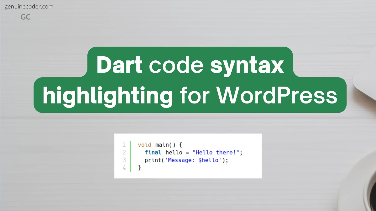
    Once the plugin is enabled, you can start adding dart or flutter code snippet using [ dart ] or [ flutter ] tag. An example dart code highlight is given below.

    void main() {
      final hello = "Hello there!";
      print('Message: $hello');
    }
    

    Conclusion

    In this tutorial, we have learned how to setup code snippet syntax highlighting for dart. For this purpose, we have created a custom plugin that works with SyntaxHighlighter evolved plugin. If you have liked this article, you might also like other WordPress tutorials I have written.

    > Dart syntax highlight, flutter syntax highlight, dart code highlight, dart syntax highlight <

  • Encryption and decryption in flutter

    Encryption and decryption in flutter

    This tutorial explores the data encryption and decryption using the dart language for the flutter apps. We come across the requirements of encrypting and decrypting data when we start building real-world applications.

    For supporting encryption, we need to add a library called encrypt. It provides all the functionalities we require for encrypting, encoding encrypted data to base16 or base64, and of course for decryption.

    Add the following line into your pubspec.yaml file under dependencies: section. This will add the ‘encrypt’ library into our project.

    encrypt: ^5.0.1
    

    To use the library in the code, import it as follows.

    import 'package:encrypt/encrypt.dart';
    

    AES Encryption & Decryption

    AES aka Advanced Encryption Standard is a very widely used symmetric block encryption technique. AES can use 128, 192 or 256 length keys.

    How the encryption key bit length is calculated?

    The AES-128 can have a 128-bit key. You can either use the Key.fromSecureRandom(16) function to generate 128-bit keys. Or else, you need to provide a 16 character string as a key.

    For example,

    • “I am 16-char key” contains 16 characters. Each character is 8 bit wide. It can be used as a 128-bit key.
    • “This 32 char key have 256 bits!!” contains 32 characters. Each character is 8 bit wide. So, it will become 256-bit key.

    Example program for AES-CBC encryption and decryption

    Let’s understand the encryption and decryption with an example code. The following program utilizes AES-CBC-PKSC7 algorithm.

    import 'package:encrypt/encrypt.dart';
    
    void main() {
      final plainText = "Fallback! I repeat fallback to sector 12!!";
      final key = "This 32 char key have 256 bits..";
    
      print('Plain text for encryption: $plainText');
    
      //Encrypt
      Encrypted encrypted = encryptWithAES(key, plainText);
      String encryptedBase64 = encrypted.base64;
      print('Encrypted data in base64 encoding: $encryptedBase64');
    
      //Decrypt
      String decryptedText = decryptWithAES(key, encrypted);
      print('Decrypted data: $decryptedText');
    }
    
    ///Accepts encrypted data and decrypt it. Returns plain text
    String decryptWithAES(String key, Encrypted encryptedData) {
      final cipherKey = Key.fromUtf8(key);
      final encryptService = Encrypter(AES(cipherKey, mode: AESMode.cbc)); //Using AES CBC encryption
      final initVector = IV.fromUtf8(key.substring(0, 16)); //Here the IV is generated from key. This is for example only. Use some other text or random data as IV for better security.
    
      return encryptService.decrypt(encryptedData, iv: initVector);
    }
    
    ///Encrypts the given plainText using the key. Returns encrypted data
    Encrypted encryptWithAES(String key, String plainText) {
      final cipherKey = Key.fromUtf8(key);
      final encryptService = Encrypter(AES(cipherKey, mode: AESMode.cbc));
      final initVector = IV.fromUtf8(key.substring(0, 16)); //Here the IV is generated from key. This is for example only. Use some other text or random data as IV for better security.
    
      Encrypted encryptedData = encryptService.encrypt(plainText, iv: initVector);
      return encryptedData;
    }
    

    The output of the program is as follows

    Plain text for encryption: Fallback! I repeat fallback to sector 12!!
    Encrypted data in base64 encoding: WI18tczGAOQfiLKGyKyXKcuCZeK9d8K9ONUeVvPEnC8H86l0EBWa76drqdZpmcXO
    Decrypted data: Fallback! I repeat fallback to sector 12!!
    
    Flutter AES Encryption and Decryption Example Output
    Flutter AES Encryption and Decryption Example Output

    What is an initialization vector?

    IV or initVector as denoted in the above code is known as initialization vector. It is an arbitrary data that can be used along with a secret key for more secure data encryption. This is needed because, multiple people can use the same key and create the same encrypted data which can then be compromised. Using IV along with key make sure that the probability of being someone else using IV and KEY is very less. In the above code snippet, the IV is derived from key. It is for example purpose only. Always use random generated IV.

    RSA Encryption and Decryption

    RSA(Rivest Shamir Adleman) is a widely used public-key asymmetric encryption algorithm. You can do encryption and decryption with RSA in flutter with the encrypt library.

    import 'package:encrypt/encrypt.dart';
    import 'package:pointycastle/asymmetric/api.dart';
    
    void main() {
      final publicKey = await readKeyFromFile<RSAPublicKey>('/public.pem'); //Read public key from file
      final privateKey = await readKeyFromFile<RSAPrivateKey>('/private.pem'); //Read private key from file
    
      final plainText = 'Your plain text to be encrypted';
      final encryptService = Encrypter(RSA(publicKey: publicKey, privateKey: privateKey));
    
      //Encrypt
      final encrypted = encryptService.encrypt(plainText);
      final encryptedBase64 = encrypted.base64;
      print('Encrypted data in base64 encoding: $encryptedBase64');
    
      //Decrypt
      final decrypted = encryptService.decrypt(encrypted);
      print('Decrypted data: $decrypted');
    }
    

    You can find more elaborate example here in GitHub.

    More supported algorithms

    The ‘encrypt’ library support some other encryption algorithms like Fernet and Salsa20.

    Conclusion

    In this tutorial, we have explored the encryption and decryption support in dart for flutter apps. We have analyzed an example program for AES algorithm and went through an RSA algorithm example as well. If you liked this article, you might want to have a look into some other flutter articles I have written.

  • Flutter TextField Tutorial

    Flutter TextField Tutorial

    TextField widgets are used for reading text inputs, like username, password, phone number, email address, etc. from the keyboard. They are one of the most commonly used widgets in Flutter, just like Buttons. Flutter TextField follows the Google’s material design principles and is fully compliant with the material design text-field specifications.

    Create a simple TextField

    By default, the TextButton component has only a simple line/divider at the bottom. No other decorations are given. Let’s see how the TextField looks in its bare form.

    Flutter textfield with default style
    Flutter textfield with default style

    The following code generated the above output. In the example code, a no-arg constructor is used to prepare the TextField.

    import 'package:flutter/material.dart';
    
    void main() {
      runApp(const TextFieldTutorial());
    }
    
    class TextFieldTutorial extends StatelessWidget {
      const TextFieldTutorial({Key? key}) : super(key: key);
    
      @override
      Widget build(BuildContext context) {
        return MaterialApp(
          theme: ThemeData(primarySwatch: Colors.teal),
          home: Scaffold(
              appBar: AppBar(title: const Text('TextField Example')),
              body: const TextFieldWidget()),
        );
      }
    }
    
    class TextFieldWidget extends StatelessWidget {
      const TextFieldWidget({Key? key}) : super(key: key);
    
      @override
      Widget build(BuildContext context) {
        return const Center(
            //Create a text field
            child: TextField()
        );
      }
    }
    

    The TextField constructor has many parameters for customization. This widget being one of the most used widgets in all the framework widgets, it indeed has to have as many customizations as the SDK can provide. Click the following code snippet header to view the constructor and all its options;

    const TextField({
     Key? key,
     TextEditingController? controller,
     FocusNode? focusNode,
     InputDecoration? decoration = const InputDecoration(),
     TextInputType? keyboardType,
     TextInputAction? textInputAction,
     TextCapitalization textCapitalization = TextCapitalization.none,
     TextStyle? style,
     StrutStyle? strutStyle,
     TextAlign textAlign = TextAlign.start,
     TextAlignVertical? textAlignVertical,
     TextDirection? textDirection,
     bool readOnly = false,
     ToolbarOptions? toolbarOptions,
     bool? showCursor,
     bool autofocus = false,
     String obscuringCharacter = '•',
     bool obscureText = false,
     bool autocorrect = true,
     SmartDashesType? smartDashesType,
     SmartQuotesType? smartQuotesType,
     bool enableSuggestions = true,
     int? maxLines = 1,
     int? minLines,
     bool expands = false,
     int? maxLength,
     MaxLengthEnforcement? maxLengthEnforcement,
     ValueChanged<String>?onChanged,
     VoidCallback? onEditingComplete,
     ValueChanged<String>?onSubmitted,
     AppPrivateCommandCallback? onAppPrivateCommand,
     List<TextInputFormatter>?inputFormatters,
     bool? enabled,
     double cursorWidth = 2.0,
     double? cursorHeight,
     Radius? cursorRadius,
     Color? cursorColor,
     BoxHeightStyle selectionHeightStyle = ui.BoxHeightStyle.tight,
     BoxWidthStyle selectionWidthStyle = ui.BoxWidthStyle.tight,
     Brightness? keyboardAppearance,
     EdgeInsets scrollPadding = const EdgeInsets.all(20.0),
     DragStartBehavior dragStartBehavior = DragStartBehavior.start,
     bool? enableInteractiveSelection,
     TextSelectionControls? selectionControls,
     GestureTapCallback? onTap,
     MouseCursor? mouseCursor,
     InputCounterWidgetBuilder? buildCounter,
     ScrollController? scrollController,
     ScrollPhysics? scrollPhysics,
     Iterable<String>?autofillHints = const<String>[],
     Clip clipBehavior = Clip.hardEdge,
     String? restorationId,
     bool scribbleEnabled = true,
     bool enableIMEPersonalizedLearning = true 
    })
    

    Customize the TextField

    Let’s learn how to customize the TextField widget with an email input example. We need to make the widget look like the material design TextField with nice rounded borders with label. Let’s also add an email icon.

    We will do the following customizations:

    • Set a rounded border with border label
    • Set a hint text
    • Set an email icon at the start position of the TextField
    • Set font size to 18dp
    • Set input type to email so that the virtual keyboard will adjust accordingly (will show @ button)
    TextField with Icon in Flutter
    Customized TextField in flutter with icon, label, hint and email keyboard-type.
    class TextFieldWidget extends StatelessWidget {
      const TextFieldWidget({Key? key}) : super(key: key);
    
      @override
      Widget build(BuildContext context) {
        return const Center(
          child: TextField(
            //Set text style
            style: TextStyle(
              fontSize: 18
            ),
            keyboardType: TextInputType.emailAddress, //Set keyboard type for email address. This will show @ button on the primary section of the keyboard.
            //Set decoration
            decoration: InputDecoration(
                border: OutlineInputBorder(), //Create rounded outlined border
                labelText: "Email", //Set the label text that will be shown over the border
                prefixIcon: Icon(Icons.email), // Set email icon at the start of the TextField
                hintText: "Enter your email ID"), // Set the hint text that will be shown when TextField is empty
          ),
        );
      }
    }
    

    Retrieve typed text input from TextField

    Flutter has multiples ways to get and process text from the TextField widget. The best approach is to use a TextController class to handle all the events coming out of the TextField properly. The simplest approach is to use an onChange() callback.

    Also, it is possible to track every change happening on the text field (For example, while entering hello, get callback after each letter h, e, l, l, and o separately). On the other hand, if you are interested only when the text field input is finished and user wants to submit the data, there is a callback method for that as well.

    Let’s see all these options in detail.

    Tracking every text change in the TextField

    First, let’s see how we can track every change happening on the TextField. There are two ways to do this.

    1. Using onChange() callback
    2. TextEditingController

    Using onChange() callback – The easy way

    onChange() callback can be added by providing it to the TextField constructor. We can provide a function to the onChanged property to register an onChange callback. This will print “Entered value: …..” as soon as we start typing contents to the TextField.

    class TextFieldWidget extends StatelessWidget {
      const TextFieldWidget({Key? key}) : super(key: key);
    
      @override
      Widget build(BuildContext context) {
        return Center(
          child: TextField(
            onChanged: (value) {
              print('Entered value: $value');
            },
            style: const TextStyle(fontSize: 18),
            keyboardType: TextInputType.emailAddress,
            decoration: const InputDecoration(border: OutlineInputBorder(), labelText: "Email", prefixIcon: Icon(Icons.email), hintText: "Enter your email ID"),
          ),
        );
      }
    }
    
    Flutter TextField onChange callback
    Flutter TextField onChange callback firing print output for each keystroke

    Using TextEditingController – The best way

    Using TextEditingController is recommended since it is easier to use as the text-value from the text field needs to be used on other widgets. For using TextEditingController, we have to do the following steps.

    1. Create a TextEditingController
    2. Create a function that executes whenever the text is changed
    3. Link the function to the TextEditingController inside initState() function. This is for creating the link between controller and function
    4. Dispose the TextEditingController inside dispose() for resource cleanup
    5. Link the controller to the TextField via the controller attribute
    import 'package:flutter/material.dart';
    
    void main() {
      runApp(const TextFieldTutorial());
    }
    
    class TextFieldTutorial extends StatefulWidget {
      const TextFieldTutorial({Key? key}) : super(key: key);
    
      @override
      State<StatefulWidget> createState() {
        return TextFieldWidget();
      }
    }
    
    class TextFieldWidget extends State<TextFieldTutorial> {
    
      //Create new TextEditingController
      final emailTextFieldController = TextEditingController();
    
      @override
      void initState() {
        super.initState();
        //Link controller to the function to be executed on change
        emailTextFieldController.addListener(printTextFieldValue);
      }
    
      @override
      void dispose() {
        //Dispose the controller when the widget is disposed
        emailTextFieldController.dispose();
        super.dispose();
      }
    
      //Function that executes when the text is changed
      void printTextFieldValue() {
        print('Second text field: ${emailTextFieldController.text}');
      }
    
      @override
      Widget build(BuildContext context) {
        return MaterialApp(
          debugShowCheckedModeBanner: false,
          theme: ThemeData(primarySwatch: Colors.blue),
          home: Scaffold(
            appBar: AppBar(title: const Text('TextField Example')),
            body: Padding(
              padding: const EdgeInsets.all(50),
              child: TextField(
                controller: emailTextFieldController, //Link controller to TextField
                style: const TextStyle(fontSize: 18),
                keyboardType: TextInputType.emailAddress,
                decoration: const InputDecoration(border: OutlineInputBorder(), labelText: "Email", prefixIcon: Icon(Icons.email), hintText: "Enter your email ID"),
              ),
            ),
          ),
        );
      }
    }
    

    Tracking text submission event with onSubmitted callback

    So far, we have seen how to track every text change inside the TextField. Most of the time, we might not be interested in the individual text changes, but on the final text the user submits. Flutter provides a callback for the submission event as well. This callback can be registered through the onSubmitted parameter.

    The onSubmitted callback will be fired only when you press the Submit button on the keyboard. In Android and iOS, it is the ‘check’ or ‘tick’ button on the keyboard. On the desktop platform, it is the ENTER key. In the following gif image, you can see that the onSubmitted function is fired only after the check button was pressed.

    class TextFieldWidget extends StatelessWidget {
      const TextFieldWidget({Key? key}) : super(key: key);
    
      @override
      Widget build(BuildContext context) {
        return Center(
          child: TextField(
            onSubmitted: (submittedValue) {
              print('Submitted value: $submittedValue');
            },
            style: const TextStyle(fontSize: 18),
            keyboardType: TextInputType.emailAddress,
            decoration: const InputDecoration(border: OutlineInputBorder(), labelText: "Email", prefixIcon: Icon(Icons.email), hintText: "Enter your email ID"),
          ),
        );
      }
    }
    
    Flutter TextField onSubmitted callback
    Flutter TextField onSubmitted callback example

    Example program: Change label value automatically when TextField text is changed

    Let’s apply what we have learned so far in this chapter into a full example application. The requirement is as follows.

    Requirement – There are two widgets in the screen, one “Text” and one “TextField” widget. Automatically update label/text component value when the input on the TextField is changed.

    The solution for the problem is given below.

    import 'package:flutter/material.dart';
    
    void main() {
      runApp(const TextFieldTutorial());
    }
    
    class TextFieldTutorial extends StatefulWidget {
      const TextFieldTutorial({Key? key}) : super(key: key);
    
      @override
      State<StatefulWidget> createState() {
        return TextFieldWidget();
      }
    }
    
    class TextFieldWidget extends State<TextFieldTutorial> {
      String state = "";
    
      @override
      Widget build(BuildContext context) {
        return MaterialApp(
          debugShowCheckedModeBanner: false,
          theme: ThemeData(primarySwatch: Colors.blue),
          home: Scaffold(
            appBar: AppBar(title: const Text('TextField Example')),
            body: Padding(
              padding: const EdgeInsets.all(50),
              child: Column(children: [
                Text('Entered email address is: $state'), //Set the label text using the state variable
                const SizedBox(height: 20),
                TextField(
                  onChanged: (value) {
                    setState(() => state = value); //Update state as soon as the TextField text is changed
                  },
                  style: const TextStyle(fontSize: 18),
                  keyboardType: TextInputType.emailAddress,
                  decoration: const InputDecoration(border: OutlineInputBorder(), labelText: "Email", prefixIcon: Icon(Icons.email), hintText: "Enter your email ID"),
                ),
              ]),
            ),
          ),
        );
      }
    }
    

    The output of the above code snippet is as follows.

    Flutter TextField and Label Binding
    Flutter TextField and Text Value Binding

    Conclusion

    In this tutorial, we have learned how to use flutter TextField. We have gone through the customization, callbacks like onChange, onSubmit and text field controller options. If this tutorial was useful, you might be interested in the other Flutter tutorials I have written.

  • Flutter OutlinedButton Tutorial (2022)

    Flutter OutlinedButton Tutorial (2022)

    An OutlinedButton is a button with text child and a border outline. It is also a form of TextButton with an outline. They are used in the places where the button needs medium importance. Unlike the other two button types (TextButton and ElevatedButton), these buttons have the outline style set by default.

    OutlinedButton Usage

    There are two constructors available for the OutlinedButton, one with option to specify icon and one without icon. First, let’s try the simple outlined button that does not have any icon.

    There are two mandatory fields in the constructor, onPressed and child.

    const OutlinedButton({
        Key? key,
        required VoidCallback? onPressed,
        VoidCallback? onLongPress,
        ValueChanged<bool>? onHover,
        ValueChanged<bool>? onFocusChange,
        ButtonStyle? style,
        FocusNode? focusNode,
        bool autofocus = false,
        Clip clipBehavior = Clip.none,
        required Widget child,
    });
    

    Now, let’s see how we can make use of the OutlinedButton in a sample application. In the following example, when the button is pressed, a snackbar message will be shown.

    import 'package:flutter/material.dart';
    
    void main() {
      runApp(const OutlinedButtonExample());
    }
    
    class OutlinedButtonExample extends StatelessWidget {
      const OutlinedButtonExample({Key? key}) : super(key: key);
    
      @override
      Widget build(BuildContext context) {
        return MaterialApp(
          home: Scaffold(
              appBar: AppBar(title: const Text('OutlinedButton Example')),
              body: const OutlinedButtonWidget()),
        );
      }
    }
    
    class OutlinedButtonWidget extends StatelessWidget {
      const OutlinedButtonWidget({Key? key}) : super(key: key);
    
      //Button click handler: Show snackbar
      handleButtonClick(BuildContext context) {
        const snackBar = SnackBar(
          content: Text("Outlined Button Clicked!"),
        );
        ScaffoldMessenger.of(context).showSnackBar(snackBar);
      }
    
      @override
      Widget build(BuildContext context) {
        return Center(
          //Create Text Button
          child: OutlinedButton(
              //Handle button press event
              onPressed: () {
                handleButtonClick(context);
              },
              //Contents of the button
              child: const Text("Click Outlined Button!")),
        );
      }
    }
    

    This code generates the following output.
    Flutter OutlinedButton Example

    Customize style and add an Icon

    Now, let’s see how we can customize the OutlinedButton with the styling options available and add an icon into the button.

    There’s a factory constructor available for making the button with an Icon. As you can see from the constructor signature below, 3 fields are mandatory. onPressed, icon and the label.

    factory OutlinedButton.icon({
      Key? key,
      required VoidCallback? onPressed,
      VoidCallback? onLongPress,
      ButtonStyle? style,
      FocusNode? focusNode,
      bool? autofocus,
      Clip? clipBehavior,
      required Widget icon,
      required Widget label,
    })
    

    For the button style customization, we will do the following.

    • Set font size to 20dp
    • Set font size to 20dp
    • Add 20px padding on all sides
    • Set the border color GREEN
    • Set the border width to 2px
    • Set the text color GREEN
    OutlinedButton With Icon
    OutlinedButton With Icon and customized style

    Now, let’s see we can do it with an example code.

    class OutlinedButtonWidget extends StatelessWidget {
      const OutlinedButtonWidget({Key? key}) : super(key: key);
    
      handleButtonClick(BuildContext context) {
        ScaffoldMessenger.of(context).showSnackBar(const SnackBar(content: Text("Outlined Button Clicked!")));
      }
    
      @override
      Widget build(BuildContext context) {
        return Center(
          //Create Elevated Button
          child: OutlinedButton.icon(
              //Handle button press event
              onPressed: () {
                handleButtonClick(context);
              },
              //Contents of the button
              style: ElevatedButton.styleFrom(
                //Style the text
                textStyle: const TextStyle(
                  fontSize: 20, //Set font size
                ),
                //Style the border
                side: const BorderSide(
                  color: Colors.green, //Set border color
                  width: 2, //Set border width
                ),
                onPrimary: Colors.green, //Set the foreground (text + icon) color
                padding: const EdgeInsets.all(20.0), //Set the padding on all sides to 20px
              ),
              icon: const Icon(Icons.download), //Button icon
              label: const Text("Click OutlinedButton!")), //Button label
        );
      }
    }
    

    Customizing flutter buttons further

    You can customize even more to the minute details of the buttons, thanks to the flutter SDK. We have discussed this in detail in the ElevatedButton article. If you are interested, please refer the article.

    Conclusion

    In this tutorial, we have learned how to make use of the Flutter OutlinedButton widget in flutter. This button is useful for non-primary actions in the GUI because it doesn’t attract too much attention for the user. We have seen how to customize it with icons and custom style. If you liked this article, you might be interested in the other Flutter tutorials I have written.