In this comprehensive tutorial, we’ll explore the world of microservices using the latest Spring Boot 3 framework. We’ll create a real-world video streaming app, covering all essential aspects of microservice development.
We will start with the fundamentals of microservice architecture and then explore the implementation of key components like service registry, configuration server, API gateway, and distributed tracing system, this tutorial provides an in-depth experience for building applications in this architecture.
What You’ll Learn
The basics of microservice architecture
How to create a video streaming app using microservices
Implementing service registry with Eureka server
Creating and testing individual microservices
Using API Gateway with Spring Cloud Routing
Service-to-service communication
Centralized configuration management with config server
Flutter camera image picker has a known issue of returning images with wrong unexpected rotation. The issue has been raised in the GitHub and marked as closed, but still occurs in the latest stable release. The issue can, however, be resolved easily with the help of exif-rotation plugin. This issue is known to be affecting both iOS and Android platforms.
Why the image is rotated
When we take an image from the camera, we could be holding the phone in any orientation. Sometimes we take photos in landscape mode, sometimes portait and so on. The camera app takes the photo and adds special metadata entries (EXIF data) to the file so that it can be rotated properly in image viewers.
Flutter image_picker has a bug where it doesn’t process the image with the given EXIF data which makes the image appear in the wrong rotation. However, we can fix it by considering the EXIF data and rotating the image manually as the metadata suggests.
How to fix the rotation?
To fix the unwanted image rotation, we need to rotate the image based on the metadata available. Luckily, a library named flutter_exif_rotation is available. Once the image is taken from the image-picker, give it to the FlutterExifRotation library. The library will rotate it, if needed, based on the available EXIF data.
Let’s have a look into the sample code.
Firstly, add the flutter_exif_rotation library to your pubspec.yaml file.
import 'dart:async';
import 'dart:io';

import 'package:flutter_exif_rotation/flutter_exif_rotation.dart'; //EXIF rotation library
import 'package:image_picker/image_picker.dart'; //Image picker library

class CameraService {

  Future<XFile?> pickImage() async {
    //Take a photo from camera
    final XFile? image = await ImagePicker().pickImage(
      source: ImageSource.camera, maxWidth: 1200, maxHeight: 1200, requestFullMetadata: true
    );
    if (image != null) {
      // Rotate the image to fix the wrong rotation coming from ImagePicker
      File rotatedImage = await FlutterExifRotation.rotateImage(path: image.path);
      return XFile(rotatedImage.path); //Return the file
    }
    return image;
  }

}
In the above code, The function FlutterExifRotation#rotateImage will fix the rotation of the image by considering the EXIF orientation tags. This solution has been proposed in the GitHub and many people supported this as the best way available at the moment.
The WordPress’s SyntaxHighligter Evolved is a great plugin for syntax highlighting. It supports a ton of syntaxes and has a lot of customization. However, when I started making flutter tutorials, the plugin did not have support for dart language. For a while, I have tried using swift and javascript syntaxes for the same. But it didn’t work well. So, I decided to work on adding support for the dart language to the plugin. In this tutorial, we will see how we can add support for dart/flutter code syntax highlighting to the SyntaxHighligter Evolved plugin.
You can follow the procedure described in this tutorial to add support for other languages as well. You can easily extend what is done here for any language you need to support.
Prerequisites
This process require adding some files to the WordPress installation directory. You need to have access to your WordPress installation via FTP.
Take a full backup of your site. Even though this procedure is safe and relatively easy, keep a backup ready in case something goes wrong.
Step 1: Create a new directory inside WordPress plugin folder
We need to create a new plugin folder inside “wp-content/plugins”. Any name can be given for the directory. I am going to name it as “dartBrushSyntaxHighlighter“.
Inside the directory, we will have to add 2 files. One JavaScript file that defines the dart language-specific things (like keywords, comment syntax, data-types etc.) and one PHP file that register the dart syntax brush.
Let’s add those files in the next steps.
Step 2: Add dart highlighter brush code
Let’s name the file as “shBrushDart.js“. Inside this file, we need to specify the language-specific things. For dart, you can just use the following file. For other languages, you have to do your research and use appropriate keywords and data-types etc.
; (function () {

    SyntaxHighlighter = SyntaxHighlighter || (typeof require !== 'undefined' ? require('shCore').SyntaxHighlighter : null);

    SyntaxHighlighter.brushes.Dart = function () {
        var funcs = 'function';
        var keywords = 'abstract as assert async await break case catch class const continue covariant default deferred do dynamic else enum export extends external factory false final finally for Function get hide if implements import in interface is library mixin new null on operator part rethrow return set show static super switch sync this throw true try typedef var void while with yield';
        var datatypes = 'int double num String bool List Map void';

        var r = SyntaxHighlighter.regexLib;
        this.regexList = [
            { regex: r.multiLineDoubleQuotedString, css: 'string' },            		// double quoted strings
            { regex: r.multiLineSingleQuotedString, css: 'string' },	            	// single quoted strings
            { regex: r.singleLineCComments, css: 'comments' },		                   	// one line comments
            { regex: r.multiLineCComments, css: 'comments' },			                // multiline comments
            { regex: new RegExp(this.getKeywords(funcs), 'gmi'), css: 'color2' },       // functions
            { regex: new RegExp(this.getKeywords(datatypes), 'gmi'), css: 'variable' }, // datatypes
            { regex: new RegExp(this.getKeywords(keywords), 'gm'), css: 'keyword' },    // keywords
        ];
    };

    SyntaxHighlighter.brushes.Dart.prototype = new SyntaxHighlighter.Highlighter();
    SyntaxHighlighter.brushes.Dart.aliases = ['dart', 'Dart', 'flutter'];

    typeof (exports) != 'undefined' ? exports.Brush = Brush : null;

})();
Step 3: Register dart brush plugin
Now we need to register the above JS file to be used with SyntaxHighligher plugin. For this, we have to add the following PHP file into the plugin directory we created in step 1. Let’s name this file as “dartBrush.php“.
<?php
/*
Plugin Name: Dart Brush For SyntaxHighlighter Evolved
Description: Adds support for the dart language to the SyntaxHighlighter Evolved plugin.
Author: Genuine Coder
Version: 1.0.0
Author URI: https://genuinecoder.com/
*/

// SyntaxHighlighter Evolved doesn't do anything until early in the "init" hook, so best to wait until after that.
add_action( 'init', 'syntaxhighlighter_dart_register' );

// Tell SyntaxHighlighter Evolved about this new language/brush and name it.
add_filter( 'syntaxhighlighter_brushes', 'syntaxhighlighter_dart_addlang' );
add_filter( 'syntaxhighlighter_brush_names', 'syntaxhighlighter_dart_add_brush_name' );

/**
 *  Register the brush file with WordPress
 */
function syntaxhighlighter_dart_register() {
	wp_register_script( 'syntaxhighlighter-brush-dart', plugins_url( 'shBrushDart.js', __FILE__ ), array( 'syntaxhighlighter-core' ), '1.2.0', true );
}

function syntaxhighlighter_dart_addlang( $brushes ) {
	$brushes['dart'] = 'dart';
	$brushes['Dart'] = 'dart';
	$brushes['Flutter'] = 'dart';
	$brushes['flutter'] = 'dart';

	return $brushes;
}

function syntaxhighlighter_dart_add_brush_name( $names ) {
	$names['dart'] = 'Dart / Flutter';
	return $names;
}
?>
Make sure that the two files are added into the newly created directory.
Step 4: Enable the custom plugin and use it!
Now, go to the plugin panel of your WordPress and you will see the newly added plugin there. The plugin name and description is set on the php file. Currently, the plugin name is “Dart Brush For SyntaxHighlighter Evolved”. If you want to change it, please change it on the PHP file.
Once the plugin is enabled, you can start adding dart or flutter code snippet using [ dart ] or [ flutter ] tag. An example dart code highlight is given below.
In this tutorial, we have learned how to setup code snippet syntax highlighting for dart. For this purpose, we have created a custom plugin that works with SyntaxHighlighter evolved plugin. If you have liked this article, you might also like other WordPress tutorials I have written.
This tutorial explores the data encryption and decryption using the dart language for the flutter apps. We come across the requirements of encrypting and decrypting data when we start building real-world applications.
For supporting encryption, we need to add a library called encrypt. It provides all the functionalities we require for encrypting, encoding encrypted data to base16 or base64, and of course for decryption.
Add the following line into your pubspec.yaml file under dependencies: section. This will add the ‘encrypt’ library into our project.
encrypt: ^5.0.1
To use the library in the code, import it as follows.
import 'package:encrypt/encrypt.dart';
AES Encryption & Decryption
AES aka Advanced Encryption Standard is a very widely used symmetric block encryption technique. AES can use 128, 192 or 256 length keys.
How the encryption key bit length is calculated?
The AES-128 can have a 128-bit key. You can either use the Key.fromSecureRandom(16) function to generate 128-bit keys. Or else, you need to provide a 16 character string as a key.
For example,
“I am 16-char key” contains 16 characters. Each character is 8 bit wide. It can be used as a 128-bit key.
“This 32 char key have 256 bits!!” contains 32 characters. Each character is 8 bit wide. So, it will become 256-bit key.
Example program for AES-CBC encryption and decryption
Let’s understand the encryption and decryption with an example code. The following program utilizes AES-CBC-PKSC7 algorithm.
import 'package:encrypt/encrypt.dart';

void main() {
  final plainText = "Fallback! I repeat fallback to sector 12!!";
  final key = "This 32 char key have 256 bits..";

  print('Plain text for encryption: $plainText');

  //Encrypt
  Encrypted encrypted = encryptWithAES(key, plainText);
  String encryptedBase64 = encrypted.base64;
  print('Encrypted data in base64 encoding: $encryptedBase64');

  //Decrypt
  String decryptedText = decryptWithAES(key, encrypted);
  print('Decrypted data: $decryptedText');
}

///Accepts encrypted data and decrypt it. Returns plain text
String decryptWithAES(String key, Encrypted encryptedData) {
  final cipherKey = Key.fromUtf8(key);
  final encryptService = Encrypter(AES(cipherKey, mode: AESMode.cbc)); //Using AES CBC encryption
  final initVector = IV.fromUtf8(key.substring(0, 16)); //Here the IV is generated from key. This is for example only. Use some other text or random data as IV for better security.

  return encryptService.decrypt(encryptedData, iv: initVector);
}

///Encrypts the given plainText using the key. Returns encrypted data
Encrypted encryptWithAES(String key, String plainText) {
  final cipherKey = Key.fromUtf8(key);
  final encryptService = Encrypter(AES(cipherKey, mode: AESMode.cbc));
  final initVector = IV.fromUtf8(key.substring(0, 16)); //Here the IV is generated from key. This is for example only. Use some other text or random data as IV for better security.

  Encrypted encryptedData = encryptService.encrypt(plainText, iv: initVector);
  return encryptedData;
}
The output of the program is as follows
Plain text for encryption: Fallback! I repeat fallback to sector 12!!
Encrypted data in base64 encoding: WI18tczGAOQfiLKGyKyXKcuCZeK9d8K9ONUeVvPEnC8H86l0EBWa76drqdZpmcXO
Decrypted data: Fallback! I repeat fallback to sector 12!!
Flutter AES Encryption and Decryption Example Output
What is an initialization vector?
IV or initVector as denoted in the above code is known as initialization vector. It is an arbitrary data that can be used along with a secret key for more secure data encryption. This is needed because, multiple people can use the same key and create the same encrypted data which can then be compromised. Using IV along with key make sure that the probability of being someone else using IV and KEY is very less. In the above code snippet, the IV is derived from key. It is for example purpose only. Always use random generated IV.
RSA Encryption and Decryption
RSA(Rivest Shamir Adleman) is a widely used public-key asymmetric encryption algorithm. You can do encryption and decryption with RSA in flutter with the encrypt library.
import 'package:encrypt/encrypt.dart';
import 'package:pointycastle/asymmetric/api.dart';

void main() {
  final publicKey = await readKeyFromFile<RSAPublicKey>('/public.pem'); //Read public key from file
  final privateKey = await readKeyFromFile<RSAPrivateKey>('/private.pem'); //Read private key from file

  final plainText = 'Your plain text to be encrypted';
  final encryptService = Encrypter(RSA(publicKey: publicKey, privateKey: privateKey));

  //Encrypt
  final encrypted = encryptService.encrypt(plainText);
  final encryptedBase64 = encrypted.base64;
  print('Encrypted data in base64 encoding: $encryptedBase64');

  //Decrypt
  final decrypted = encryptService.decrypt(encrypted);
  print('Decrypted data: $decrypted');
}
In this tutorial, we have explored the encryption and decryption support in dart for flutter apps. We have analyzed an example program for AES algorithm and went through an RSA algorithm example as well. If you liked this article, you might want to have a look into some other flutter articles I have written.
TextField widgets are used for reading text inputs, like username, password, phone number, email address, etc. from the keyboard. They are one of the most commonly used widgets in Flutter, just like Buttons. Flutter TextField follows the Google’s material design principles and is fully compliant with the material design text-field specifications.
Create a simple TextField
By default, the TextButton component has only a simple line/divider at the bottom. No other decorations are given. Let’s see how the TextField looks in its bare form.
Flutter textfield with default style
The following code generated the above output. In the example code, a no-arg constructor is used to prepare the TextField.
The TextField constructor has many parameters for customization. This widget being one of the most used widgets in all the framework widgets, it indeed has to have as many customizations as the SDK can provide. Click the following code snippet header to view the constructor and all its options;
Let’s learn how to customize the TextField widget with an email input example. We need to make the widget look like the material design TextField with nice rounded borders with label. Let’s also add an email icon.
We will do the following customizations:
Set a rounded border with border label
Set a hint text
Set an email icon at the start position of the TextField
Set font size to 18dp
Set input type to email so that the virtual keyboard will adjust accordingly (will show @ button)
Customized TextField in flutter with icon, label, hint and email keyboard-type.
class TextFieldWidget extends StatelessWidget {
  const TextFieldWidget({Key? key}) : super(key: key);

  @override
  Widget build(BuildContext context) {
    return const Center(
      child: TextField(
        //Set text style
        style: TextStyle(
          fontSize: 18
        ),
        keyboardType: TextInputType.emailAddress, //Set keyboard type for email address. This will show @ button on the primary section of the keyboard.
        //Set decoration
        decoration: InputDecoration(
            border: OutlineInputBorder(), //Create rounded outlined border
            labelText: "Email", //Set the label text that will be shown over the border
            prefixIcon: Icon(Icons.email), // Set email icon at the start of the TextField
            hintText: "Enter your email ID"), // Set the hint text that will be shown when TextField is empty
      ),
    );
  }
}
Retrieve typed text input from TextField
Flutter has multiples ways to get and process text from the TextField widget. The best approach is to use a TextController class to handle all the events coming out of the TextField properly. The simplest approach is to use an onChange() callback.
Also, it is possible to track every change happening on the text field (For example, while entering hello, get callback after each letter h, e, l, l, and o separately). On the other hand, if you are interested only when the text field input is finished and user wants to submit the data, there is a callback method for that as well.
Let’s see all these options in detail.
Tracking every text change in the TextField
First, let’s see how we can track every change happening on the TextField. There are two ways to do this.
Using onChange() callback
TextEditingController
Using onChange() callback – The easy way
onChange() callback can be added by providing it to the TextField constructor. We can provide a function to the onChanged property to register an onChange callback. This will print “Entered value: …..” as soon as we start typing contents to the TextField.
Flutter TextField onChange callback firing print output for each keystroke
Using TextEditingController – The best way
Using TextEditingController is recommended since it is easier to use as the text-value from the text field needs to be used on other widgets. For using TextEditingController, we have to do the following steps.
Create a TextEditingController
Create a function that executes whenever the text is changed
Link the function to the TextEditingController inside initState() function. This is for creating the link between controller and function
Dispose the TextEditingController inside dispose() for resource cleanup
Link the controller to the TextField via the controller attribute
import 'package:flutter/material.dart';

void main() {
  runApp(const TextFieldTutorial());
}

class TextFieldTutorial extends StatefulWidget {
  const TextFieldTutorial({Key? key}) : super(key: key);

  @override
  State<StatefulWidget> createState() {
    return TextFieldWidget();
  }
}

class TextFieldWidget extends State<TextFieldTutorial> {

  //Create new TextEditingController
  final emailTextFieldController = TextEditingController();

  @override
  void initState() {
    super.initState();
    //Link controller to the function to be executed on change
    emailTextFieldController.addListener(printTextFieldValue);
  }

  @override
  void dispose() {
    //Dispose the controller when the widget is disposed
    emailTextFieldController.dispose();
    super.dispose();
  }

  //Function that executes when the text is changed
  void printTextFieldValue() {
    print('Second text field: ${emailTextFieldController.text}');
  }

  @override
  Widget build(BuildContext context) {
    return MaterialApp(
      debugShowCheckedModeBanner: false,
      theme: ThemeData(primarySwatch: Colors.blue),
      home: Scaffold(
        appBar: AppBar(title: const Text('TextField Example')),
        body: Padding(
          padding: const EdgeInsets.all(50),
          child: TextField(
            controller: emailTextFieldController, //Link controller to TextField
            style: const TextStyle(fontSize: 18),
            keyboardType: TextInputType.emailAddress,
            decoration: const InputDecoration(border: OutlineInputBorder(), labelText: "Email", prefixIcon: Icon(Icons.email), hintText: "Enter your email ID"),
          ),
        ),
      ),
    );
  }
}
Tracking text submission event with onSubmitted callback
So far, we have seen how to track every text change inside the TextField. Most of the time, we might not be interested in the individual text changes, but on the final text the user submits. Flutter provides a callback for the submission event as well. This callback can be registered through the onSubmitted parameter.
The onSubmitted callback will be fired only when you press the Submit button on the keyboard. In Android and iOS, it is the ‘check’ or ‘tick’ button on the keyboard. On the desktop platform, it is the ENTER key. In the following gif image, you can see that the onSubmitted function is fired only after the check button was pressed.
Example program: Change label value automatically when TextField text is changed
Let’s apply what we have learned so far in this chapter into a full example application. The requirement is as follows.
Requirement – There are two widgets in the screen, one “Text” and one “TextField” widget. Automatically update label/text component value when the input on the TextField is changed.
The solution for the problem is given below.
import 'package:flutter/material.dart';

void main() {
  runApp(const TextFieldTutorial());
}

class TextFieldTutorial extends StatefulWidget {
  const TextFieldTutorial({Key? key}) : super(key: key);

  @override
  State<StatefulWidget> createState() {
    return TextFieldWidget();
  }
}

class TextFieldWidget extends State<TextFieldTutorial> {
  String state = "";

  @override
  Widget build(BuildContext context) {
    return MaterialApp(
      debugShowCheckedModeBanner: false,
      theme: ThemeData(primarySwatch: Colors.blue),
      home: Scaffold(
        appBar: AppBar(title: const Text('TextField Example')),
        body: Padding(
          padding: const EdgeInsets.all(50),
          child: Column(children: [
            Text('Entered email address is: $state'), //Set the label text using the state variable
            const SizedBox(height: 20),
            TextField(
              onChanged: (value) {
                setState(() => state = value); //Update state as soon as the TextField text is changed
              },
              style: const TextStyle(fontSize: 18),
              keyboardType: TextInputType.emailAddress,
              decoration: const InputDecoration(border: OutlineInputBorder(), labelText: "Email", prefixIcon: Icon(Icons.email), hintText: "Enter your email ID"),
            ),
          ]),
        ),
      ),
    );
  }
}
The output of the above code snippet is as follows.
Flutter TextField and Text Value Binding
Conclusion
In this tutorial, we have learned how to use flutter TextField. We have gone through the customization, callbacks like onChange, onSubmit and text field controller options. If this tutorial was useful, you might be interested in the other Flutter tutorials I have written.
An OutlinedButton is a button with text child and a border outline. It is also a form of TextButton with an outline. They are used in the places where the button needs medium importance. Unlike the other two button types (TextButton and ElevatedButton), these buttons have the outline style set by default.
OutlinedButton Usage
There are two constructors available for the OutlinedButton, one with option to specify icon and one without icon. First, let’s try the simple outlined button that does not have any icon.
There are two mandatory fields in the constructor, onPressed and child.
Now, let’s see how we can make use of the OutlinedButton in a sample application. In the following example, when the button is pressed, a snackbar message will be shown.
Now, let’s see how we can customize the OutlinedButton with the styling options available and add an icon into the button.
There’s a factory constructor available for making the button with an Icon. As you can see from the constructor signature below, 3 fields are mandatory. onPressed, icon and the label.
Note: In the default constructor, we have used ‘child’ parameter for specifying the button label. For the factory constructor with an icon, child is not available, and we have to use label to specify the button text.
For the button style customization, we will do the following.
Set font size to 20dp
Set font size to 20dp
Add 20px padding on all sides
Set the border color GREEN
Set the border width to 2px
Set the text color GREEN
OutlinedButton With Icon and customized style
Now, let’s see we can do it with an example code.
class OutlinedButtonWidget extends StatelessWidget {
  const OutlinedButtonWidget({Key? key}) : super(key: key);

  handleButtonClick(BuildContext context) {
    ScaffoldMessenger.of(context).showSnackBar(const SnackBar(content: Text("Outlined Button Clicked!")));
  }

  @override
  Widget build(BuildContext context) {
    return Center(
      //Create Elevated Button
      child: OutlinedButton.icon(
          //Handle button press event
          onPressed: () {
            handleButtonClick(context);
          },
          //Contents of the button
          style: ElevatedButton.styleFrom(
            //Style the text
            textStyle: const TextStyle(
              fontSize: 20, //Set font size
            ),
            //Style the border
            side: const BorderSide(
              color: Colors.green, //Set border color
              width: 2, //Set border width
            ),
            onPrimary: Colors.green, //Set the foreground (text + icon) color
            padding: const EdgeInsets.all(20.0), //Set the padding on all sides to 20px
          ),
          icon: const Icon(Icons.download), //Button icon
          label: const Text("Click OutlinedButton!")), //Button label
    );
  }
}
In this tutorial, we have learned how to make use of the Flutter OutlinedButton widget in flutter. This button is useful for non-primary actions in the GUI because it doesn’t attract too much attention for the user. We have seen how to customize it with icons and custom style. If you liked this article, you might be interested in the other Flutter tutorials I have written.
Very often, we come across the need to have UUID. UUIDs are perfect for giving unique ID to objects and resources. In this tutorial, we will see how to create UUID in dart for a flutter app.
Generating the UUID
Step 1: Add the uuid library to your project
To create UUIDs, we need to add the uuid library into the project. It can be added by inserting the following entry into your project’s pubsec.yaml file.
uuid: 3.0.6
Step 2: Import “uuid/uuid.dart” and use it
Now, let’s use the added library to create UUID. First, import the library and then use it. Simply create an object of the Uuid() class and then use the provided v1(), v2(), v3(), v4(), or v5() function based on the UUID version you need. All the standard UUID versions are supported in this library.
If you are confused on which version of UUID you want, just use v4 uuid. It is unique and optimal for using as identifiers.
If you are looking for more customized UUIDs with more control over the random data, have look into the library example section.
Create Unique ID without additional libraries
Now, let’s say you don’t need UUID exactly, but want unique auto-generated IDs. Then you can proceed with the UniqueKey class.
UniqueKey() will return an alphanumeric string (usually 5 char length).
createUUID() {
  return UniqueKey();
}
Conclusion
In this tutorial, we have seen how to generate UUID with flutter. The UUID library supports all the standard variations and is straightforward to use. If you have liked this article, have a look into the other flutter tutorials I have written.
In this tutorial, we will explore the ElevatedButton widget in Flutter. ElevatedButtons are, as the name suggests, buttons with a depth or elevation. They will stand on top of the container with a shadow. So they have a different appearance compared to the flat button TextButton.
ElevatedButton without Icon
There are two constructors available for the ElevatedButton, one with icon and one without icon. Let’s first see how to use the one without icon.
There are two mandatory fields in the constructor, onPressed and child.
The above code generates the following output. Note that the color of the button is taken from the default theme. We will see how to customize the colors and fonts in the next section.
Simple Flutter ElevatedButton
Customize button style and add an icon
Now, let’s see how to customize the button and add an icon to it. The ElevatedButton class has a separate constructor for creating the button with an icon. We will make use of that.
For styling the button, ElevatedButton.styleFrom() to update the values from the default theme.
Note: In the ElevatedButton’s default constructor, we have used ‘child’ parameter for specifying the button label. For the factory constructor with icon, child is not available, and we have to use label parameter.
For the button style customization, we will do the following.
Add a download icon
Change the font size to 22dp
Add 20px padding on all sides
Set the foreground color to RED
Set the background color to YELLOW
Now, let’s see we can do it with an example code.
@override
Widget build(BuildContext context) {
    return Center(
        //Create Elevated Button
        child: ElevatedButton.icon(
            //Handle button press event
            onPressed: () {
              handleButtonClick(context);
            },
            //Contents of the button
            style: ElevatedButton.styleFrom(
              //Change font size
              textStyle: const TextStyle(
                  fontSize: 22,
              ),
              //Set the background color
              primary: Colors.yellow,
              //Set the foreground (text + icon) color
              onPrimary: Colors.red,
              //Set the padding on all sides to 30px
              padding: const EdgeInsets.all(30.0),
            ),
            icon: const Icon(Icons.send_rounded), //Button icon
            label: const Text("Click Text Button!")), //Button label
    );
}
This will generate the following output. As you can see below, the
ElevatedButton with icon and theme customization
More button style customization
Let’s go through all the style customization flutter provides for the ElevatedButton. All the following mentioned customizations can be used within ElevatedButton.styleFrom(), Just like we did in the above example for padding, color etc.
Set the disabled state color (applies for button label and icon)
onSurface: Colors.colorOfYourChoice
Set the shadow/elevation color
shadowColor: Colors.colorOfYourChoice
Set the elevation.
Higher the elevation, more the shadow spread.
elevation: 6.0
Specify minimum size of the button
//First parameter is width, second is height.
minimumSize: Size(20, 40)
Set the button border
//Setting solid 1px red color border
side: BorderSide(color: Colors.red, width: 1.0, style: BorderStyle.solid),
//Setting sold 1px red color border
Set button shape
//Setting button shape to circle with radius of 35.
shape: RoundedRectangleBorder(borderRadius: BorderRadius.circular(35.0)),
Mouse cursor when button is enabled
//Set mouse cursor to click (hand cursor)
enabledMouseCursor: SystemMouseCursors.click,
//Set mouse cursor to text (I cursor)
Button with custom cursor, rounded corners, border, etc.
Mouse cursor when button is disabled
//Hide mouse cursor when hovered over disabled ElevatedButton
disabledMouseCursor: SystemMouseCursors.none,
Set button’s default animation duration for shape change and elevation change
//Setting the animation duration to 100ms
animationDuration: Duration(milliseconds: 100)
Enable/disable button click feedback
Enable or disable vibration (haptic) and sound (acoustic) feedbacks.
enableFeedback: true
Alighnment of button’s text
alignment: Alignment.bottomCenter
Background color of the button
primary: Colors.yourPrefferedBackground
Foreground color of the button icon + text
onPrimary: Colors.yourFavouriteForegroundColor
Change font properties
//Set font size and font weight
textStyle: const TextStyle(
       fontSize: 20,
       fontWeight: FontWeight.bold,
),
Set button padding
//Set the padding on all sides to 20px
padding: const EdgeInsets.all(20.0),
Conclusion
In this chapter, we have learned how to make use of the ElevatedButton widget in Flutter. We have seen how to create one with icon, without icon and went through all the style customizations we can do for the button. If you liked this article, you might be interested in the other Flutter tutorials I have written.
JFrame is a java swing container that can be used to create application windows. JFrames are the top most container in the swing applications. All the GUI components like labels, comboboxes are added into the JFrame. In this tutorial, we will learn how to make use of the Java JFrames to create swing applications and see how to manage the JFrame windows.
Simple application with JFrame
First, let’s create a simple application. We will add a button to the JFrame container.
import javax.swing.JButton;
import javax.swing.JFrame;
import javax.swing.JPanel;

public class JFrameTutorial {

  public static void main(String[] args) {
    //Create a JFrame
    JFrame jFrame = new JFrame("My JFrame Window!");
    //Set JFrame size
    jFrame.setSize(300, 200);

    //Create a JPanel to contain our button
    JPanel panel = new JPanel();
    //Add button to the panel
    panel.add(new JButton("Click Me"));

    //Attach panel to JFrame
    jFrame.add(panel);

    //Show the JFrame
    jFrame.setVisible(true);
  }
}
This will create the following output
Even though the above code works, it is not perfect. If you run the above code, you will have some questions. Let me make things clear for you.
Question: Even after the JFrame is closed, the application is still running in the background. Why does my application still run after closing the main window?
This is because you haven’t specified what to do when the JFrame is closed. Remember that in a real-world application, there will be many windows, so many JFrames. By default, if the JFrame was exiting/killing the application when it is closed, then this would cause countless issues. Because each window closing will cause the application to terminate by default.
To prevent this, when the close button is pressed, the JFrame just gets hidden and will not exit the application fully. To exit the application on window close, add the following line into the code to set setDefaultCloseOperation.
public static void main(String[] args) {
  JFrame frame = new JFrame("My JFrame Window!");
  frame.setSize(300, 200);
  JPanel panel = new JPanel();
  panel.add(new JButton("Click Me"));
  frame.add(panel);

  //Close the application when the window is closed
  frame.setDefaultCloseOperation(JFrame.EXIT_ON_CLOSE);

  frame.setVisible(true);
}
Question: The JFrame window is opening at the edge of the screen. How to make JFrame center on screen?
By default, the Window will appear at the edge of the screen (most of the time, in most of the common operating systems). To make the JFrame window appear at the dead center of the screen, you need to set the window’s location-relative-to null. It can be done as follows.
//Set location of the JFrame relative to null to get it open at the center of the screen
frame.setLocationRelativeTo(null);
Set Icon for JFrame Window
Very often, we will have to set our custom icon to the application window. With JFrame, this is possible with the method JFrame#setIconImage(Image). This will make the icon appear on the OS taskbar as well.
//Read the image you want to set as icon
Image image = ImageIO.read(JFrameTutorial.class.getResourceAsStream("/logo.png"));
//Set the image icon to window
frame.setIconImage(image);
import java.awt.Image;
import java.io.IOException;
import javax.imageio.ImageIO;
import javax.swing.JButton;
import javax.swing.JFrame;
import javax.swing.JPanel;

public class JFrameTutorial {
  public static void main(String[] args) throws IOException {
    JFrame frame = new JFrame("My JFrame Window!");
    frame.setSize(300, 200);
    JPanel panel = new JPanel();
    panel.add(new JButton("Click Me"));
    frame.add(panel);
    frame.setDefaultCloseOperation(JFrame.EXIT_ON_CLOSE);
    frame.setLocationRelativeTo(null);
    frame.setIconImage(ImageIO.read(JFrameTutorial.class.getResourceAsStream("/logo.png")));
    frame.setVisible(true);
  }
}
Close/Hide JFrame Programmatically
Let’s say we want to close a JFrame programmatically. This can be done with JFrame#setVisible(false) method followed by a JFrame#dispose() method to clear the object. There is a deprecated function JFrame#hide(), but you should never use it as it has been deprecated from Java 1.5.
Simply set the visibility of the frame to false, and it will hide/close the window. Then call dispose() to release the system resources used by it.
//Set visibility to false for closing the JFrame
frame.setVisible(false);
//Dispose the frame to release resources
frame.dispose();
Another method for closing
Another easy method for closing the JFrame is by simulating the close button click event. As we have already seen, pressing the X button will close the window. We can simply simulate the close button click to close the JFrame itself. We can do that as follows
Now, let’s say we came across a requirement where we need to maximize a JFrame window programmatically. There is a function called JFrame#setExtendedState(int state) for programmatically maximizing and minimizing. Let’s see how we can do that with some code snippet.
private void minimizeJFrameWindow(JFrame jFrame) {
  //Minimize to task bar
  jFrame.setExtendedState(JFrame.ICONIFIED);
}

private void maximizeJFrameWindow(JFrame jFrame) {
  //Maximize the window
  jFrame.setExtendedState(JFrame.MAXIMIZED_BOTH);
}

private void maximizeJFrameWindowWidth(JFrame jFrame) {
  //Maximize the window only in the width (x-axis). Height will remain unchanged
  jFrame.setExtendedState(JFrame.MAXIMIZED_HORIZ);
}

private void maximizeJFrameWindowHeight(JFrame jFrame) {
  //Maximize the window only in the height (y-axis). Width will remain unchanged
  jFrame.setExtendedState(JFrame.MAXIMIZED_VERT);
}
Conclusion
In this tutorial, we have learned how to make use of JFrame to create windows in Java. We have seen how to create it, attach icon, center on screen, maximize and minimize etc. If you have liked this article, you might also like the following articles I have written.
In this tutorial, we will explore the Button widgets available in the Flutter. Compared to the previous version Flutter2, Flutter3 has updated the button widget. We will see how to use the TextButton widget and customize it. If you want to learn how to create your first flutter project, head over to this tutorial on making your first flutter project.
TextButtons, as the name suggests, are widgets with simple text that can be interacted with a click. It uses the theme “TextButtonTheme”. These buttons are useful for action in dialogs, snackbars and cards. The material design 3 specifications for the TextButton can be found in here.
TextButton without Icon
Constructor of the TextButton given below. The onPressed and child properties are mandatory.
TextButton uses the theme TextButtonTheme. Let’s see how we apply the following style updates for the Button.
Change the font size to 20: Use textStyle
Make the button font bold: Use textStyle
Change the text color to RED: Use primary
Add padding of 20px on all sides: Use padding
@override
Widget build(BuildContext context) {
  return Center(
    //Create Text Button
    child: TextButton(
      //Handle button press event
        onPressed: () {
          handleButtonClick(context);
        },
        style: TextButton.styleFrom(
            //Change font size and weight
            textStyle: const TextStyle(
              fontSize: 20,
              fontWeight: FontWeight.bold,
            ),
            //Set the foreground color
            primary: Colors.red,
            //Set the padding on all sides to 20px
            padding: const EdgeInsets.all(20.0),
        ),
        //Contents of the button
        child: const Text("Click Text Button!")),
  );
}
Customized Flutter TextButton
TextButton with Icon
Now, let’s see how we can create the TextButton with an icon. There is a special factory constructor available for creating TextButton with an Icon. Let’s have a look into the factory constructor.
As it can be seen from the above constructor, we need to provide an icon, label and onPressed values.
Note: In the TextButton without icon constructor, we have used ‘child’ parameter for specifying the button label. In this factory constructor, child is not available, and we have to use label parameter.
Let’s see how we can do this with an example code.
@override
Widget build(BuildContext context) {
  return Center(
    //Create Text Button
    child: TextButton.icon(
        onPressed: () {
          handleButtonClick(context);
        },
        style: TextButton.styleFrom(
          //Change font size and weight
          textStyle: const TextStyle(
            fontSize: 20,
            fontWeight: FontWeight.bold,
          ),
          //Set the foreground color
          primary: Colors.deepOrange,
          //Set the padding on all sides to 20px
          padding: const EdgeInsets.all(20.0),
        ),
        //Set the icon
        icon: const Icon(Icons.send_rounded),
        //Set the label
        label: const Text("Click Text Button!")),
  );
}
It generates the following output. As you can see, the icon is added to the button, the label is set and the customized styling is applying. Flutter TextButton with an icon
Conclusion
In this tutorial, we have learned how to use the TextButtons in flutter. We have seen how to use it, customize it, and add icons to it. If you liked this article, you might want to check out my other Flutter tutorials.
Let’s see how to filter-out only image files from a directory in Java. We will write code to iterate through all the files present in a directory, and then filter out only the image files by their extension. In the following example snippet, .jpg, .png, .gif and .webp images will be selected from the given folder.
Pass the directory from which images should be found as the parameter
Specify the image extension for the required images in the list supportedImageExtensions
private List<File> getAllImageFilesFromFolder(File directory) {
  //Get all the files from the folder
  File[] allFiles = directory.listFiles();
  if (allFiles == null || allFiles.length == 0) {
    throw new RuntimeException("No files present in the directory: " + directory.getAbsolutePath());
  }

  //Set the required image extensions here.
  List<String> supportedImageExtensions = Arrays.asList("jpg", "png", "gif", "webp");

  //Filter out only image files
  List<File> acceptedImages = new ArrayList<>();
  for (File file : allFiles) {
    //Parse the file extension
    String fileExtension = file.getName().substring(file.getName().lastIndexOf(".") + 1);
    //Check if the extension is listed in the supportedImageExtensions
    if (supportedImageExtensions.stream().anyMatch(fileExtension::equalsIgnoreCase)) {
      //Add the image to the filtered list
      acceptedImages.add(file);
    }
  }

  //Return the filtered images
  return acceptedImages;
}
In this tutorial, we will learn how to programmatically create animated GIF by combining multiple images in java easily. We will make use of the library gifencoder for this purpose.
Add the ‘gifencoder’ library to your project
If you are using Gradle, add the following dependency into your build.gradle file.
If you are using Java 9+ with modules, add the following line into your module-info.java file.
requires com.squareup.gifencoder;
Build GIF from multiple image files
First, let’s build our GIF from 4 image files. The steps for preparing the GIF from images as follows.
Convert the BufferedImages to int[][] pixel array
Provide the image pixel array into the encoder
Encode all the pixel array-based images into GIF image
Make sure that all the images you are using to prepare the GIF have the same size as that of the GIF. Automatic resizing of images is not done in the following code. If you want to do automatic resizing/cropping, take a look into the Thumbnailator library to do it easily.
import com.squareup.gifencoder.FloydSteinbergDitherer;
import com.squareup.gifencoder.GifEncoder;
import com.squareup.gifencoder.ImageOptions;
import java.awt.image.BufferedImage;
import java.io.File;
import java.io.FileOutputStream;
import java.io.IOException;
import java.util.concurrent.TimeUnit;
import javax.imageio.ImageIO;

public class JavaGifTutorial {

  public static void main(String[] args) throws Exception {
    JavaGifTutorial gifTutorial = new JavaGifTutorial();
    gifTutorial.createAnimatedGif();
  }

  private void createAnimatedGif() throws Exception {
    File image1 = new File("gifencoder/image1.jpg");
    File image2 = new File("gifencoder/image2.jpg");
    File image3 = new File("gifencoder/image3.jpg");
    File image4 = new File("gifencoder/image4.jpg");

    //The GIF image will be created with file name "my_animated_image.gif"
    try (FileOutputStream outputStream = new FileOutputStream("my_animated_image.gif")) {
      ImageOptions options = new ImageOptions();

      //Set 500ms between each frame
      options.setDelay(500, TimeUnit.MILLISECONDS);
      //Use Floyd Steinberg dithering as it yields the best quality
      options.setDitherer(FloydSteinbergDitherer.INSTANCE);

      //Create GIF encoder with same dimension as of the source images
      new GifEncoder(outputStream, 500, 313, 0)
          .addImage(convertImageToArray(image1), options)
          .addImage(convertImageToArray(image2), options)
          .addImage(convertImageToArray(image3), options)
          .addImage(convertImageToArray(image4), options)
          .finishEncoding(); //Start the encoding
    }
  }

  /**
   * Convert BufferedImage into RGB pixel array
   */
  public int[][] convertImageToArray(File file) throws IOException {
    BufferedImage bufferedImage = ImageIO.read(file);
    int[][] rgbArray = new int[bufferedImage.getHeight()][bufferedImage.getWidth()];
    for (int i = 0; i < bufferedImage.getHeight(); i++) {
      for (int j = 0; j < bufferedImage.getWidth(); j++) {
        rgbArray[i][j] = bufferedImage.getRGB(j, i);
      }
    }
    return rgbArray;
  }
}
Create GIF from all the images from a folder
Now, let’s see how we can improve the above code to take all the image files from a folder and use it to make an animated GIF. This way, you can simply put all the images you want to include the GIF image and run the code, no need to mention the individual images separately.
To achieve this, we need to add code for filtering only image files from a directory.
How to take only image files from a directory in Java?
Let’s see how to filter-out only JPEG and PNG files from a directory in Java. We will write code to iterate through all the files present in a directory, and then filter out only the image files by their extension.
private List<File> getAllImageFilesFromFolder(File directory) {
  //Get all the files from the folder
  File[] allFiles = directory.listFiles();
  if (allFiles == null || allFiles.length == 0) {
    throw new RuntimeException("No files present in the directory: " + directory.getAbsolutePath());
  }

  //Filter out only image files
  List<File> acceptedImages = new ArrayList<>();
  for (File file : allFiles) {
    String fileExtension = file.getName().substring(file.getName().lastIndexOf(".") + 1);
    if (fileExtension.equalsIgnoreCase("jpg") || fileExtension.equalsIgnoreCase("png")) {
      acceptedImages.add(file);
    }
  }

  //Return the filtered images
  return acceptedImages;
}
Create GIF from all the images in the folder
Now, let’s make use of the above function to get all the images from a folder and encode it into a GIF image.
//Trimmed code. Functions and imports used on the first section is excluded to keep the code compact

private void createAnimatedGifFromFolder(String path) throws Exception {
  //The GIF image will be created with file name "gif_from_folder.gif"
  try (FileOutputStream outputStream = new FileOutputStream("my_animated_image.gif")) {
    //Create GIF encoder with same dimension as of the source images
    GifEncoder encoder = new GifEncoder(outputStream, 1920, 1200, 0);

    //Get all the image files
    List<File> imageFiles = getAllImageFilesFromFolder(new File(path));

    //Make sure that at least one image is present
    if (imageFiles.isEmpty()) {
      throw new RuntimeException("No image files present!");
    }

    //Add all the images to the GifEncoder
    ImageOptions options = new ImageOptions();
    for (File imageFile : imageFiles) {
      encoder.addImage(convertImageToArray(imageFile), options);
    }

    //Finish encoding and create the file
    encoder.finishEncoding();
  }
}

private List<File> getAllImageFilesFromFolder(File directory) {
  File[] allFiles = directory.listFiles();
  List<File> acceptedImages = new ArrayList<>();
  for (File file : allFiles) {
    String fileExtension = file.getName().substring(file.getName().lastIndexOf(".") + 1);
    if (fileExtension.equalsIgnoreCase("jpg") || fileExtension.equalsIgnoreCase("png")) {
      acceptedImages.add(file);
    }
  }
  return acceptedImages;
}
That’s all. The function createAnimatedGifFromFolder(String folder) will go through all the JPG and PNG images available inside it and then use it to make the GIF animated image.
Conclusion
In this tutorial, we have learned how to create an animated GIF image a set of images in Java. Java GIF creation is done with the help of the gifencoder library. If you have liked this article, you might want to check out some of the other articles I have written.
In this tutorial, we will explore the Java spreadsheet support and learn how to create Microsoft Excel .xlsx spreadsheet files using java program. For handling Excel files, we need to make use of the well known Apache POI library. This tutorial has been updated for Java 17 and work with Apache POI modules.
Add Apache POI library into your project
The first step is adding the Apache POI library into your project.
If you are using Gradle, add the following dependency into your build.gradle file.
Q. I am getting the exception “java.lang.module.FindException: Module SparseBitSet not found, required by org.apache.poi.poi”. How can I fix it?
Another similar exception you might come across is: “java.lang.module.FindException: Module commons.math3 not found, required by org.apache.poi.poi”.
Since you are using Java 9+ with modules, you need to set the module configuration correctly. First, make sure that your module-info.java contains the following lines to have your application access the org.apache.poi.poi module.
requires org.apache.poi.poi;
Then, we must allow the Apache poi module to access two if its dependencies. This needs to be added as a JVM argument. Add the following JVM argument into your project.
The first thing to do when creating a spreadsheet file is creating a workbook. We will create an org.apache.poi.hssf.usermodel.HSSFWorkbook and then save it as an .xlsx file.
import java.io.File;
import java.io.OutputStream;
import java.nio.file.Files;
import org.apache.poi.hssf.usermodel.HSSFWorkbook;
import org.apache.poi.ss.usermodel.Workbook;

public class ExcelTutorial {

  public static void main(String[] args) throws Exception {
    ExcelTutorial excelTutorial = new ExcelTutorial();
    excelTutorial.createWorkbook();
  }

  private void createWorkbook() throws Exception {
    //Create a workbook
    try (Workbook wb = new HSSFWorkbook()) {
      //Add two sheets into the workbook
      wb.createSheet("My Excel Sheet 1");
      wb.createSheet("My Excel Sheet 2");
      //Save the workbook to a file
      try (OutputStream fileOut = Files.newOutputStream(new File("my_first_java_spreadsheet.xlsx").toPath())) {
        wb.write(fileOut);
      }
    }
  }
This will create a new file Excel file. We can open it on the MS Excel or any compatible spreadsheet program you have installed, including LibreOffice Calc, Google Sheet, etc. The following screenshot shows the Excel file opened with LibreOffice. Excel workbook we have created with two sheets
Create Excel spreadsheet with actual data
Now that we have learned how to create Excel spreadsheet with sheets, let’s learn how to add tabular data into the sheets.
We can add rows into the sheets using the method sheet.createRow(rowIndex);. For each row, we can then set the value for each cell using the setCellValue(String); function. Let’s understand this better with the following example code.
import java.io.File;
import java.io.OutputStream;
import java.nio.file.Files;
import org.apache.poi.hssf.usermodel.HSSFWorkbook;
import org.apache.poi.ss.usermodel.CellType;
import org.apache.poi.ss.usermodel.Row;
import org.apache.poi.ss.usermodel.Sheet;
import org.apache.poi.ss.usermodel.Workbook;

public class ExcelTutorial {

  public static void main(String[] args) throws Exception {
    ExcelTutorial excelTutorial = new ExcelTutorial();
    excelTutorial.createEmployeeSheet();
  }

  private void createEmployeeSheet() throws Exception {
    try (Workbook wb = new HSSFWorkbook()) {
      Sheet sheet = wb.createSheet("Building#1");
      //Create table header
      Row headerRow = sheet.createRow(0); //First row - Heading
      headerRow.createCell(0).setCellValue("Employee No.");
      headerRow.createCell(1).setCellValue("Name");
      headerRow.createCell(2).setCellValue("Department");
      headerRow.createCell(3, CellType.BOOLEAN).setCellValue("Promoted");
      //Add first employee
      Row firstEmployee = sheet.createRow(1); //Second row
      firstEmployee.createCell(0).setCellValue(1); //Giving numeric value to cell
      firstEmployee.createCell(1).setCellValue("Genuine Coder");
      firstEmployee.createCell(2).setCellValue("IT");
      firstEmployee.createCell(3).setCellValue(false); //Giving a boolean value to the cell
      //Add second employee
      Row secondEmployee = sheet.createRow(2); //Third row
      secondEmployee.createCell(0).setCellValue(2);
      secondEmployee.createCell(1).setCellValue("Anya");
      secondEmployee.createCell(2).setCellValue("IT");
      secondEmployee.createCell(3).setCellValue(true); //Giving a boolean value to the cell

      //Write workbook into file
      try (OutputStream fileOut = Files.newOutputStream(new File("employee_data.xlsx").toPath())) {
        wb.write(fileOut);
      }
    }
  }
}
We have created a new Excel file with the name employee_data.xlsx and two employees. For each employee, we have given numeric, string and boolean cell data. You can see the generated file in the below screenshot.
Java Excel Workbook With Worksheet and Data
Q. How to set background color of a row with Apache POI?
Now, let’s say we want to set the background color of the title. We need to set background color and text color for the entire first row.
Let’s see how we can do the styling per-cell for the entire header row. This way, in future if you would like to have customization within a row itself, it will be much easier.
private void applyStyleForRow(Row row) {
  //Create new style for the row
  CellStyle cellStyle = row.getSheet().getWorkbook().createCellStyle();
  //Configure single solid color fill
  cellStyle.setFillPattern(FillPatternType.SOLID_FOREGROUND);
  //Set font color
  cellStyle.setFillForegroundColor(IndexedColors.BLUE.getIndex());
  //Set background color
  cellStyle.setFillBackgroundColor(IndexedColors.WHITE.getIndex());
  //Apply style for each cell
  row.forEach(cell -> cell.setCellStyle(cellStyle));
}
Spreadsheet with customized header
Q. How to change font with Apache POI?
Often we would want to change the font for particular rows or cells. This is also easily achievable with Apache POI. We can set font family, font weight and of course font size with style attribute. Let’s see how we can do that with a code example.
private void applyFontForRow(Row row) {
  Workbook workbook = row.getSheet().getWorkbook();

  //Create and style font
  Font font = workbook.createFont();
  //Set bold
  font.setBold(true);
  //Set font family
  font.setFontName("Roboto");
  //Set font size
  font.setFontHeightInPoints((short) 20);

  //Apply style for each cell
  CellStyle cellStyle = workbook.createCellStyle();
  cellStyle.setFont(font); //Attach font to style
  row.forEach(cell -> cell.setCellStyle(cellStyle));
}
We have customized the header font by using Bold Roboto Font of 20pt size. The generated file looks as shown below. Spreadsheet with customized fonts
Conclusion
In this tutorial, we have learned how to create Excel spreadsheets in Java. We have seen how to create workbook with multiple sheets, adding contents to sheets, customizing font and background style of cells and rows. If you have liked this article, you might want to check some of my other tutorial articles given below.
WebP is a new generation image format developed by Google exclusively for the Web. It has both lossy and lossless compression support. When compared to the commonly used formats like JPEG, WebP has 25%-34% lesser file size for the same quality. WebP provides much better compression and reduced file sizes, which are crucial for the web since every byte of data saved matters.
In this tutorial, let’s see how we can process WebP images in the Java program. We will learn how to read and save/encode/write WebP images.
Add support for WebP into your Java program
As of writing this article in 2022, Java doesn’t natively support WebP images. However, there is a there is a library called webp-imageio that can support WebP image-io for Java. Let’s make use of this web-imageio library to process WebP images.
Add the dependency on to your project.
If you are using the Gradle, add the dependency as follows.
Now, let’s see how we can read WebP images to a BufferedImage object. You can read the WebP image just like reading any other JPEG or PNGs with ImageIO.read() function. Let’s understand it with a sample code snippet.
import java.awt.image.BufferedImage;
import java.io.File;
import java.io.IOException;
import javax.imageio.ImageIO;

public class JavaWebpSupportTest {

  public static void main(String[] args) throws IOException {
    JavaWebpSupportTest webPSupportTest = new JavaWebpSupportTest();
    webPSupportTest.readWebpImage();
  }

  private void readWebpImage() throws IOException {
    BufferedImage image = ImageIO.read(new File("/home/gc/my_image.webp"));
    System.out.printf("\nDimension of the image:%dx%d", image.getWidth(), image.getHeight());
  }
}
This will read the WebP image as BufferedImage and will print the dimension of the image. You can see a sample output below. You can then continue processing the BufferedImage just you do with any other image format. Java program successfully read WebP image and displayed its dimension.
Save WebP image from Java
Now that we have learned how to read WebP images, let’s see how we can save a BufferedImage as a WebP image. For this, we will read a JPEG image and then save it as a WebP image. WebP supports for both lossless and lossy compressions. So, let’s explore how to do both cases with Java.
private void convertJpegToWebp() throws Exception {
  //Read JPG image
  BufferedImage image = ImageIO.read(new File("/home/afsal/sample.jpg"));
  // Encode it as webp using default settings and save it as webp file
  ImageIO.write(image, "webp", new File("/home/afsal/sample.webp"));
}
1. Save WebP with lossless encoding
In the above code snippet, we have used the default settings for writing the WebP image file. Now, let’s see how we can customize the encoding parameters to customize the image. First, let’s save the image in lossless format. We will set the compression type as LOSSLESS_COMPRESSION using the WebPWriteParam#setCompressionType option.
import com.luciad.imageio.webp.WebPWriteParam;
import java.awt.image.BufferedImage;
import java.io.File;
import java.io.IOException;
import javax.imageio.IIOImage;
import javax.imageio.ImageIO;
import javax.imageio.ImageWriteParam;
import javax.imageio.ImageWriter;
import javax.imageio.stream.FileImageOutputStream;

public class JavaWebpSupportTest {

  public static void main(String[] args) throws Exception {
    JavaWebpSupportTest webPSupportTest = new JavaWebpSupportTest();
    webPSupportTest.convertJpegToWebpLossless();
  }

  private void convertJpegToWebpLossless() throws Exception {
    BufferedImage image = ImageIO.read(new File("/home/gc/sample.jpg"));

    ImageWriter writer = ImageIO.getImageWritersByMIMEType("image/webp").next();

    WebPWriteParam writeParam = new WebPWriteParam(writer.getLocale());
    //Notify encoder to consider WebPWriteParams
    writeParam.setCompressionMode(ImageWriteParam.MODE_EXPLICIT);
    //Set lossless compression
    writeParam.setCompressionType(writeParam.getCompressionTypes()[WebPWriteParam.LOSSLESS_COMPRESSION]);

    // Save the image
    writer.setOutput(new FileImageOutputStream(new File("/home/gc/sample.webp")));
    writer.write(null, new IIOImage(image, null, null), writeParam);
  }
}
2. Save WebP with lossy encoding
Now, let’s see how we can configure the compression ratio and use lossy compression to encode an image as WebP. The following code will read a JPEG image and save it as WebP with 80% compression quality (0% has the highest compression and 100% has the highest quality).
private void convertJpegToWebpWithLossyCompression() throws Exception {
  BufferedImage image = ImageIO.read(new File("/home/gc/sample.jpg"));

  ImageWriter writer = ImageIO.getImageWritersByMIMEType("image/webp").next();

  WebPWriteParam writeParam = new WebPWriteParam(writer.getLocale());
  //Notify encoder to consider WebPWriteParams
  writeParam.setCompressionMode(ImageWriteParam.MODE_EXPLICIT);
  //Set lossy compression
  writeParam.setCompressionType(writeParam.getCompressionTypes()[WebPWriteParam.LOSSY_COMPRESSION]);
  //Set 80% quality. Allowed values are between 0 and 1
  writeParam.setCompressionQuality(0.8f);

  // Save the image
  writer.setOutput(new FileImageOutputStream(new File("/home/gc/sample.webp")));
  writer.write(null, new IIOImage(image, null, null), writeParam);
}
Conclusion
In this tutorial, we have learned how to process WebP images using Java. With the help of the webp-imageio library, we can read and write WebP images easily. Since the library works with ImageIO.read() and ImageIO.write(), the processing of images is a breeze. If you are using Linux and wants to enable WebP thumbnail support on your platform, learn how to do that from the following tutorial: How to add WebP thumbnail support on Ubuntu and Linux Mint.
In this tutorial, we will learn how to create image buttons in JavaFX. By default, there is no special component named ImageButton. However, we can easily extend the default JavaFX Button to create a button with image.
JavaFX Image Button with Text
To create a button with image, we can make use of the Button#setGraphic(Node) function. We can set the image we want to attach to the button through the setGraphic() method. Let’s see an example code to understand it better.
import javafx.application.Application;
import javafx.scene.Scene;
import javafx.scene.control.Button;
import javafx.scene.control.ContentDisplay;
import javafx.scene.image.Image;
import javafx.scene.image.ImageView;
import javafx.scene.layout.Region;
import javafx.scene.layout.StackPane;
import javafx.stage.Stage;

public class JavaFXImageButton extends Application {

  private static final double BUTTON_HEIGHT = 100;

  public void start(Stage stage) {
    //Create a Button
    Button button = new Button("Download!");
    button.setPrefSize(Region.USE_COMPUTED_SIZE, BUTTON_HEIGHT);

    //Create imageview with background image
    ImageView view = new ImageView(new Image("download.png"));
    view.setFitHeight(BUTTON_HEIGHT);
    view.setPreserveRatio(true);

    //Attach image to the button
    button.setGraphic(view);
    //Set the image to the top
    button.setContentDisplay(ContentDisplay.TOP);

    Scene scene = new Scene(new StackPane(button), 600, 300);
    stage.setTitle("JavaFX Button with Image!");
    stage.setScene(scene);
    stage.show();
  }

  public static void main(String[] args) {
    launch(args);
  }
}
JavaFX Image Button With Text
You can see the result above. We have added the image icon on the top and text on the bottom. You can change the position of the text with respect to the image by changing the setContentDisplay() option.
//Set button text to the right of the image
button.setContentDisplay(ContentDisplay.RIGHT);
//Set button text to the left of the image
button.setContentDisplay(ContentDisplay.LEFT);
JavaFX Image Only Button
Now, if you would like to implement a button without any text that fits the button fully, let’s see how that can be achieved. When you want a clickable button with just an image and no text, you can still use the setGraphic(Node) function. Let’s understand it with an example code. We should make use of the no-arg constructor of javafx.scene.control.Button() to create button without any text.
private static final double BUTTON_HEIGHT = 100;

public void start(Stage stage) {

  //Creating a Button without any text
  Button button = new Button();
  button.setPrefSize(Region.USE_COMPUTED_SIZE, BUTTON_HEIGHT);

  //Create imageview with background image
  ImageView view = new ImageView(new Image("background.jpg"));
  view.setFitHeight(BUTTON_HEIGHT);
  view.setPreserveRatio(true);

  //Attach image to the button
  button.setGraphic(view);

  Scene scene = new Scene(new StackPane(button), 600, 300);
  stage.setTitle("JavaFX Button with Image!");
  stage.setScene(scene);
  stage.show();
}
This will create the following output.
JavaFX Image Only Button
Q. How to remove the padding between the button graphic image and the button edge?
If you want to get rid of the padding between the image and the button edge, you need to manually set the button padding to zero. This can be done using the setPadding(Inset) option.
button.setPadding(Insets.EMPTY);
JavaFX Image Button with CSS
We can also create ImageButton with the help of JavaFX CSS. Set the image as the background for the Button using -fx-background-image CSS styling. Let’s see how we can create our ImageButton with CSS. The disadvantage of using a background image is that, the text will be on top of the image, and we will have to make sure that the text color is readable in the image background.
import javafx.application.Application;
import javafx.scene.Scene;
import javafx.scene.control.Button;
import javafx.scene.layout.StackPane;
import javafx.stage.Stage;

public class JavaFXImageButton extends Application {

  public void start(Stage stage) {
    //Creating a Button without any text
    Button button = new Button();
    button.setPrefSize(200, 100);
    button.setStyle("-fx-background-image: url(background.jpg);-fx-text-fill: white;-fx-font-size: 20px");
    button.setText("Download!");

    Scene scene = new Scene(new StackPane(button), 600, 300);
    stage.setTitle("JavaFX Image Button with CSS!");
    stage.setScene(scene);
    stage.show();
  }

  public static void main(String[] args) {
    launch(args);
  }
}
JavaFX Image Button using CSS
Conclusion
In this tutorial, we have learned how to create JavaFX Buttons with Images. We have created button with image and text, button with only image and Image Button with CSS styling. If you liked this article, you might also want to checkout some of the other interesting articles I have written.
Flutter is the new developer-friendly cross-platform open-source framework developed by Google. The flutter community is growing and as of 2022, with flutter 3, it is stable for Android, iOS, Web and Desktop platforms! Flutter 3 added stable support for Linux desktop and macOS platform.
In this tutorial for beginners, we will learn how to create a simple flutter application and build it as a native desktop application for Linux.
Setting up the flutter development environment
Based on your platform, the steps for installing the flutter and configuring is a bit different. In this tutorial, we will cover the setting up of flutter SDK for Linux Ubuntu platform.
Step 5 [OPTIONAL]: Accept Android SDK licenses by running the following command
flutter doctor --android-licenses
Step 6: Run the flutter doctor command again. Now all dependencies should be ticked!
flutter doctor --android-licenses
Enable flutter desktop development support
First things first, let’s confirm that flutter SDK desktop support is enabled. To do this, run the command “flutter devices” and make sure that your desktop platform is indeed listed as shown in the below screenshot. Note that, based on your platform, it could be Linux (desktop), Windows (desktop) or macOS (desktop).
If you can’t see the desktop in the devices list, you need to enable your desktop platform manually. It can be easily done with just the following command.
#Command format
flutter config --enable-<platform>-desktop
#Enable Linux desktop support for flutter
flutter config --enable-windows-desktop
#Enable Windows desktop support for flutter
flutter config --enable-linux-desktop
#Enable macOS desktop support for flutter
flutter config --enable-macOS-desktop
Create a new flutter desktop project
Now, let’s create our flutter project. Flutter project can be created with “flutter create” command. Let’s create a new flutter project named “genuine_flutter_app” with the following command. You can use your project’s name.
flutter create genuine_flutter_app
Now, you will see the following output mentioning that the flutter app is indeed created.
Creating project genuine_flutter_app...
Running "flutter pub get" in genuine_flutter_app...              1,968ms
Wrote 127 files.

All done!
To run your application, type:

  $ cd genuine_flutter_app
  $ flutter run

Your application code is in genuine_flutter_app/lib/main.dart.
The flutter SDK has just created a new folder with default project template and added all the required files for us. We can run the project right away and see if all is good so far.
Run the flutter app on desktop
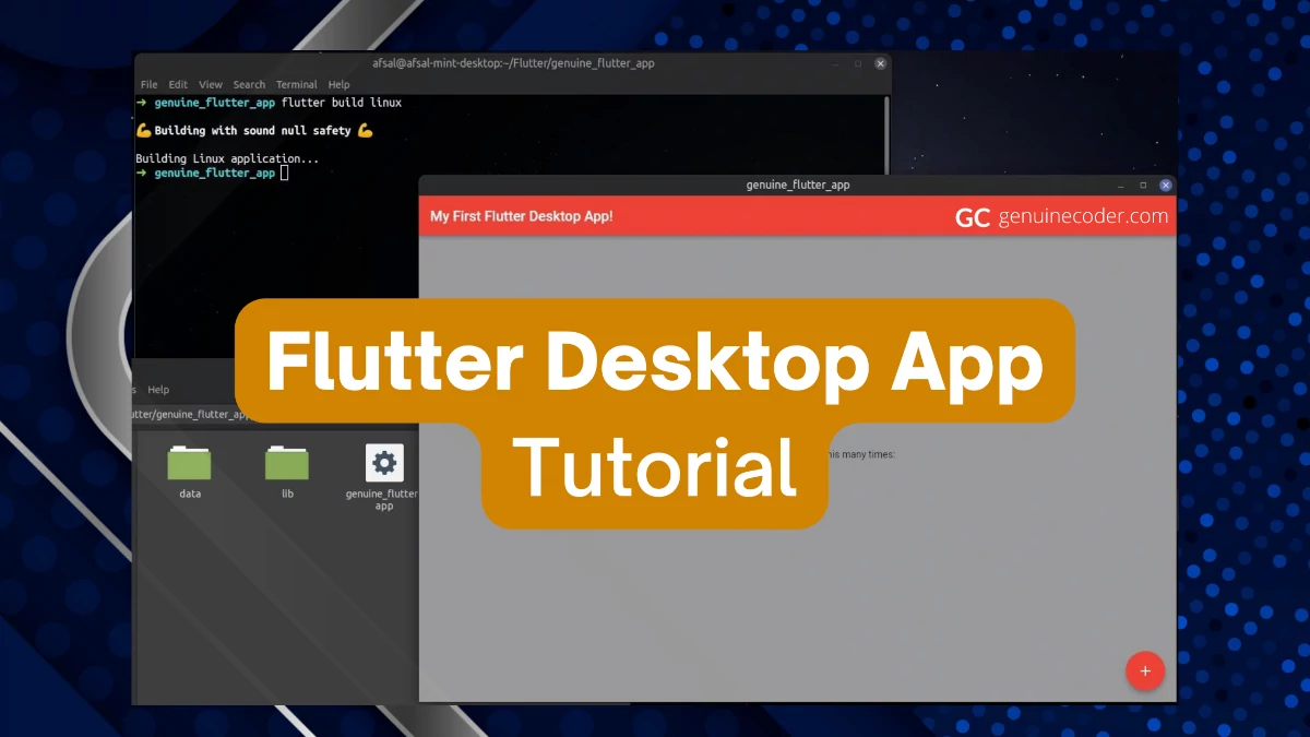
Since the “flutter create” command created the project with template code, we can run it and test it right away. So, let’s run the project with flutter run command. Since I am using Linux, I will be using “-d linux”. If you are using Windows or Mac, make sure to use your platform’s name there.
#cd into the project directory
cd genuine_flutter_app
#Run the project
flutter run -d linux
and…here we go! You will now see the application window opened. This is the default template project. Flutter Linux Desktop Application Running
Customize the default project
Let’s customize the default project and see how we can program in dart. To achieve this, let’s open the project on our IDE. I am using VSCode. You can choose your own editor.
Open the file lib/main.dart. This is the source file that is generating the sample demo project. Let’s then customize the project. Flutter main.dart file inside lib directory
Q1. How to set title of the flutter AppBar?
Currently, the AppBar title is ‘Flutter Demo Home Page’ that is passed on to the MyHomePage widget. So, let’s change it into ‘My First Flutter Desktop App!’ by changing it in the MyApp widget.
Q2. How to change the AppBar color?
The AppBar color can be changed from the theme attribute. Set the primarySwatch as your preferred color and that will update the AppBar color.
class MyApp extends StatelessWidget {
  const MyApp({Key? key}) : super(key: key);

  @override
  Widget build(BuildContext context) {
    return MaterialApp(
      title: 'Flutter Demo',

      //Set the app color there
      theme: ThemeData(
        primarySwatch: Colors.blue,
      ),

      // Set the title here
      home: const MyHomePage(title: 'My First Flutter Desktop App!'),
    );
  }
Q3. How to change the app body color?
To set the background color for the body section, you need to set the background for the scaffold.
....
@override
Widget build(BuildContext context) {
  return Scaffold(
    //This is where the AppBar title is set
    appBar: AppBar(
      title: Text(widget.title),
    ),
    //Set your preferred background color
    backgroundColor: Colors.grey,
....
Build and release executable file from flutter project
Now that we have a working flutter application, let’s see how we can build an executable file for our project. Thanks to flutter, this is also an easy step. You can execute the “flutter build” command to start the building. If you are using Windows or Mac, make sure to use your platform instead of Linux.
#Generates Linux runnable image (application/x-executable)
flutter build linux
#Generates Windows runnable .exe file
flutter build windows
#Generates macOS runnable .app file
flutter build macos
This will build an executable file for the project. The executable can then be found at the following path. [your_platform] can be Linux, windows and macOS.
build/[your_platform]/x64/release/bundle
Flutter project released as Linux desktop executable
Conclusion
In this tutorial, we have learned how to create a Flutter desktop application and build a release executable file from the project. We will be posting more flutter related tutorials in the future. If you liked this tutorial, you might also be interested in checking out the following articles.
As of writing this article, on 2022 June, there is no default support for WebP images in the Ubuntu/Linux Mint file explorers. As a result, the image file thumbnails are not rendered and we have to open the image file to see what’s in it. In this tutorial, we will see how to add support for the WebP files so that the image thumbnails are generated just like any other supported image format.
What is WebP Image Format?
WebP is an image format developed specifically for the web by Google. The primary goal of the WebP format is to replace other conventional formats like JPEG, PNG, etc. and provide better compression and quality/file-size ratio. When compared to JPEG, WebP file size is 25%-34% for the comparable quality JPEG image.
To add support for WebP images, we need to install the package named “webp-pixbuf-loader”. You can install them by executing the following commands.
#Add the PPA
sudo add-apt-repository ppa:krifa75/eog-ordissimo

#Refresh apt
sudo apt update

#Install the package
sudo apt install webp-pixbuf-loader
After the installation is done, just refresh the file-manager and you will see the thumbnails generated for the WebP images.
Image Viewer with WebP Support
Web browsers like Google Chrome can act as WebP image-viewer. However, if you are looking for image-viewer program itself with support for WebP, you can try gThumb.
How to install gThumb on Ubuntu/Mint
sudo apt install gthumb
This will install the gThum image viewer and you can use it to open WebP images.
Conclusion
In this tutorial, we have seen how to add native support for WebP images so that the file manager can show thumbnails for them. Also, gThumb image viewer has good support for the new WebP image standard. You might also be interested in reading the following articles.
JavaFX ObservableList is JavaFX SDK’s special implementation of List interface. It is basically an observable list that provides option to attach listeners for list content change. ObservableList has an integral role in the JavaFX development because it is used for major components like TableView, ComboBox, etc.
In this tutorial, we will explore the JavaFX ObservableList and see how we can utilize its special functionalities.
Creating and using ObservableList
You cannot instantiate an ObservableList class directly using a new call. Instead, FXCollections should be used to create an ObservableList. Let’s see how we can create an ObservableList of String type. The most common way to create it is using observableArrayList() function.
As you have already noted, the basic operations are similar to normal lists, except the addAll() function availability. You can add multiple entries to the ObservableList using comma separated values. The output of the above code is as follows.
[Java]
[Java, Cpp, C#, Python]
[Java, C#, Python]
Now, let’s see some special advanced features of the ObservableList.
Listening for changes in the ObservableList
ObservableList allows us to add listeners into the list so that we can execute some logic when the contents of the list is changed. In the previous code snippet, we have added system.out.println after each change we made into the list to print the list. Instead, we can actually attach a listener to the ObservableList and it will help us to print the list as soon as it is changed. To achieve this, we will make use of javafx.collections.ListChangeListener. The onChanged() function will be called as soon as any change is made to the contents of the list.
ObservableList<String> listInstance = FXCollections.observableArrayList();

//Add a ListChangeListener that will execute as soon as the contents of the list is changed.
listInstance.addListener(new ListChangeListener<String>() {
  @Override
  public void onChanged(Change<? extends String> c) {
    System.out.println(listInstance);
  }
});

//Manipulate contents of the list
listInstance.add("Java");
listInstance.addAll("Cpp", "C#", "Python");
listInstance.remove("Cpp");
The output of the code snippet is given below. The “System.out.println(listInstance);” was executed three times, once after each list change.
[Java]
[Java, Cpp, C#, Python]
[Java, C#, Python]
ObservableList also provides a second type of listener called InvalidationListener. Unlike ListChangeListener that provides the actual change as a parameter to the onChanged function, it doesn’t provide the change. You can read more about it in the dedicated observable tutorial.
Getting values from the ObserableList is similar to getting value from normal lists in Java. To get an item at specific index, you can call “observableList.get(index)”. You can also get iterator through observableList.iterator() function.
Video Tutorial for JavaFX ObservableList
If you are interested in learning more about the ObservableList, please have a look into this ObservableList video tutorial. The video shows how to make use of the ObservableList for JavaFX ListView with realworld example.
ObservableList size change listener
Thanks to JavaFX Binding class, we can add listeners to some observable properties of the list, like the size of the list. This way, similar to how we tracked the list-content-change using a listener, we can also easily track the list size. Let’s adjust the above list content listener code to list size listener code and learn how to create a binding value to an ObservableList’s size and add a listener to it.
ObservableList<String> listInstance = FXCollections.observableArrayList();

//Listen for changes in list size
IntegerBinding listSizeProperty = Bindings.size(listInstance);
listSizeProperty.addListener(new ChangeListener<Number>() {
  @Override
  public void changed(ObservableValue<? extends Number> observable, Number oldValue, Number newValue) {
    System.out.println("Updated list size: " + newValue);
  }
});

listInstance.add("something");
listInstance.addAll("something1", "random_data", "something2");
listInstance.remove("somethin3");
Output of the above code snippet is given below. As you can see, the size of the list is tracked and printed for each 3 changes we have made.
Updated list size: 1
Updated list size: 4
Updated list size: 3
Conclusion
In this tutorial, we have learned how to create and use ObservableList in JavaFX. It provides all the functionalities of normal Java lists along with cool observable support. You might also be interested in the other articles on JavaFX like JavaFX Scene Switch Animation and JavaFX Animation Tutorial.
JavaFX CheckComboBox is a special UI control provided by ControlsFX. It is used for giving option to users to select more than one item from a Combobox. It is an extremely useful component you can use to provide a rich user experience. In this tutorial, we will explore the component usage with an example and style it using CSS. The basic idea of this component is Checkbox + ComboBox so that ComboBox can have multiple parallel selections.
Adding ControlsFX to Project
Since the component is from ControlsFX library, you need to include the dependency on your project. If you are using the maven, add the dependency as follows.
If you are using Gradle, add the following line to your build.gradle file.
implementation 'org.controlsfx:controlsfx:11.1.1'
How to use CheckComboBox
The usage of CheckComboBox is similar to the normal JavaFX ComboBox. You can create a list of item you want to add and then attach it to the CheckComboBox.
In the following example, we will make use of CheckComboBox to keep things simlpe. Let’s see the usage on a sample code.
//Reduced import code
import org.controlsfx.control.CheckComboBox;

public class JavaFXCheckComboBoxTutorial extends Application {

  private CheckComboBox<String> createCheckComboBox() {
    // Create the list of items to be shown on the combobox
    ObservableList<String> programmingLanguages = FXCollections.observableArrayList(
        "Java",
        "Cpp",
        "Python",
        "C#",
        "Kotlin"
    );
    // Attach the list to the Combobox
    CheckComboBox<String> checkComboBox = new CheckComboBox<>(programmingLanguages);
    //As soon as an item is selected or selection is changed, display all the selected items
    checkComboBox.getCheckModel().getCheckedItems().addListener(new InvalidationListener() {
      @Override
      public void invalidated(Observable observable) {
        System.out.printf("\nSelected items: %s", getSelectedItems(checkComboBox));
      }
    });
    return checkComboBox;
  }

  /**
   * Get the currently selected items from the CheckComboBox
   */
  private List<String> getSelectedItems(CheckComboBox<String> checkComboBox) {
    return checkComboBox.getCheckModel().getCheckedItems();
  }

  @Override
  public void start(Stage stage) {
    VBox contentPane = new VBox(10);
    contentPane.setAlignment(Pos.CENTER);
    contentPane.getChildren().addAll(new Label("CheckComboBox Example"), createCheckComboBox());

    Scene scene = new Scene(contentPane, 400, 500);
    stage.setScene(scene);
    stage.show();
  }

  public static void main(String[] args) {
    launch();
  }
}
To get the list of selected items from the CheckComboBox, you can use
checkComboBox.getCheckModel().getCheckedItems()
It will return an ObservableList with all the selected items.
Customize CheckComboBox with CSS
Now, let’s see how to style the CheckComboBox with JavafX CSS styling. This component can be styled using combo-box-base CSS. By applying the following CSS, the CheckComboBox is customized with a lighter background.
You can use the same CSS you use for ComboBox to style CheckComboBox.
In this tutorial, we have discussed how to make use of the CheckComboBox in code and style it using CSS. ControlsFX has a lot of such useful extra components. You might also be interested to checkout the following articles.
JavaFX provides effective ways to customize the shape of most of the components. In this tutorial, we will learn how to set a custom shape for the JavaFX Button component.
Creating custom shaped buttons
We can make use of -fx-shape CSS property to set the button to any custom shape. Let’s see how we can make a heart shaped button using -fx-shape styling. We will create two buttons, one normal button without any special styling and one with heart-shape. The -fx-shape css property accepts SVG paths as shape. Thanks to the SVG support, we can actually make any shape by providing the corresponding svg parameters. You can learn more about SVG shapes from w3.org.
import javafx.application.Application;
import javafx.geometry.Pos;
import javafx.scene.Scene;
import javafx.scene.control.Button;
import javafx.scene.layout.HBox;
import javafx.stage.Stage;

public class HeartShapedButtonTutorial extends Application {

  @Override
  public void start(Stage stage) {
    HBox contentContainer = new HBox(50d, createNormalButton(), createHeartShapedButton());
    contentContainer.setAlignment(Pos.CENTER);
    Scene scene = new Scene(contentContainer, 500, 500);
    stage.setTitle("JavaFX Button Tutorial");
    stage.setScene(scene);
    stage.show();
  }

  private Button createNormalButton() {
    Button button = new Button("Normal Button!");
    button.setPrefSize(200, 200);
    return button;
  }

  private Button createHeartShapedButton() {
    Button button = new Button("Custom Button!");
    button.setStyle(
        "-fx-shape: \"M23.6,0c-3.4,0-6.3,2.7-7.6,5.6C14.7,2.7,11.8,0,8.4,0C3.8,0,0,3.8,0,8.4c0,9.4,9.5,11.9,16,21.26.1-9.3,16-12.1,16-21.2C32,3.8,28.2,0,23.6,0z\";"
    );
    button.setPrefSize(200, 200);
    return button;
  }

  public static void main(String[] args) {
    launch();
  }
}
This will create the following output. The normal JavaFX button is added as the first child to the HBox. The custom shaped button is added as the second child.
You can also make use of this styling on special buttons like JavaFX Material Design Button, JFXButton.
JavaFX allows setting custom shapes for its GUI components via -fx-shape option. We have explored the option and created variety of different buttons with heart-shape, circle-shape and triangle shape. You can make the button any shape you want by giving proper SVG path. If you have enjoyed this article, you might also be interested in the following.

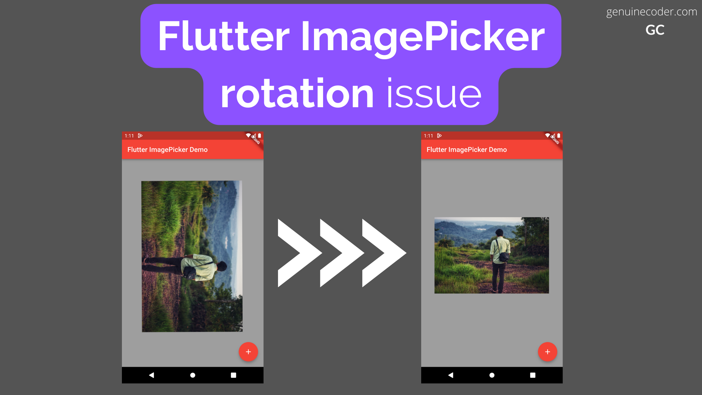
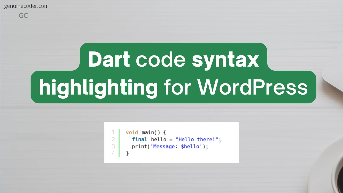


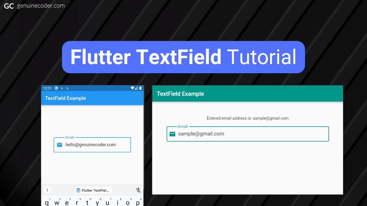


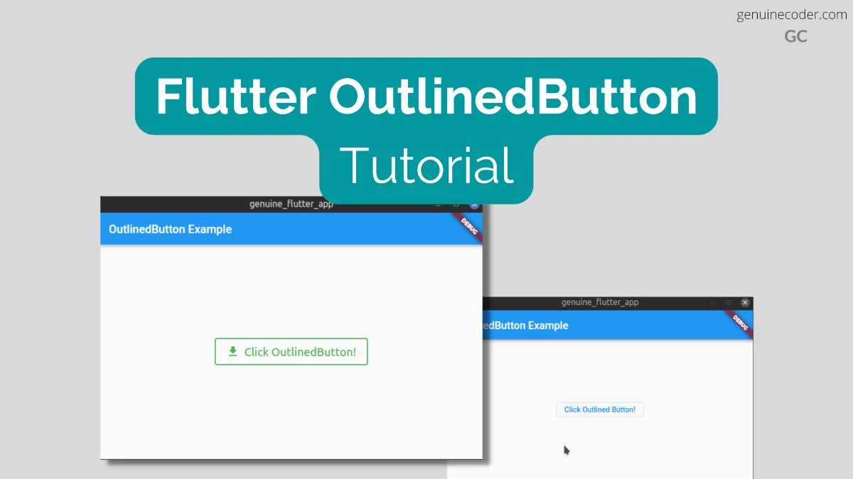


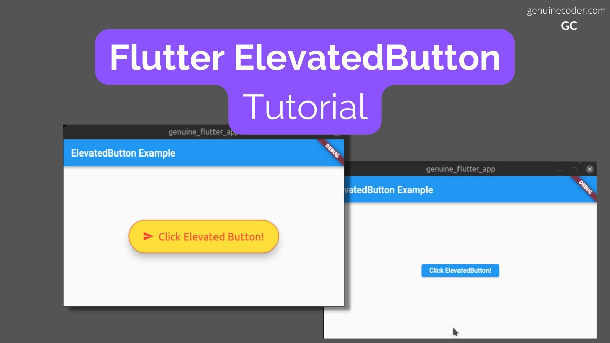


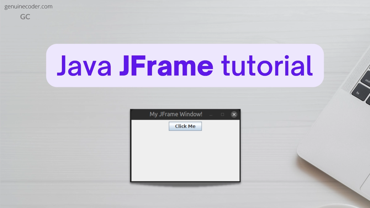

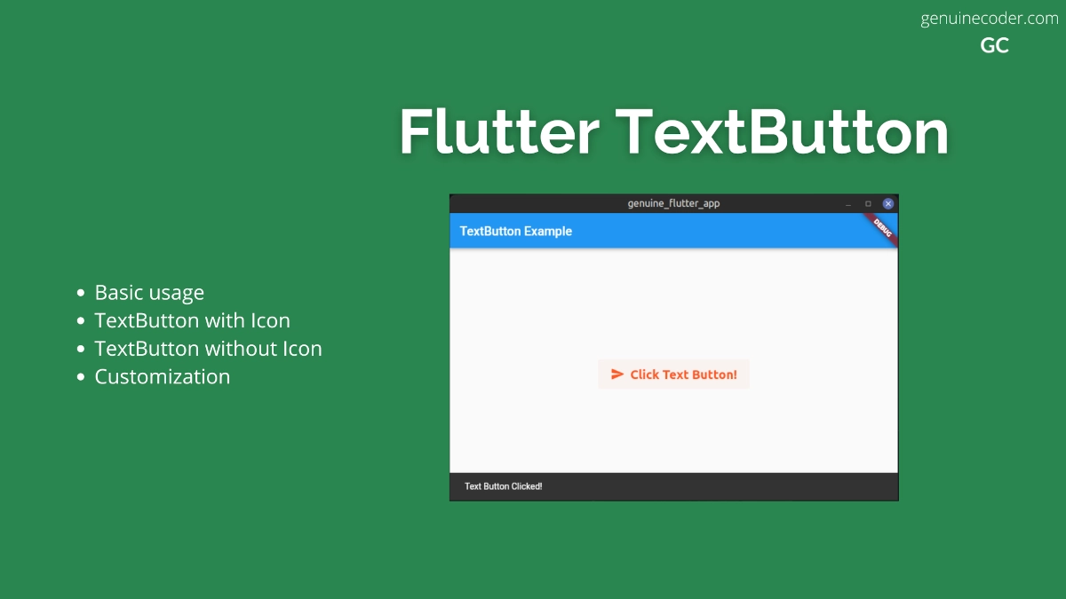

